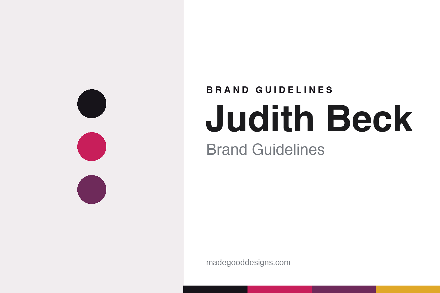
Judith Beck Brand Guidelines
Bambule! as identity.
Aa
Two constants: a cerise-and-plum palette and a friendly geometric register. Abstract homage — not the Judith Beck labels.
Bambule! as identity
Judith Beck’s identity is carried by a playful, rebellious voice.
Judith Beck is a lesson in naming as identity. Judith Beck took full control of her family’s Gols, Burgenland estate in 2004 (founded by her parents in 1976), farming biodynamically as a founding member of respekt-BIODYN and making red-led, low-intervention wines by Lake Neusiedl.
Its brand identity is carried by a playful, rebellious voice. Her natural range is called “Bambule!” — German-Austrian slang for a ruckus or riot — and her cuvées wear exclamation-marked, lower-case, English-inflected names like Hunny Bunny, Cherry Bomb, Ink and Koreaa that deliberately break with formal Austrian estate convention. The naming is the design signal: contemporary, irreverent, a “riot” of natural wine.
(Honest notes: she is certified by respekt-BIODYN, not Demeter, and took full control in 2004 (not 2005). The actual label graphics are thinly documented and no designer is credited, so we describe the verifiable naming rather than inventing a house style. She is a separate estate from her Gols neighbour Claus Preisinger. And there’s no official brand hex, so the tones here are an unofficial interpretation.)
Colour
Judith Beck lives in a cerise-and-plum palette. Click a swatch to copy the hex.
Judith Beck’s identity is bold, playful and rebellious — an ink, a cerise, a plum, a gold, and a paper. The palette pairs a punchy cerise with a plum — the register of a “riot,” a red-led estate and a contemporary natural voice. It signals energy and irreverence rather than formality. The honest caveat: with no published brand hex, these tones are an original, unofficial interpretation, not first-party values.
The lesson is a cerise with a plum signals a bold, rebellious brand. Judith Beck’s world is a “Bambule!” — a joyful riot of natural wine. For designers, it is a reminder that a punchy cerise with a plum reads as energetic and contemporary — right for a playful, rule-breaking identity. The takeaways: lead with a punchy hue; add a deeper plum; keep it energetic; and treat any single hex as unofficial — using ink for small text so the palette stays bold.
Typography
The register is a friendly geometric — contemporary, playful, rebellious.
Judith Beck’s identity carries a contemporary, playful, rebellious spirit — a riot and a wink. A friendly geometric sans captures the mood: it is modern and warm, the register of a playful, contemporary brand. Set in a cerise-and-plum palette, the friendly geometric feels contemporary and playful — exactly the personality Judith Beck carries. It is energetic rather than formal, mirroring the “Bambule!” voice. (Judith Beck’s real labels are works we describe but do not reproduce, and no typeface is documented for us to use.) Because they are not ours to use, the honest description is “a friendly geometric spirit,” shown here in a stand-in. The type behaves like the brand: contemporary, playful and rebellious.
Aa
A friendly geometric spirit — contemporary and playful. (Specimen set in Rubik, a friendly geometric STAND-IN; NOT the Judith Beck labels.)
Naming as identity
Judith Beck stands for a voice that carries the brand.
Judith Beck is a lesson in making naming the identity. A cerise-and-plum palette, a friendly geometric and a rebellious voice make language itself the whole brand — contemporary, playful, memorable. The naming is the differentiator. The differentiator is a playful, rule-breaking, contemporary identity.
For designers and brand-builders, Judith Beck offers a clear takeaway: a voice can be a brand. The lessons: let names do the work (Bambule!, Hunny Bunny, Cherry Bomb); break the category’s formality on purpose (lower-case, exclamation-marked, English-inflected); and let the wine range read as a single rebellious voice. It is also a reminder to stay accurate: it is respekt-BIODYN (not Demeter), the graphics are undocumented (so we describe the naming), and the palette here is an unofficial interpretation. Judith Beck made a voice the brand — proof that naming can be the difference.
Explore & save
Keep Judith Beck’s identity on hand — save it to a board in the Made Good inspiration library.
Judith Beck identity set
Pin the cerise-and-plum palette and the friendly-geometric register to your own board.


