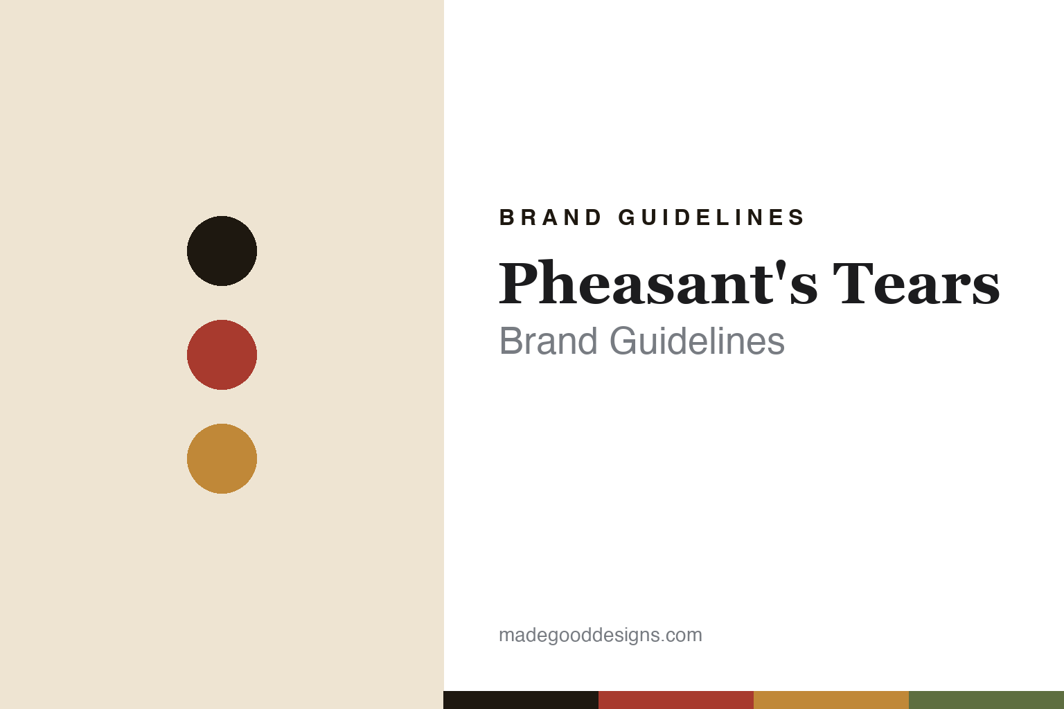
Pheasant’s Tears Brand Guidelines
An award-winning label.
Aa
Two constants: a folk-red-and-amber palette and a folk display serif register. Abstract homage — not the Pheasant’s Tears labels.
An award-winning label
Pheasant’s Tears’ labels are designed, and Red Dot-awarded.
Pheasant’s Tears is a lesson in a painter’s milieu, a designer’s labels. Founded in 2007 by the American painter John Wurdeman and the Georgian winegrower Gela Patalishvili in Kakheti, eastern Georgia, it makes wine in qvevri — the buried clay vessels of Georgia’s roughly 8,000-year skin-contact tradition. Its name comes from a Georgian saying that a wine can be so good it makes a pheasant weep.
Its brand identity is a professionally designed system. Although Wurdeman is a painter, the labels are not his canvases — they are the work of the Swedish graphic designer Henrik Callerstrand (a partner in the winery), and the “Pheasant’s Tears Labels” project won a Red Dot Design Award. Wurdeman’s painting financed the early winery and shapes the brand’s ethnographic sensibility, but the bottle-label system is a deliberate, award-recognised design.
(Honest notes: it isn’t just two founders — a Swedish contingent are partners. Wurdeman is an American painter, not the label artist. The “Poliphonia” bottling blends hundreds of near-extinct varieties, but the exact count varies by source. And there’s no official brand hex, so the tones here are an unofficial interpretation.)
Colour
Pheasant’s Tears lives in a folk-red-and-amber palette. Click a swatch to copy the hex.
Pheasant’s Tears’ identity is earthen, folk and warm — an ink, a folk red, an amber, a vine green, and a cream. The palette pairs a Caucasus folk red with the amber of qvevri wine — the register of Georgian craft, clay and skin-contact colour. It signals heritage and place rather than gloss. The honest caveat: with no published brand hex, these tones are an original, unofficial interpretation, not first-party values.
The lesson is a folk red with an amber signals a heritage, hand-craft identity. Pheasant’s Tears’ world is amber wine from buried clay in the Caucasus. For designers, it is a reminder that a folk red with an amber reads as earthen and old-world — right for a Georgian qvevri estate. The takeaways: anchor with ink; use a folk red; add the amber of skin-contact wine; and treat any single hex as unofficial — using ink for small text so the palette stays folk.
Typography
The register is a folk display serif — warm, characterful, ethnographic.
Pheasant’s Tears’ identity carries a warm, characterful, ethnographic spirit — folk song, craft and the Caucasus. A folk display serif captures the mood: it is warm and rooted, the register of a hand-made, heritage brand. Set in a folk-red-and-amber palette, the folk display serif feels characterful and ethnographic — exactly the personality Pheasant’s Tears carries. It is warm rather than slick, mirroring a designed folk label. (Pheasant’s Tears’ real labels are Henrik Callerstrand’s designs; we describe but do not reproduce them, and the exact lettering is not ours to use.) Because they are not ours to use, the honest description is “a folk display serif spirit,” shown here in a stand-in. The type behaves like the brand: warm, characterful and rooted.
Aa
A folk display serif spirit — warm and characterful. (Specimen set in Eczar, a folk display serif STAND-IN; NOT the Pheasant’s Tears labels.)
A designed label as identity
Pheasant’s Tears stands for craft matched to real design.
Pheasant’s Tears is a lesson in pairing craft with design. A folk-red-and-amber palette, a folk display serif and an award-winning label make heritage and design one identity — warm, considered, recognisable. The designed label is the differentiator. The differentiator is a Georgian, qvevri, award-recognised identity.
For designers and brand-builders, Pheasant’s Tears offers a clear takeaway: a painter’s world can still hire a designer. The lessons: let the founder’s art set the mood but commission a real label system (Henrik Callerstrand’s Red Dot-winning design); root the identity in place (qvevri, Kakheti, folk song); and let a name carry a story (a wine that makes a pheasant weep). It is also a reminder to stay accurate: Wurdeman paints canvases, not the labels; Georgia is the source the Italian pioneers Gravner and Radikon drew on; and the palette here is an unofficial interpretation. Pheasant’s Tears matched craft to design — proof that both can be the difference.
Explore & save
Keep Pheasant’s Tears’s identity on hand — save it to a board in the Made Good inspiration library.
Pheasant’s Tears identity set
Pin the folk-red-and-amber palette and the folk-serif register to your own board.


