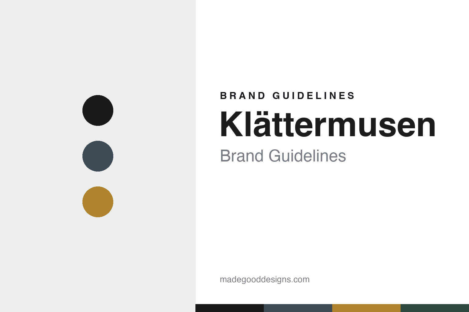
Klättermusen Brand Guidelines
The climbing mouse.
Aa
Two constants: a storm-slate palette and a sturdy display register. Abstract homage — not the Klättermusen wordmark or logo.
The climbing mouse
Klättermusen names its gear after Norse mythology.
Klättermusen is a lesson in mythology as a naming system. Founded in 1975 by a group of climbers in Umeå, Sweden, the brand — whose name means “the climbing mouse” — makes durable, repair-first technical mountaineering gear, today headquartered in Åre.
Its brand identity is technical, durable and Norse-themed — “Maximum Safety. Minimum Impact.” Its signature is a Norse-mythology naming system: products are named after gods, myth figures and runes (Allgrön, Vili, Megingjörð — Thor’s belt of strength, Raido — a rune). It was the first outdoor brand to reach a 100% fluorocarbon-free collection, back in 2017.
(Honest notes: it was founded by Umeå climbers, not a single person — Peter Askulv acquired it in 1984 and shaped it for decades before selling to current owner Gonz Ferrero. There was no bankruptcy — that’s a misconception; it was an ownership handover. And there’s no official brand hex, so the tones here are an unofficial interpretation.)
Colour
Klättermusen lives in a storm-slate palette. Click a swatch to copy the hex.
Klättermusen’s identity is rugged, Nordic and technical — an ink, a storm slate, a rune amber, a pine, and a snow. The palette leans on a storm slate with a rune amber — the register of Nordic weather, rune stones and heavy-duty gear. It signals durability, myth and the mountains rather than lifestyle. The honest caveat: with no published brand hex, these tones are an original, unofficial interpretation, not first-party values.
The lesson is storm slate plus rune amber signals rugged Nordic myth. Klättermusen’s world is a Swedish mountain in bad weather. For designers, it is a reminder that a slate grey with an amber accent reads as rugged and mythic — right for a brand named for the climbing mouse. The takeaways: anchor with ink; use a storm slate; add a rune amber; and treat any single hex as unofficial — using ink for small text so the palette stays rugged.
Typography
The register is a sturdy display — heavy and Nordic.
Klättermusen’s identity carries a rugged, durable, Nordic spirit — Norse myth and heavy-duty gear. A sturdy display face captures the mood: it is heavy and assertive, the register of a durable, mythic brand. Set in a storm-slate palette, the sturdy display feels heavy and Nordic — exactly the personality Klättermusen carries. It is solid rather than delicate, mirroring rugged kit. (Klättermusen’s real wordmark and climbing-mouse motif are trademarks we describe but do not reproduce, and the exact brand typeface is not ours to use.) Because the marks are not ours to use, the honest description is “a sturdy display spirit,” shown here in a stand-in. The type behaves like the brand: rugged, durable and Nordic.
Aa
A sturdy display spirit — heavy and Nordic. (Specimen set in Fjalla One, a sturdy display STAND-IN; NOT the Klättermusen wordmark or climbing-mouse motif, which are trademarks.)
Mythology as identity
Klättermusen stands for Norse-named technical gear.
Klättermusen is a lesson in making mythology the identity. A storm-slate palette, a Norse-mythology naming system and repair-first durability make Nordic myth the whole brand — rugged, technical, sustainable. The mythology is the differentiator. The differentiator is a Norse-themed, durable, technical identity.
For designers and brand-builders, Klättermusen offers a clear takeaway: a naming system can be a brand. The lessons: pick a coherent world (Norse myth); build durability in (repair-first); and lead on materials (fluorocarbon-free first). It is also a reminder to stay accurate: it was founded by Umeå climbers (not one person), it never went bankrupt, and the palette here is an unofficial interpretation. Klättermusen made mythology the brand — proof that a naming system can be the difference.
Explore & save
Keep Klättermusen’s identity on hand — save it to a board in the Made Good inspiration library.
Klättermusen identity set
Pin the storm-slate palette and the sturdy-display register to your own board.


