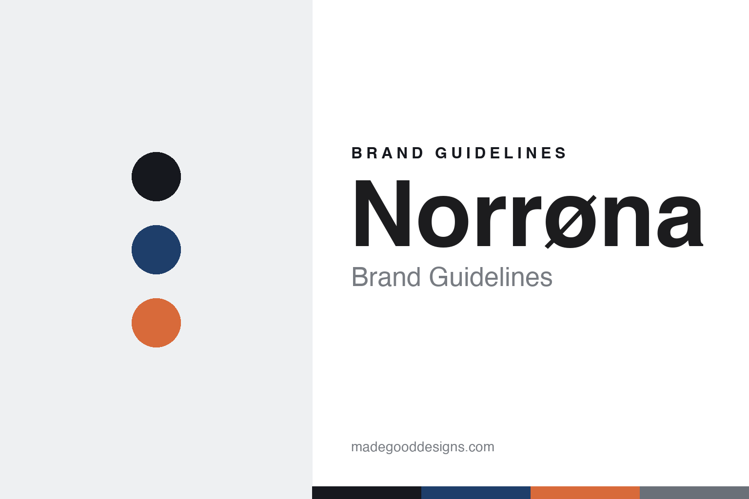
Norrøna Brand Guidelines
Since 1929.
Aa
Two constants: a fjord-blue palette and a technical sans register. Abstract homage — not the Norrøna wordmark or logo.
Since 1929
Norrøna is Norway’s family-owned technical outdoor brand.
Norrøna is a lesson in heritage and family continuity. Founded in 1929 by Jørgen Jørgensen in Lysaker, near Oslo, Norway, it is one of the oldest outdoor brands still going — and still run by the same family, now in its fourth generation, under the founder’s great-grandson (also named Jørgen Jørgensen).
Its brand identity is premium, technical and Scandinavian — an innovator that introduced GORE-TEX to Europe. Its signature is a place-name collection system: garments are named after Norwegian locations where they’re meant to be used — lofoten for freeride ski, trollveggen for mountaineering, falketind for hiking, bitihorn for lightweight trekking.
(Honest notes: Norrøna is genuinely independent and family-owned — a real contrast to the consolidated names in outdoor. Its HQ is Lysaker (greater Oslo), not Oslo city. Its name means “of the North” in Old Norse, and its slashed “ø” is the signature of the wordmark. And there’s no official brand hex, so the tones here are an unofficial interpretation.)
Colour
Norrøna lives in a fjord-blue palette. Click a swatch to copy the hex.
Norrøna’s identity is Scandinavian, technical and nature-drawn — an ink, a fjord blue, an alpenglow, a steel, and a snow. The palette pairs a deep fjord blue with a warm alpenglow — the register of Norwegian mountains, water and sky. It signals nature, heritage and technical performance rather than fashion. The honest caveat: with no published brand hex, these tones are an original, unofficial interpretation, not first-party values.
The lesson is a fjord blue plus alpenglow signals Nordic nature. Norrøna’s world is a Norwegian mountain. For designers, it is a reminder that a deep blue with a warm accent reads as Scandinavian and technical — right for a brand named for the North. The takeaways: anchor with ink; use a fjord blue; add a warm alpenglow; and treat any single hex as unofficial — using ink for small text so the palette stays natural.
Typography
The register is a technical sans — clean and Scandinavian.
Norrøna’s identity carries a clean, technical, Scandinavian spirit — nearly a century of Norwegian craft. A technical sans captures the mood: it is clean and modern, the register of a premium technical brand. Set in a fjord-blue palette, the technical sans feels clean and Scandinavian — exactly the personality Norrøna carries. It is precise rather than decorative, mirroring technical kit. (Norrøna’s real wordmark — with its slashed Nordic “ø” — is a trademark we describe but do not reproduce, and the exact brand typeface is not ours to use.) Because the mark is not ours to use, the honest description is “a technical sans spirit,” shown here in a stand-in. The type behaves like the brand: clean, technical and Scandinavian.
Aa
A technical sans spirit — clean and Scandinavian. (Specimen set in Archivo, a technical sans STAND-IN; NOT the Norrøna wordmark, which is a trademark.)
Continuity as identity
Norrøna stands for family-owned Norwegian craft.
Norrøna is a lesson in making continuity the identity. A fjord-blue palette, nearly a century of heritage and a place-name system make family-owned Norwegian craft the whole brand — technical, Scandinavian, enduring. The continuity is the differentiator. The differentiator is a heritage, technical, family-owned identity.
For designers and brand-builders, Norrøna offers a clear takeaway: staying independent can be a brand. The lessons: keep it in the family (four generations); build a coherent naming system (Norwegian places); and back it with real technical firsts (GORE-TEX to Europe). It is also a reminder to stay accurate: it’s Lysaker (not Oslo), independent (not PE-owned), and the palette here is an unofficial interpretation. Norrøna made continuity the brand — proof that staying the course can be the difference.
Explore & save
Keep Norrøna’s identity on hand — save it to a board in the Made Good inspiration library.
Norrøna identity set
Pin the fjord-blue palette and the technical-sans register to your own board.


