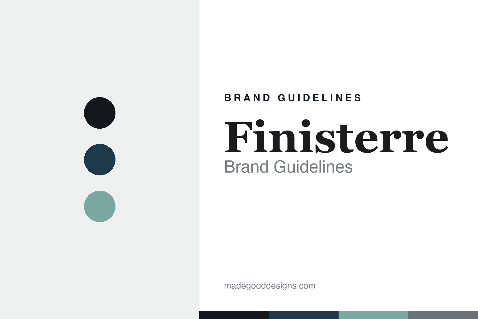
Finisterre Brand Guidelines
Land’s end. Cold water.
Aa
Two constants: an Atlantic-navy palette and an editorial serif register. Abstract homage — not the Finisterre wordmark or logo.
Land’s end, cold water
Finisterre makes kit for British cold-water surfers.
Finisterre is a lesson in a place and a purpose as the brand. Founded in 2003 by Tom Kay in St Agnes, Cornwall — in a flat above a surf shop — the brand set out to make functional kit for hardy British cold-water surfers. Its name, a Shipping Forecast sea area meaning “land’s end,” carries an Atlantic-storm identity.
Its brand identity is ocean-led, considered and sustainable — built on a “Product, Environment, People” ethos. It’s a certified B Corp, its wetsuits use Yulex natural rubber (with a rental-and-repair scheme), and it pioneers materials like NetPlus recycled yarn made from reclaimed fishing nets.
(Honest notes: Finisterre is founder-led but not independent — it has taken outside growth investment, and majority control sits with holding/investment companies (Active Partners among them), with Tom Kay as a director rather than the majority owner. It became a B Corp in 2018, not at its founding. And there’s no official brand hex, so the tones here are an unofficial interpretation.)
Colour
Finisterre lives in an Atlantic-navy palette. Click a swatch to copy the hex.
Finisterre’s identity is maritime, cool and considered — an ink, an Atlantic navy, a sea foam, a storm grey, and a sand. The palette pairs a deep Atlantic navy with a sea-foam green — the register of cold water, storms and the Cornish coast. It signals the ocean, seriousness and durability rather than bright surf-fashion. The honest caveat: with no published brand hex, these tones are an original, unofficial interpretation, not first-party values.
The lesson is a deep navy plus sea foam signals a cold-water ocean brand. Finisterre’s world is a grey Atlantic swell off Cornwall. For designers, it is a reminder that an Atlantic navy with a sea-foam green reads as maritime and considered — right for a cold-water surf brand. The takeaways: anchor with ink; use a deep sea navy; add a sea-foam green; and treat any single hex as unofficial — using ink for small text so the palette stays cool.
Typography
The register is an editorial serif — considered and coastal.
Finisterre’s identity carries a considered, editorial, ocean spirit — sustainability storytelling and a Cornish sense of place. An editorial serif captures the mood: it is thoughtful and human, the register of a brand that writes as much as it makes. Set in an Atlantic-navy palette, the editorial serif feels considered and coastal — exactly the personality Finisterre carries. It is reflective rather than loud, mirroring a purpose-led brand. (Finisterre’s real minimalist wordmark is a trademark we describe but do not reproduce, and the exact brand typeface is not ours to use.) Because the mark is not ours to use, the honest description is “an editorial serif spirit,” shown here in a stand-in. The type behaves like the brand: considered, editorial and ocean-led.
Aa
An editorial serif spirit — considered and coastal. (Specimen set in Newsreader, an editorial serif STAND-IN; NOT the Finisterre wordmark, which is a trademark.)
Place and purpose as identity
Finisterre stands for cold-water surf and sustainability.
Finisterre is a lesson in making place and purpose the identity. An Atlantic-navy palette, a cold-water surf origin and a sustainability ethos make the ocean the whole brand — considered, Cornish, purpose-led. The purpose is the differentiator. The differentiator is a cold-water-surf, sustainable, place-rooted identity.
For designers and brand-builders, Finisterre offers a clear takeaway: a place and a cause can be a brand. The lessons: root it somewhere real (St Agnes, the Atlantic); solve for your people (cold-water surfers); and make sustainability structural (B Corp, Yulex wetsuits, NetPlus yarn, rental and repair). It is also a reminder to stay accurate: it’s founder-led but investor-backed (not independent), it became a B Corp in 2018 (not at founding), and the palette here is an unofficial interpretation. Finisterre made place and purpose the brand — proof that where and why can be the difference.
Explore & save
Keep Finisterre’s identity on hand — save it to a board in the Made Good inspiration library.
Finisterre identity set
Pin the Atlantic-navy palette and the editorial-serif register to your own board.


