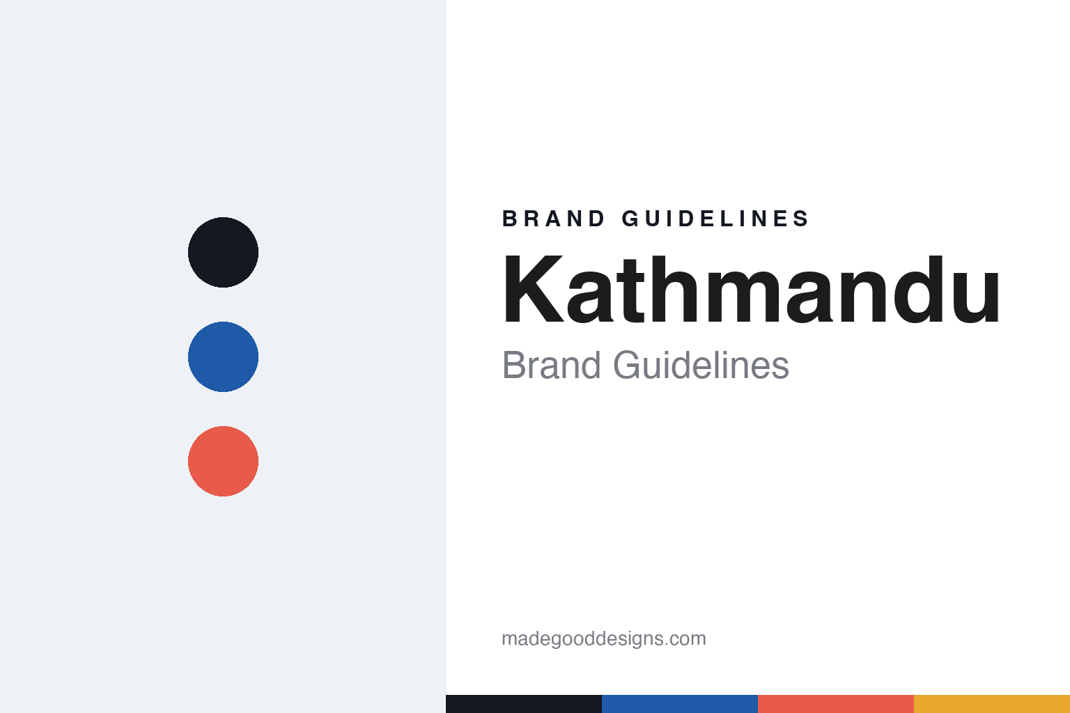
Kathmandu Brand Guidelines
Adventure, for everyone.
Aa
Two constants: a blue-and-coral palette and a friendly sans register. Abstract homage — not the Kathmandu wordmark or logo.
Adventure, for everyone
Kathmandu makes accessible, colourful outdoor and travel gear.
Kathmandu is a lesson in making the outdoors accessible. Co-founded in 1987 by John Pawson and Jan Cameron in Christchurch, New Zealand, it grew into a large, colourful, mainstream outdoor and travel retailer known for down jackets, packs and its big seasonal sale events.
Its brand identity is accessible, colourful and value-driven — everyday adventure rather than premium alpine specialism. Signature lines include the Epiq puffer and XT Series waterproofs, and it’s a certified B Corp. It is a New Zealand brand whose name simply evokes travel and adventure via the city of Kathmandu.
(Honest notes: Kathmandu is owned by the publicly listed group KMD Brands (NZX/ASX: KMD, formerly Kathmandu Holdings), which also owns Rip Curl and Oboz — so it isn’t a small independent. It’s a New Zealand brand, not a Nepali one. Manufacturing is now offshore, not NZ-made. And there’s no official brand hex, so the tones here are an unofficial interpretation.)
Colour
Kathmandu lives in a blue-and-coral palette. Click a swatch to copy the hex.
Kathmandu’s identity is bright, friendly and accessible — an ink, a Kathmandu blue, a coral, a sun, and a snow. The palette pairs a bold blue with a warm coral — the register of colourful, everyday-adventure outdoor gear. It signals accessibility, travel and fun rather than muted premium restraint. The honest caveat: with no published brand hex, these tones are an original, unofficial interpretation, not first-party values.
The lesson is a bold blue plus a warm coral signals an accessible outdoor brand. Kathmandu’s world is a colourful puffer on a family adventure. For designers, it is a reminder that a bold blue with a coral reads as friendly and accessible — right for a mainstream outdoor brand. The takeaways: lead with a bold blue; add a warm coral; keep it colourful; and treat any single hex as unofficial — using ink for small text so the palette stays bright.
Typography
The register is a friendly sans — accessible and modern.
Kathmandu’s identity carries a friendly, accessible, everyday spirit — colourful outdoor and travel gear for many. A friendly sans captures the mood: it is warm and approachable, the register of a mainstream, welcoming brand. Set in a blue-and-coral palette, the friendly sans feels accessible and modern — exactly the personality Kathmandu carries. It is welcoming rather than exclusive, mirroring value-driven adventure. (Kathmandu’s real lowercase wordmark and peak motif are trademarks we describe but do not reproduce, and the exact brand typeface is not ours to use.) Because the marks are not ours to use, the honest description is “a friendly sans spirit,” shown here in a stand-in. The type behaves like the brand: friendly, accessible and modern.
Aa
A friendly sans spirit — accessible and modern. (Specimen set in Plus Jakarta Sans, a friendly sans STAND-IN; NOT the Kathmandu wordmark, which is a trademark.)
Accessibility as identity
Kathmandu stands for outdoor adventure for everyone.
Kathmandu is a lesson in making accessibility the identity. A blue-and-coral palette, colourful gear and value-driven positioning make everyday adventure the whole brand — accessible, colourful, mainstream. The accessibility is the differentiator. The differentiator is a mainstream, colourful, value outdoor identity.
For designers and brand-builders, Kathmandu offers a clear takeaway: being for everyone can be a brand. The lessons: price and position for the many (value, big sale events); keep it colourful and friendly (not muted premium); and back it with substance (B Corp, RDS down, Fairtrade cotton). It is also a reminder to stay accurate: it’s owned by the listed KMD Brands (not a small independent), it’s a New Zealand brand (not Nepali), and the palette here is an unofficial interpretation. Kathmandu made accessibility the brand — proof that being for everyone can be the difference.
Explore & save
Keep Kathmandu’s identity on hand — save it to a board in the Made Good inspiration library.
Kathmandu identity set
Pin the blue-and-coral palette and the friendly-sans register to your own board.


