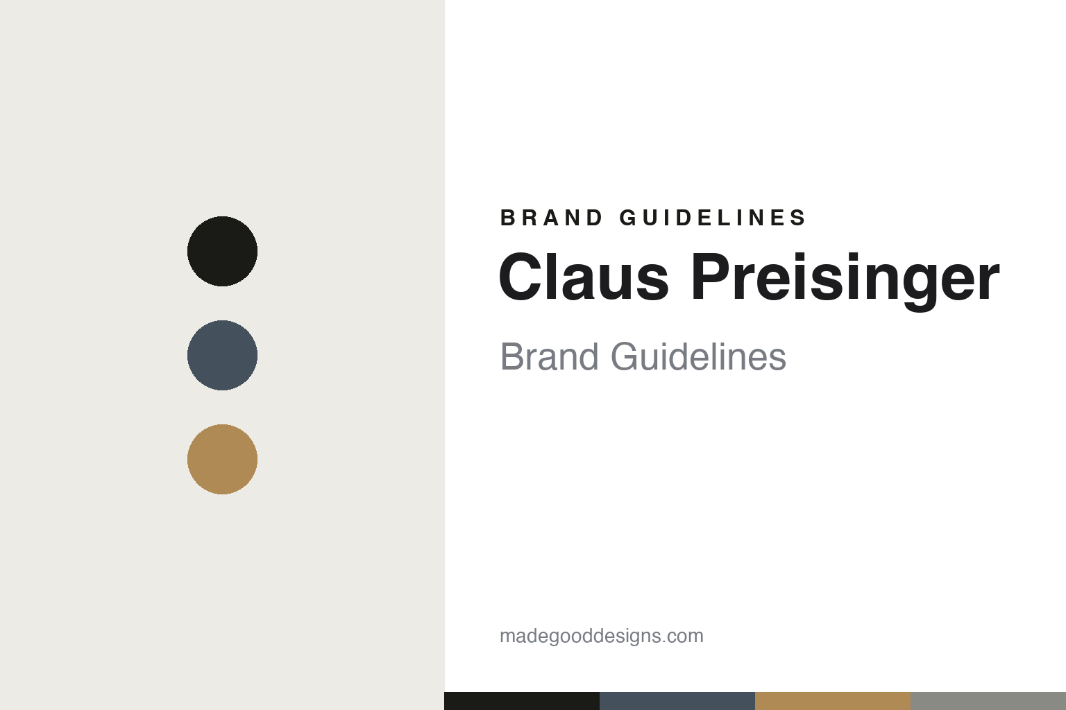
Claus Preisinger Brand Guidelines
The signature scribble.
Aa
Two constants: a slate-and-larch palette and a modernist sans register. Abstract homage — not the Preisinger labels.
The signature scribble
Preisinger’s label is white space and a handwritten name.
Claus Preisinger is a lesson in minimalism as identity. Working in Gols, on Lake Neusiedl in Burgenland, Austria, Claus Preisinger made his first vintage in 2000 and built his own estate from the early 2000s, farming biodynamically (he co-founded the respekt-BIODYN association in 2007) and making red-led, low-intervention wines.
Its brand identity is radically minimalist and typographic — a clean white label dominated by negative space, whose hero is Preisinger’s handwritten signature, a loose scribble, with only the essentials (estate, soil type, grape) set small in a quiet sans in the corner. It reads like contemporary graphic design rather than a wine label. His concrete-and-larch winery, by the Vienna studio propeller z, extends the same stripped-back sensibility to architecture. One label even hides a banned vineyard name in plain sight: for “Edelgraben,” Austrian law forbade naming the single vineyard, so the emphasised letters inside a longer word — ErDELuftGRAsundreBEN — spell EDELGRABEN.
(Honest notes: Preisinger is certified by respekt-BIODYN, not Demeter. No graphic designer is credited for the labels — the one named studio, propeller z, designed the building. The range isn’t monolithic: playful experimental cuvées use looser, colourful treatments. And there’s no official brand hex, so the tones here are an unofficial interpretation.)
Colour
Claus Preisinger lives in a slate-and-larch palette. Click a swatch to copy the hex.
Preisinger’s identity is modern, austere and material — an ink, a slate, a larch, a concrete, and a chalk. The palette pairs a cool slate with a warm larch — the register of the concrete-and-larch winery and the white, negative-space labels. It signals restraint and modern craft rather than tradition. The honest caveat: with no published brand hex, these tones are an original, unofficial interpretation, not first-party values.
The lesson is a cool slate with a warm larch signals a modern, material identity. Preisinger’s world is white space, a scribbled signature and honest materials. For designers, it is a reminder that a slate grey with a larch tan reads as modern and grounded — right for a minimalist, architectural brand. The takeaways: build on neutrals; warm them with one wood tone; keep it austere; and treat any single hex as unofficial — using ink for small text so the palette stays modern.
Typography
The register is a modernist sans — clean, quiet, contemporary.
Preisinger’s identity carries a modern, austere, contemporary spirit — negative space and a handwritten mark. A modernist sans captures the mood: it is clean and quiet, the register of gallery-like graphic design. Set in a slate-and-larch palette, the modernist sans feels contemporary and austere — exactly the personality Preisinger carries. It is minimal rather than ornate, mirroring a white, signature-led label. (Preisinger’s real labels are works we describe but do not reproduce, and the exact typeface is not ours to use.) Because they are not ours to use, the honest description is “a modernist sans spirit,” shown here in a stand-in. The type behaves like the brand: clean, quiet and contemporary.
Aa
A modernist sans spirit — clean and contemporary. (Specimen set in Space Grotesk, a modernist sans STAND-IN; NOT the Preisinger labels.)
Minimalism as identity
Claus Preisinger stands for white space and one handwritten mark.
Claus Preisinger is a lesson in making minimalism the identity. A slate-and-larch palette, a modernist sans and a white, signature-led label make restraint itself the whole brand — modern, austere, unmistakable. The minimalism is the differentiator. The differentiator is a modernist, material, signature identity.
For designers and brand-builders, Preisinger offers a clear takeaway: negative space can be the design. The lessons: let a handwritten signature be the hero on a white field; set only the essentials, small and quiet; and let the architecture and the label share one sensibility. There is even wit in the restraint — the Edelgraben label hides a banned vineyard name in emphasised letters. It is also a reminder to stay accurate: it is respekt-BIODYN (not Demeter), propeller z designed the building (not the labels), and the palette here is an unofficial interpretation. Preisinger made minimalism the brand — proof that restraint can be the difference.
Explore & save
Keep Claus Preisinger’s identity on hand — save it to a board in the Made Good inspiration library.
Claus Preisinger identity set
Pin the slate-and-larch palette and the modernist-sans register to your own board.


