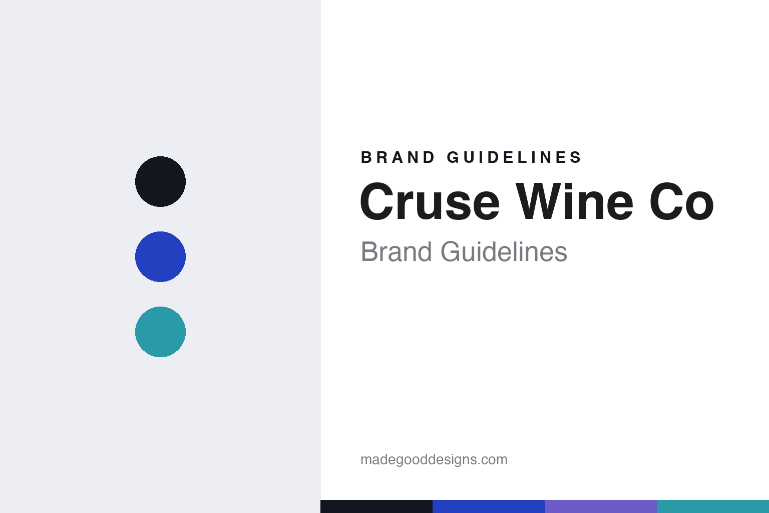
Cruse Wine Co Brand Guidelines
The iridescent blue.
Aa
Two constants: an ultramarine palette and a geometric sans register. Abstract homage — not the Cruse or Ultramarine labels.
The iridescent blue
Cruse’s Ultramarine label broke sparkling-wine convention.
Cruse Wine Co is a lesson in a colour becoming a brand. Michael Cruse — a UC Berkeley molecular biologist turned winemaker, and San Francisco Chronicle’s Winemaker of the Year for 2016 — works in Petaluma, California as a leading traditional-method sparkling specialist. He runs two labels: Ultramarine, the prestige, cult single-vineyard sparkling that started first (a 2008 backyard project, first released 2014); and Cruse Wine Co (2013), the broader label built around the Valdiguié-led red “Monkey Jacket” and other overlooked varieties.
Its most design-notable identity is Ultramarine. The label — designed by the studio CF Napa Brand Design — renders the vivid ultramarine blue that named the brand across a modern, pearlized iridescent “fish-scale” texture, on a distinct bottle. It deliberately breaks from Champagne convention: no gold foil, no crest, no château script, just a shimmering blue field. It won a Lürzer’s International Archive award in 2015.
(Honest notes: Ultramarine and Cruse Wine Co are two separate labels with one winemaker — Ultramarine came first. The Ultramarine design is by CF Napa, not by Cruse himself, and the Cruse Wine Co label’s designer isn’t documented. And there’s no official brand hex, so the tones here are an unofficial interpretation.)
Colour
Cruse lives in an ultramarine palette. Click a swatch to copy the hex.
Cruse’s identity is vivid, modern and iridescent — an ink, an ultramarine, an iris, a sea, and a silver. The palette leans on a vivid ultramarine blue with iridescent iris and sea tones — the register of the pearlized fish-scale field that defines the Ultramarine label. It signals modern collectibility rather than heritage. The honest caveat: with no published brand hex, these tones are an original, unofficial interpretation, not first-party values.
The lesson is a vivid ultramarine signals a modern, collectible identity. Cruse’s world is a shimmering blue sparkling bottle unlike any Champagne shelf. For designers, it is a reminder that a single vivid blue, given an iridescent texture, reads as contemporary and distinctive — right for a label that rejects gold-foil tradition. The takeaways: commit to one signature colour; give it a texture (here, the pearlized scale); and treat any single hex as unofficial — using ink for small text so the blue stays the hero.
Typography
The register is a geometric sans — modern, precise, collectible.
Cruse’s identity carries a modern, precise, collectible spirit — a studio-designed, contemporary package. A geometric sans captures the mood: it is clean and current, the register of a design-forward label. Set in an ultramarine palette, the geometric sans feels modern and precise — exactly the personality Ultramarine carries. It is contemporary rather than traditional, mirroring a label that breaks with Champagne convention. (Cruse’s real labels are works we describe but do not reproduce, and the exact typefaces are not ours to use.) Because they are not ours to use, the honest description is “a geometric sans spirit,” shown here in a stand-in. The type behaves like the brand: modern, precise and collectible.
Aa
A geometric sans spirit — modern and precise. (Specimen set in Jost, a geometric sans STAND-IN; NOT the Cruse or Ultramarine labels.)
A colour as identity
Cruse stands for a single colour, made unmistakable.
Cruse is a lesson in making one colour the identity. An ultramarine palette, a geometric sans and a pearlized iridescent texture make a single blue the whole brand — modern, collectible, unmistakable. The colour is the differentiator. The differentiator is a vivid, iridescent, convention-breaking identity.
For designers and brand-builders, Cruse offers a clear takeaway: own a colour. The lessons: name the brand for its colour and then earn it (ultramarine, given a fish-scale texture); break a category’s clichés on purpose (no gold foil or crest); and let a studio push the craft (CF Napa’s award-winning package). It is also a reminder to stay accurate: Ultramarine and Cruse Wine Co are separate labels, the design credit is CF Napa (not Cruse himself), and the palette here is an unofficial interpretation. Cruse made a colour the brand — proof that one hue can be the difference.
Explore & save
Keep Cruse Wine Co’s identity on hand — save it to a board in the Made Good inspiration library.
Cruse Wine Co identity set
Pin the ultramarine palette and the geometric-sans register to your own board.


