Alé Brand Guidelines
The colour in cycling.
Aa
Two constants: a vivid, colour-forward palette and a loud display register. Abstract homage — not the Alé wordmark or logo.
The colour in cycling
Alé makes colour the whole point of race kit.
Alé is a lesson in colour as the core idea. Made by the Italian manufacturer A.P.G. S.r.l. in Bonferraro di Sorgà, in the Verona province of Veneto, Alé traces its apparel heritage back around four decades, with the Alé label itself rising in the early 2010s. Its own line says it best: “Siamo il colore nel ciclismo” — “We are the colour in cycling.”
Its brand identity is vivid, Italian and race-forward — bold, saturated colourways across a race range (R-EV1), a premium line (PR.E) and weather kit (Klimatik). The name is the race-side cheer, “allez!,” shouted at riders; the tagline is “Elevate your speed.”
(Honest notes: Alé is an independent, privately held Italian company — notably, it reports that 90% of its workforce is women. Its current sponsorships include Bahrain Victorious and British Cycling; the older Alé-Cipollini and Alé-BTC-Ljubljana teams are in the past. And there’s no official brand hex, so the colours here are an unofficial interpretation.)
Colour
Alé lives in a vivid, colour-forward palette. Click a swatch to copy the hex.
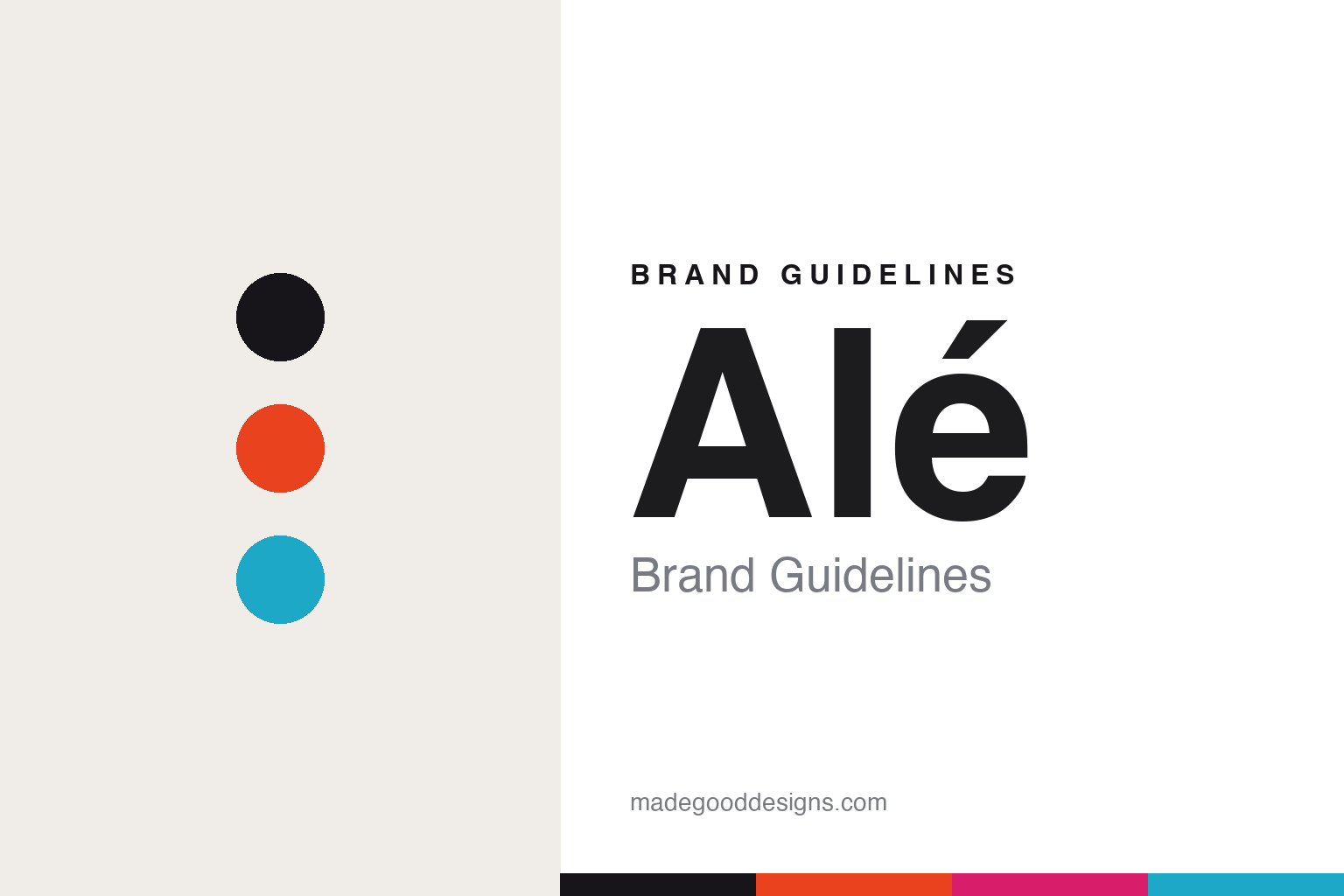
Alé’s identity is, by design, vivid and colour-forward — an ink, an orange, a magenta, a cyan, and a bone. Colour is the brand, so it works in bold, saturated race colourways — the whole point is the colour itself. It signals energy, speed and Italian confidence rather than restraint. The honest caveat: with no published brand hex, these tones are an original, unofficial interpretation, not first-party values.
The lesson is vivid colour can be the whole race identity. Alé’s world is a saturated jersey in the bunch. For designers, it is a reminder that a brand can make colour itself the concept — loud, confident, unmistakable in the peloton. The takeaways: let colour lead; keep the type loud to match; and treat any single hex as unofficial — using ink for small text so the colours stay vivid.
Typography
The register is a loud display — bold and confident.
Alé’s identity carries a loud, confident, colour-forward spirit — the race-side cheer and saturated kit. A loud display face captures the mood: it is bold and assertive, the register of a shout and a bright jersey. Set against vivid colour, the loud display feels bold and confident — exactly the personality Alé carries. It is assertive rather than quiet, mirroring a saturated colourway. (Alé’s real accented “Alé” wordmark — which carries no exclamation mark, despite the name’s meaning — is a trademark we describe but do not reproduce, and the exact brand typeface is not ours to use.) Because the mark is not ours to use, the honest description is “a loud display spirit,” shown here in a stand-in. The type behaves like the brand: loud, confident and colour-forward.
Aa
A loud display spirit — bold and confident. (Specimen set in Anton, a loud display STAND-IN; NOT the Alé wordmark, which is a trademark.)
Colour as identity
Alé stands for colour itself.
Alé is a lesson in making colour the identity. A vivid palette, a race-forward range and a “we are the colour” proposition make colour the whole brand — bold, energetic, Italian. The colour is the differentiator. The differentiator is a vivid, colour-forward, race identity.
For designers and brand-builders, Alé offers a clear takeaway: one idea (colour) can be a brand. The lessons: commit fully to the concept; keep the type as loud as the colour; and ground it in real making. It is also a reminder to stay accurate: it’s made by A.P.G. in the Verona province, the logo carries no exclamation mark, and the palette here is an unofficial interpretation. Alé made colour the brand — proof that one idea can be the difference.
Explore & save
Keep Alé’s identity on hand — save it to a board in the Made Good inspiration library.
Alé identity set
Pin the colour-forward palette and the loud-display register to your own board.