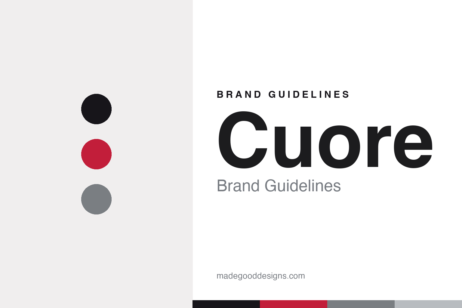
Cuore Brand Guidelines
Built for you.
Aa
Two constants: a heart-red palette and a clean Swiss sans register. Abstract homage — not the Cuore wordmark or logo.
Built for you
Cuore builds premium custom kit from Switzerland.
Cuore is a lesson in custom as the core business. Founded in 1989 and based in Zuzwil, in eastern Switzerland’s canton of St. Gallen, CUORE of Switzerland is a premium custom-teamwear specialist for cycling, triathlon and running — its name is Italian for “heart,” though the brand is firmly Swiss.
Its brand identity is premium, Swiss and custom-first — team, club and event kit built to order, alongside an own-brand collection and a made-to-order “CUORE AMORE” line. Its slogans, “100% Performance, 0% Compromise” and “Built for you,” put the customer’s fit at the centre.
(Honest notes: Cuore is independent and owner-managed — since 2012 by former pro cyclists Jürgen Sprich and Jürgen Eckmann (who are not the 1989 founders, and it isn’t “family-owned”). It runs its own factory in Asia (established 2006), so production is Asian while the brand is Swiss. And there’s no official brand hex, so the tones here are an unofficial interpretation.)
Colour
Cuore lives in a heart-red palette. Click a swatch to copy the hex.
Cuore’s identity is premium, Swiss and heart-led — an ink, a heart red, a steel, an alpine grey, and a snow. The palette pairs a heart red with clean neutrals — a nod to the name (“cuore” = heart) and to Swiss precision. It signals performance, craft and customization rather than loud fashion. The honest caveat: with no published brand hex, these tones are an original, unofficial interpretation, not first-party values.
The lesson is a heart red plus clean neutrals signals premium Swiss custom. Cuore’s world is a made-to-order team kit. For designers, it is a reminder that a single red against clean neutrals reads as premium and precise — right for a brand named for the heart. The takeaways: anchor with clean neutrals; add a single heart red; and treat any single hex as unofficial — using ink for small text so the red stays a signal.
Typography
The register is a clean Swiss sans — precise and premium.
Cuore’s identity carries a precise, premium, Swiss spirit — customization and clean design. A clean Swiss sans captures the mood: it is precise and premium, the register of Swiss design and a made-to-order kit. Set in a heart-red palette, the clean Swiss sans feels precise and premium — exactly the personality Cuore carries. It is refined rather than loud, mirroring premium custom kit. (Cuore’s real all-caps wordmark is a trademark we describe but do not reproduce, and the exact brand typeface is not ours to use.) Because the mark is not ours to use, the honest description is “a clean Swiss sans spirit,” shown here in a stand-in. The type behaves like the brand: precise, premium and Swiss.
Aa
A clean Swiss sans spirit — precise and premium. (Specimen set in Manrope, a clean Swiss sans STAND-IN; NOT the Cuore wordmark, which is a trademark.)
Customization as identity
Cuore stands for premium Swiss custom kit.
Cuore is a lesson in making customization the identity. A heart-red palette, a Swiss home and a made-to-order model make premium custom kit the whole brand — precise, premium, personal. The customization is the differentiator. The differentiator is a premium, Swiss, custom identity.
For designers and brand-builders, Cuore offers a clear takeaway: a service model can be a brand. The lessons: own a real capability (custom teamwear, own factory); ground it in a place (Swiss precision); and put the customer’s fit first (“Built for you”). It is also a reminder to stay accurate: it’s owner-managed since 2012 (not family-owned), Swiss but made in its own Asian factory, and the palette here is an unofficial interpretation. Cuore made customization the brand — proof that a service can be the difference.
Explore & save
Keep Cuore’s identity on hand — save it to a board in the Made Good inspiration library.
Cuore identity set
Pin the heart-red palette and the clean-Swiss-sans register to your own board.


