PowerChina Brand Guidelines
A hydropower builder’s lineage, regrouped in 2011 under one parent brand.
Aa
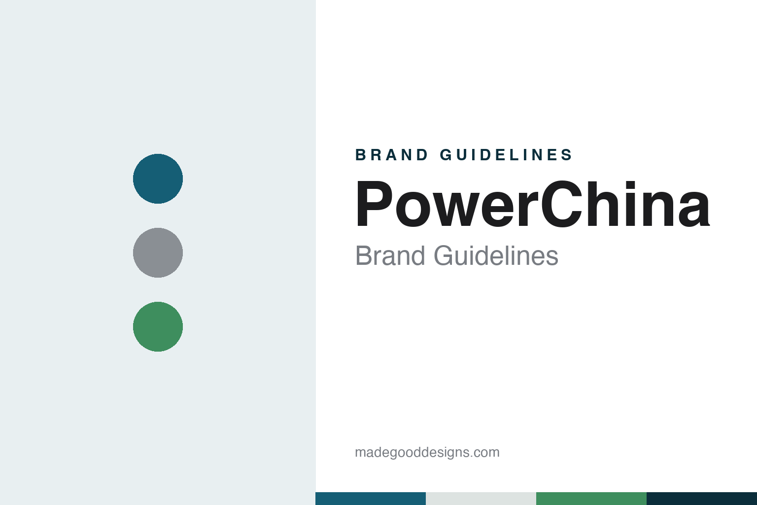
Two constants: a reservoir blue, concrete and green palette and a utility sans register. Abstract homage — not a PowerChina product or mark; no emblem, logo or project image is reproduced.
Built from Sinohydro
A 2011 regrouping of hydropower builders.
Power Construction Corporation of China, which writes its short name in English as POWERCHINA, is a construction group headquartered in Beijing. English Wikipedia describes it as a wholly state-owned enterprise under SASAC, the State Council’s asset-supervision commission. The company calls itself an integrated group providing investment and financing, planning and design, construction, equipment manufacturing and operation for clean energy, water resources, environmental works and infrastructure, with hydropower and electric power at the centre.
The group itself is young. It was formed on 29 September 2011, the company and Chinese Wikipedia say, through a State Council-approved restructuring that combined Sinohydro Construction Group Corporation, China Hydropower Engineering Consulting Group Corporation and survey, design, construction and equipment enterprises from 14 provincial and regional grid businesses, previously part of State Grid Corporation of China and China Southern Power Grid. English Wikipedia says the new parent consolidated 105 subsidiaries, Sinohydro among them.
The roots are older. English Wikipedia dates Sinohydro to 1950. The company’s own history says that from the early years of the People’s Republic until October 1986 its predecessor changed names several times, starting as the Hydropower Engineering Bureau and passing through general administrations for hydropower and for water conservancy and hydropower construction, and that it reported in turn to the ministries of the fuel industry, of electric power and of water conservancy and electric power. A water conservancy and hydropower engineering corporation followed in October 1988 and was reorganised as the China Water Conservancy and Hydropower Construction Corporation on 29 December 2002. A parallel line of planning and design work, the China Renewable Energy Engineering Institute set up in August 1994, became the China Hydropower Engineering Consulting Group Corporation on the same day in 2002.
Colour
Dams, power plants and an overseas name.
Sinohydro was the international face of the business long before the merger. English Wikipedia says it received foreign-trade rights on 10 April 1993, and that in 2000 it adopted a “four unities” approach for overseas work: unified management, resource allocation, branding and external cooperation. By the end of 2010 it had 69 overseas offices in 53 countries, according to the same article, and its European regional headquarters is in Belgrade. On 10 March 2016 Sinohydro’s international business was merged with that of HydroChina to form POWERCHINA International.
The listed arm has its own history. Sinohydro Group Limited was set up in 2009 by the two hydropower group corporations and listed on the Shanghai Stock Exchange on 18 October 2011, Chinese Wikipedia says, which describes it as the main body of the group. Its annual reports are now issued under the name Power Construction Corporation of China, Ltd. English Wikipedia counts nearly 800 subsidiaries across the group, including Sinohydro, HydroChina, HDEC and SEPCO.
Projects span dams, power plants and transport. English Wikipedia lists domestic work on the Three Gorges Project, the Beijing–Shanghai high-speed railway and Shenzhen Metro Line 12, and overseas work including the Merowe Dam in Sudan, the Karuma hydroelectric station in Uganda, the Nam Ou cascade in Laos and the Coca Codo Sinclair dam in Ecuador. The company says it now works in more than 130 countries and regions. Its business pages run from solar, wind, hydro and pumped storage to transmission lines, railways, ports and water treatment, and on to housing and municipal engineering.
Typography
Design and documentation.
Asia’s large construction and engineering groups tend to present themselves through scale rather than ornament. A short wordmark or a set of initials, often in a bold sans and a single strong colour such as red, blue or green, sits above aerial photographs of towers, bridges, dams, plants and rail lines. Larsen & Toubro, for example, greets visitors to its website under its initials, “L&T,” and describes its aim as being “a builder of nations.”
Their websites are usually organised by business rather than by product. Building, civil works, plant and housing appear as separate divisions, and Korean Wikipedia describes Hyundai E&C’s business in exactly those terms: civil engineering, building, housing and plant. L&T adds manufacturing, defence and technology arms alongside construction, according to English Wikipedia.
Housing often carries a second identity. In South Korea the large builders sell apartments under their own consumer brands: Hyundai E&C uses Hillstate and THE H, according to Korean Wikipedia, alongside the company name. Overseas work is presented project by project, with named highways, ports, stadiums and metro lines standing in for a portfolio; a metro extension in Noida, reported by IBEF in November 2026, is a recent example for L&T.
Corporate reporting is part of the identity too. Annual reports, annual reviews and sustainability reports sit alongside the project pages; L&T, for instance, offers an Annual Review for 2026 on its corporate pages. This guide sets out what can be checked about each group — who founded it, who owns it today, and what it builds — and marks clearly what rests on the company’s own word.
Aa
A utility sans — a plain, capitalised register. (Specimen set in Barlow, a sans STAND-IN; NOT the PowerChina logo.)
PowerChina
One parent brand, many sub-brands.
Rankings feature heavily in how the group presents itself. In 2026, the company says, it ranked 104th in the Fortune Global 500 and first in Engineering News-Record’s Top 150 Global Design Firms; for 2024 it reported seventh place among ENR’s Top 250 Global Contractors. It describes itself as one of the largest power construction enterprises in the world. Its brand page, updated in May 2025, sets out a multi-brand structure for international business: a strong parent brand, rational use of sub-brands, and as little competition as possible between the group’s own names. The corporate line is “PowerChina, Empower the World.”
Sub-brands still appear under their own names in the news. In a 2026 case in Malaysia, Sinohydro Corporation and its Malaysian unit reached a settlement with the utility Tenaga Nasional over earlier arbitration proceedings about the Connaught Bridge power plant project in Klang, Selangor. The settlement was formalised by a consent judgment recorded at the Court of Appeal in Putrajaya on 23 April 2026, without admission of liability by any party, The Star reported on 26 October 2026, describing Sinohydro as a PowerChina subsidiary.
The company’s English pages often set the name in capitals, and its culture page frames the brand in a handful of short lines. The group’s mission statement lists developing clean energy, building a green environment and serving smart cities, and its stated vision is a world-class enterprise with a globally recognised brand.
For a design guide, PowerChina shows how a merged state group can set one parent name above older trading names such as Sinohydro, and carry that name into a short English slogan. Compare China Railway Group and China State Construction. For this guide we use reservoir blue, dam-concrete grey and turbine green with a sans, an unofficial interpretation; no product or logo is reproduced.
Explore & save
Keep PowerChina’s identity on hand — save it to a board in the Made Good inspiration library.
PowerChina identity set
Pin the reservoir blue, concrete and green palette and the utility sans register to your own board.