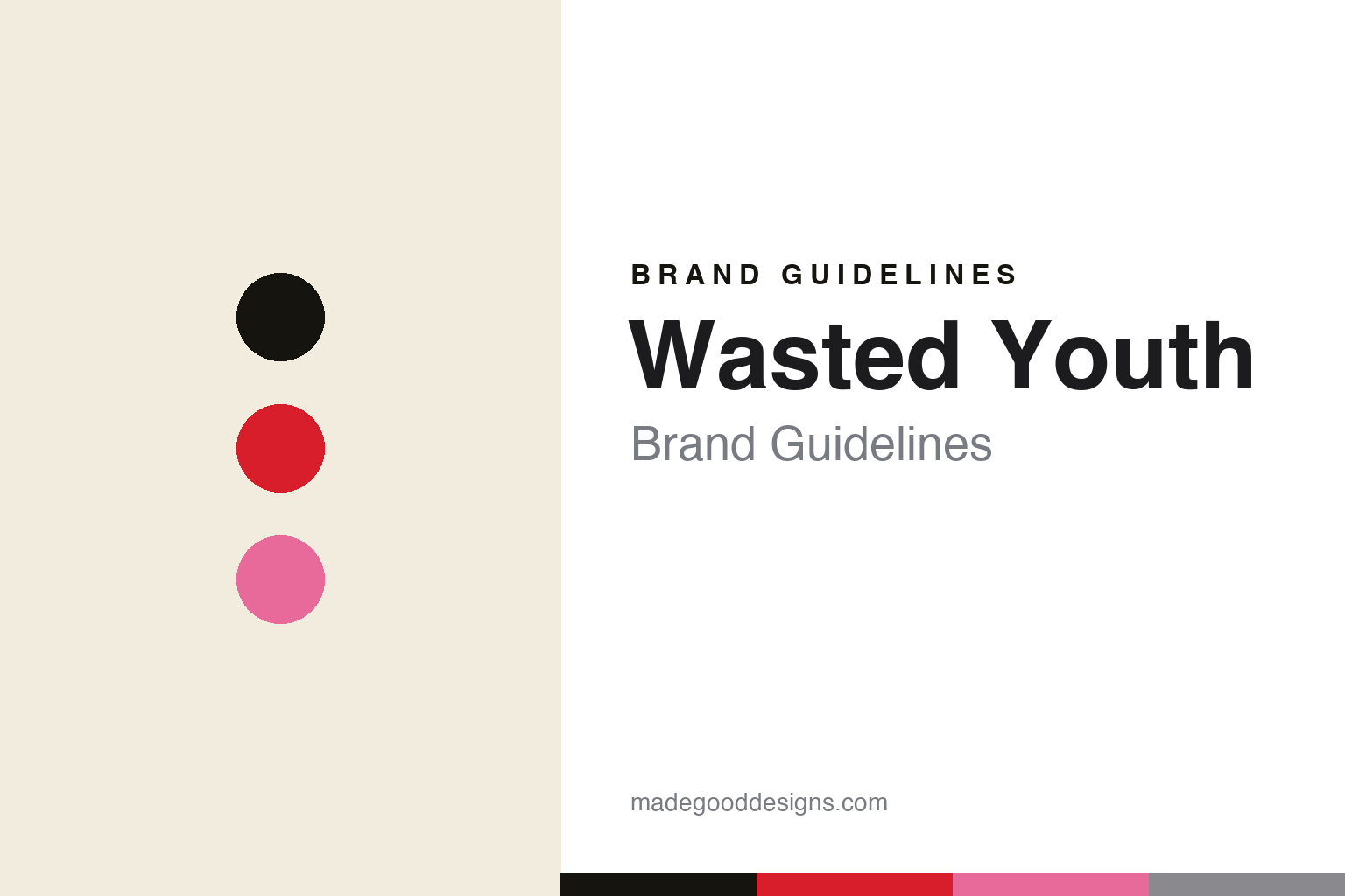
Wasted Youth Brand Guidelines
Punk pop graphics.
Aa
Two constants: a punk-pop palette and a heavy slab register. Abstract homage — not the Wasted Youth wordmark or its rose logo.
Punk pop graphics
Wasted Youth is one artist’s punk-skate world.
Wasted Youth is a lesson in a graphic artist building a brand. Founded in 2016 by the Japanese artist Verdy in Tokyo, it is his punk- and skate-rooted graphic label — bold, hand-drawn and pop, with a rose logo and a heavy, Budweiser-style script wordmark.
Its brand identity is punk, pop and graphic-driven — roses, hand-drawn type and playful iconography, alongside Verdy’s rabbit-panda mascot Vick (used across all his projects). It runs on a drop and pop-up model, and is retailed through NIGO’s Human Made as a platform.
(Honest notes: Verdy works mononymously — his real name isn’t public, so we don’t print one. Wasted Youth (2016) is a separate project from his more fashion-leaning Girls Don’t Cry (2017): the rose belongs to Wasted Youth, the red heart to Girls Don’t Cry — don’t merge them. It’s an independent Verdy project, active in 2026, with a famous Nike SB Dunk in 2021. There’s no official brand hex, so the colours here are an unofficial interpretation.)
Colour
Wasted Youth lives in a punk-pop palette. Click a swatch to copy the hex.
Wasted Youth’s identity is punk, pop and bold — an ink, a rose red, a pink, a steel, and a bone. The palette pairs a rose red with an ink base and a pop pink — the register of punk flyers, skate graphics and hand-drawn pop art. It signals youth, energy and playful rebellion rather than restraint. The honest caveat: with no published brand hex, these tones are an original, unofficial interpretation, not first-party values.
The lesson is a punk-pop palette signals hand-drawn energy. Wasted Youth’s world is a punk flyer crossed with pop art. For designers, it is a reminder that a rose red and a pop pink on ink read as youthful and graphic, right for a brand built on one artist’s hand-drawn iconography. The takeaways: use a bold red and a pop accent; keep it hand-drawn; and treat any single hex as unofficial — using ink for small text so the red stays bold.
Typography
The register is a heavy slab — bold and hand-drawn.
Wasted Youth’s identity carries a punk, pop, hand-drawn spirit — roses, skate graphics and playful type. A heavy slab captures the mood: it is bold and poster-like, the register of a punk flyer and a vintage label. Set in a punk-pop palette, the heavy slab feels bold and hand-drawn — exactly the personality Wasted Youth carries. It is bold rather than delicate, mirroring a hand-drawn wordmark. (Wasted Youth’s real wordmark and its rose logo are trademarks we describe but do not reproduce, and the exact brand lettering is not ours to use.) Because the marks are not ours to use, the honest description is “a heavy slab spirit,” shown here in a stand-in. The type behaves like the brand: punk, pop and hand-drawn.
Aa
A heavy slab spirit — bold and hand-drawn. (Specimen set in Alfa Slab One, a heavy slab STAND-IN; NOT the Wasted Youth wordmark or rose logo, which are trademarks.)
The hand as identity
Wasted Youth stands for the artist’s hand.
Wasted Youth is a lesson in making one artist’s hand the identity. A punk-pop palette, a rose logo and hand-drawn iconography make Verdy’s graphic voice the whole brand — bold, playful, unmistakable. The hand is the differentiator. The differentiator is a punk, pop, artist-drawn identity.
For designers and brand-builders, Wasted Youth offers a clear takeaway: a graphic artist’s voice can be a brand. The lessons: let a real hand lead (drawings, iconography); build recurring characters and marks (the rose, Vick); and use energy and scarcity (drops, pop-ups). It is also a reminder to stay accurate: Verdy works mononymously (no real name printed), Wasted Youth and Girls Don’t Cry are separate projects (rose vs heart), and the palette here is an unofficial interpretation. Wasted Youth made the hand the brand — proof that an artist’s voice can be the difference.
Explore & save
Keep Wasted Youth’s identity on hand — save it to a board in the Made Good inspiration library.
Wasted Youth identity set
Pin the punk-pop palette and the heavy-slab register to your own board.


