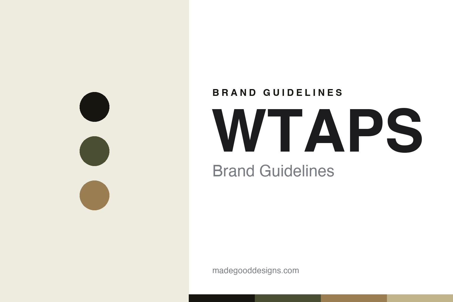
WTAPS Brand Guidelines
Visual uparmored.
Aa
Two constants: a military-utility palette and a stencil register. Abstract homage — not the WTAPS wordmark or logo.
Visual uparmored
WTAPS translates the military into menswear.
WTAPS is a lesson in military codes as menswear. Founded in the mid-1990s (widely cited as 1996) by Tetsu Nishiyama — “Tet” — in Tokyo, the cornerstone Ura-Harajuku label translates field uniforms and outdoor gear into disciplined, utilitarian clothing under the tagline “WTAPS VISUALUPARMORED.”
Its brand identity is military, utilitarian and disciplined — field-and-outdoor silhouettes, tactical detailing, and trad/Ivy references, in a palette of olive, black and coyote. Before WTAPS, Nishiyama ran the earlier project FPAR (Forty Percent Against Rights, 1993).
(Honest notes: the name is pronounced “double taps” — a military term for two rapid shots — not a words-based acronym; we don’t spell it out. Sources split on 1996 vs 1997, so we hedge the year. Olive and black are associated tones, not an official palette, so the colours here are an unofficial interpretation.)
Colour
WTAPS lives in a military-utility palette. Click a swatch to copy the hex.
WTAPS’ identity is military, utilitarian and disciplined — an olive, a coyote, a black, a khaki, and a bone. The palette leans on military olive and coyote with black — the register of field uniforms, surplus and outdoor gear. It signals utility, discipline and function rather than fashion gloss. The honest caveat: with no published brand hex, these tones are an original, unofficial interpretation, not first-party values.
The lesson is a military-utility palette signals function and discipline. WTAPS’ world is a field uniform. For designers, it is a reminder that olive, coyote and black read as tactical and functional — right for a brand built on translating the military into menswear. The takeaways: anchor with olive and black; add coyote and khaki; and treat any single hex as unofficial — using black for small text so the olive stays functional.
Typography
The register is a stencil — military and functional.
WTAPS’ identity carries a military, utilitarian, disciplined spirit — field gear and tactical detailing. A military stencil captures the mood: it is functional and stamped, the register of a crate, a uniform and a supply label. Set in a military-utility palette, the stencil feels military and functional — exactly the personality WTAPS carries. It is stamped rather than decorative, mirroring militaria. (WTAPS’ real wordmark and insignia are trademarks we describe but do not reproduce, and the exact brand typeface is not ours to use.) Because the marks are not ours to use, the honest description is “a stencil spirit,” shown here in a stand-in. The type behaves like the brand: military, utilitarian and disciplined.
Aa
A stencil spirit — military and functional. (Specimen set in Black Ops One, a military stencil STAND-IN; NOT the WTAPS wordmark or insignia, which are trademarks.)
Utility as identity
WTAPS stands for disciplined utility.
WTAPS is a lesson in making utility the identity. A military-utility palette, field-and-outdoor silhouettes and disciplined, tactical detailing make function the whole brand — considered, coded, uncompromising. The utility is the differentiator. The differentiator is a military, utilitarian, disciplined identity.
For designers and brand-builders, WTAPS offers a clear takeaway: a coherent code can be a brand. The lessons: commit to a language (military, field, outdoor); design with discipline and function; and let a tagline carry the idea (“visual uparmored”). It is also a reminder to stay accurate: the name is pronounced “double taps” (not an acronym), the year is mid-1990s, and the palette here is an unofficial interpretation. WTAPS made utility the brand — proof that discipline can be the difference.
Explore & save
Keep WTAPS’s identity on hand — save it to a board in the Made Good inspiration library.
WTAPS identity set
Pin the military-utility palette and the stencil register to your own board.


