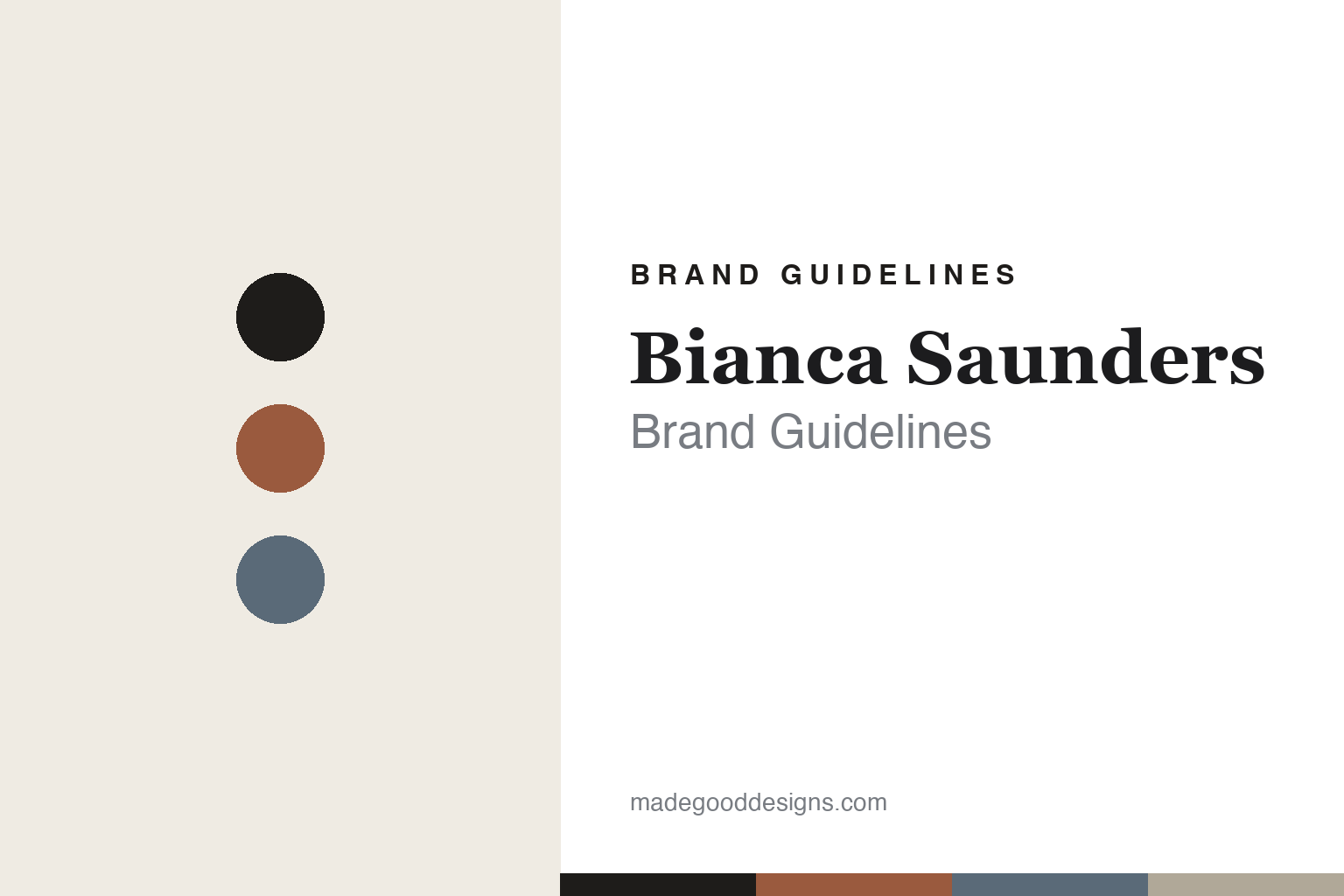
Bianca Saunders Brand Guidelines
Drape & diaspora.
Aa
Two constants: a refined, considered palette and an elegant serif register. Abstract homage — not the Bianca Saunders wordmark or logo.
Drape & diaspora
Bianca Saunders reimagines menswear through drape.
Bianca Saunders is a lesson in refinement and diaspora as design. Founded in 2017 by Bianca Saunders — a Royal College of Art menswear graduate of Jamaican, British-Caribbean heritage — in London, the independent label reimagines menswear through drape, twist and fluidity.
Its brand identity is refined, considered and fashion-forward — twisted seams, rounded shoulders and fabric manipulation that borrow from womenswear, exploring Black masculinity, fit and movement, and Caribbean diaspora culture (Jamaican patois, symbols and family photographs). It is quiet, design-led menswear — closer to fashion and tailoring than hype streetwear.
(Honest notes: her heritage is Jamaican / British-Caribbean. She won the ANDAM Grand Prize in 2021 and was an LVMH Prize finalist the same year (a finalist, not a winner). Confirmed collaborations include Wrangler and Farah. There’s no official brand hex, so the tones here are an unofficial interpretation.)
Colour
Bianca Saunders lives in a refined, considered palette. Click a swatch to copy the hex.
Bianca Saunders’ identity is refined, warm and considered — an ink, a clay, a slate, a warm grey, and a bone. The palette pairs a warm clay and a slate against ink — the register of fine tailoring, considered colour and quiet confidence. It signals refinement, thought and diaspora warmth rather than hype. The honest caveat: with no published brand hex, these tones are an original, unofficial interpretation, not first-party values.
The lesson is a refined, considered palette signals elevated menswear. Bianca Saunders’ world is a draped, tailored garment. For designers, it is a reminder that a warm clay and a slate on ink read as refined and thoughtful — right for a brand that treats menswear as fine, diaspora-rooted design. The takeaways: use a refined, warm-and-cool palette; keep it considered; and treat any single hex as unofficial — using ink for small text so the palette stays quiet.
Typography
The register is an elegant serif — refined and considered.
Bianca Saunders’ identity carries a refined, considered, fashion-forward spirit — drape, tailoring and diaspora. An elegant serif captures the mood: it is graceful and quiet, the register of a fashion label and a considered book. Set in a refined palette, the serif feels refined and considered — exactly the personality Bianca Saunders carries. It is graceful rather than loud, mirroring a draped garment. (Bianca Saunders’ real wordmark is a trademark we describe but do not reproduce, and the exact brand typeface is not ours to use.) Because the mark is not ours to use, the honest description is “an elegant serif spirit,” shown here in a stand-in. The type behaves like the brand: refined, considered and fashion-forward.
Aa
An elegant serif spirit — refined and considered. (Specimen set in Cormorant Garamond, an elegant serif STAND-IN; NOT the Bianca Saunders wordmark, which is a trademark.)
Refinement as identity
Bianca Saunders stands for considered menswear.
Bianca Saunders is a lesson in making refinement the identity. A considered palette, drape and fabric manipulation, and a genuine exploration of Black masculinity and diaspora make thoughtful menswear the whole brand — quiet, elevated, meaningful. The refinement is the differentiator. The differentiator is a refined, considered, diaspora-rooted identity.
For designers and brand-builders, Bianca Saunders offers a clear takeaway: quiet refinement can be a brand. The lessons: let craft and cut lead (drape, twist, fit); root the work in real culture (Caribbean diaspora, masculinity); and stay considered rather than loud. It is also a reminder to stay accurate: her heritage is Jamaican, the ANDAM Prize was a 2021 win, the LVMH Prize was a finalist place, and the palette here is an unofficial interpretation. Bianca Saunders made refinement the brand — proof that quiet can be the difference.
Explore & save
Keep Bianca Saunders’s identity on hand — save it to a board in the Made Good inspiration library.
Bianca Saunders identity set
Pin the refined palette and the elegant-serif register to your own board.


