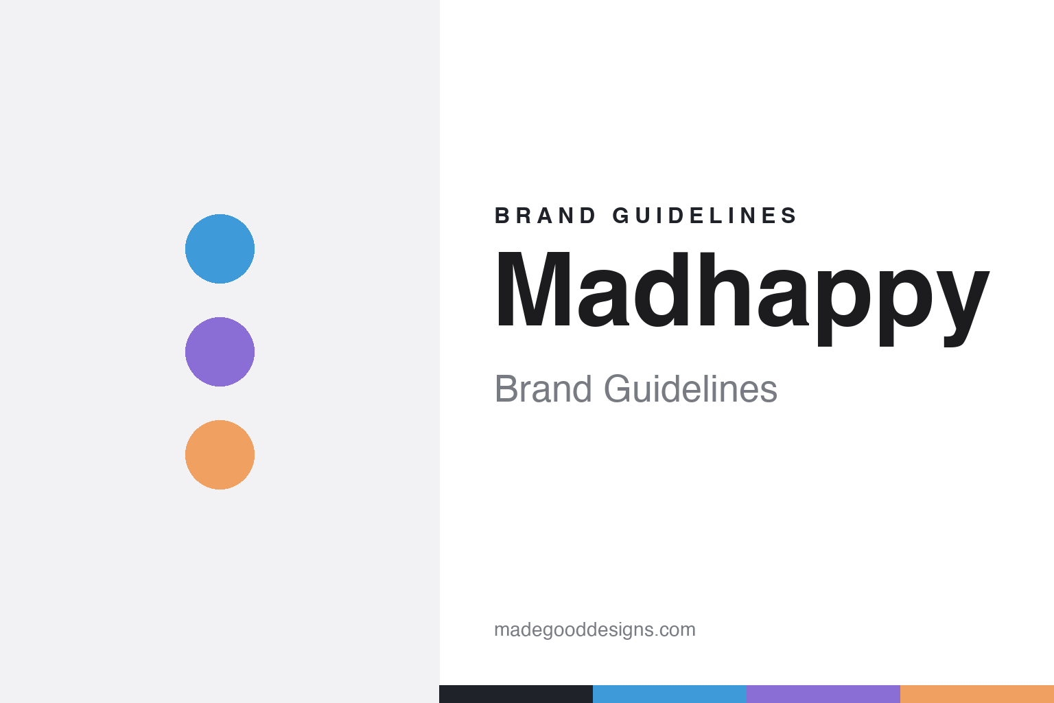
Madhappy Brand Guidelines
Optimism, elevated.
Aa
Two constants: an optimistic palette and a rounded optimist register. Abstract homage — not the Madhappy wordmark or logo.
Optimism, elevated
Madhappy makes optimism the whole brand.
Madhappy is a lesson in optimism as a brand. Founded in 2017 by Peiman Raf, Noah Raf, Mason Spector and Joshua Sitt in Los Angeles, the independent label makes “clothing for a community of optimists” — elevated basics and premium athleisure in bright, hopeful colour.
Its brand identity is optimistic, colourful and premium, and its mental-health mission is central rather than a footnote: the Madhappy Foundation (a 501(c)(3) that gives around 1% of proceeds to mental-health work) and the “Local Optimist” community and magazine anchor the brand as much as the hoodies do.
(Honest notes: credit all four co-founders. In 2019, LVMH Luxury Ventures made a minority, seed-stage investment — that is an investment, not an acquisition, and the company remains founder-led and independent. There’s no official brand hex, so the colours here are an unofficial interpretation.)
Colour
Madhappy lives in an optimistic palette. Click a swatch to copy the hex.
Madhappy’s identity is optimistic, bright and warm — a sky blue, a lilac, a peach, an ink, and a cloud. The palette leans on a hopeful sky blue with lilac and peach — the register of a bright morning and a warm mood. It signals optimism, openness and care rather than cool detachment. The honest caveat: with no published brand hex, these tones are an original, unofficial interpretation, not first-party values.
The lesson is a bright, warm palette signals optimism. Madhappy’s world is a hopeful morning. For designers, it is a reminder that a sky blue, a lilac and a peach read as optimistic and open — right for a brand built on positivity and mental-health awareness. The takeaways: use bright, warm colour; keep it hopeful; and treat any single hex as unofficial — using ink for small text so the palette stays light.
Typography
The register is a rounded optimist — friendly and open.
Madhappy’s identity carries an optimistic, friendly, open spirit — positivity and community. A rounded, geometric sans captures the mood: it is friendly and clean, the register of a hopeful poster and an approachable label. Set in an optimistic palette, the rounded sans feels friendly and open — exactly the personality Madhappy carries. It is warm rather than cold, mirroring an optimistic message. (Madhappy’s real wordmark is a trademark we describe but do not reproduce, and the exact brand typeface is not ours to use.) Because the mark is not ours to use, the honest description is “a rounded optimist spirit,” shown here in a stand-in. The type behaves like the brand: optimistic, friendly and open.
Aa
A rounded optimist spirit — friendly and open. (Specimen set in Quicksand, a rounded geometric STAND-IN; NOT the Madhappy wordmark, which is a trademark.)
Optimism as identity
Madhappy stands for optimism and mental health.
Madhappy is a lesson in making optimism the identity. An optimistic palette, premium basics and a genuine mental-health mission make positivity the whole brand — hopeful, colourful, purposeful. The optimism is the differentiator. The differentiator is an optimistic, premium, mission-led identity.
For designers and brand-builders, Madhappy offers a clear takeaway: a real mission can be a brand. The lessons: let a genuine purpose lead (mental health); use bright, hopeful colour; and build community (the “Local Optimist”). It is also a reminder to stay accurate: credit all four founders, note that LVMH took a minority stake (not an acquisition), and treat the palette as an unofficial interpretation. Madhappy made optimism the brand — proof that a mission can be the difference.
Explore & save
Keep Madhappy’s identity on hand — save it to a board in the Made Good inspiration library.
Madhappy identity set
Pin the optimistic palette and the rounded register to your own board.


