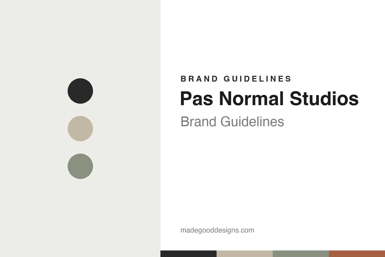
Pas Normal Studios Brand Guidelines
Scandinavian cycling.
Aa
Two constants: a muted, Scandi palette and a minimal grotesque register. Abstract homage — not the Pas Normal Studios wordmark or logo.
Scandinavian cycling
Pas Normal Studios made cycling minimalist.
Pas Normal Studios (PNS) is a lesson in minimalism as a design language. Founded in 2014 in Copenhagen, with creative director Karl-Oskar Olsen — a co-founder of the fashion label Wood Wood — the brand brought a Scandinavian, design-forward sensibility to road and gravel cycling.
Its brand identity is understated, refined and premium — “technically perfect apparel, combined with visionary aesthetics,” in muted palettes and a restrained typographic wordmark. Ranges include Mechanism, Essential, the T.K.O. off-road line and the adventure-minded Escapism.
(Honest notes: PNS is Danish (Copenhagen), not French, despite the French-language name — which reads as “not normal,” though the brand doesn’t officially explain it, so we don’t invent a meaning. We credit Karl-Oskar Olsen as creative director rather than naming an unverified co-founder. There’s no official brand hex, so the tones here are an unofficial interpretation.)
Colour
Pas Normal Studios lives in a muted, Scandi palette. Click a swatch to copy the hex.
PNS’s identity is muted, refined and Scandinavian — a charcoal, a sand, a sage, a rust, and an off-white. The palette leans on muted, earthy neutrals — charcoal, sand and sage — the register of understated Scandinavian design. It signals restraint, quality and calm rather than loud sport. The honest caveat: with no published brand hex, these tones are an original, unofficial interpretation, not first-party values.
The lesson is muted, Scandi neutrals signal understated premium. PNS’s world is a quiet, considered ride. For designers, it is a reminder that charcoal, sand and sage read as refined and premium — right for a brand built on Scandinavian minimalism. The takeaways: use muted, earthy neutrals; keep it restrained; and treat any single hex as unofficial — using charcoal for small text so the palette stays calm.
Typography
The register is a minimal grotesque — restrained and refined.
PNS’s identity carries a minimal, refined, Scandinavian spirit — quiet design and technical performance. A minimal grotesque captures the mood: it is restrained and precise, the register of a design-led, understated brand. Set in a muted palette, the minimal grotesque feels restrained and refined — exactly the personality PNS carries. It is quiet rather than loud, mirroring understated kit. (PNS’s real wordmark is a trademark we describe but do not reproduce, and the exact brand typeface is not ours to use.) Because the mark is not ours to use, the honest description is “a minimal grotesque spirit,” shown here in a stand-in. The type behaves like the brand: minimal, refined and Scandinavian.
Aa
A minimal grotesque spirit — restrained and refined. (Specimen set in Hanken Grotesk, a minimal grotesque STAND-IN; NOT the Pas Normal Studios wordmark, which is a trademark.)
Minimalism as identity
Pas Normal Studios stands for refined restraint.
Pas Normal Studios is a lesson in making minimalism the identity. A muted palette, refined design and a fashion-led sensibility make understated premium the whole brand — quiet, considered, elevated. The minimalism is the differentiator. The differentiator is a muted, refined, Scandinavian identity.
For designers and brand-builders, PNS offers a clear takeaway: restraint can be premium. The lessons: bring real design pedigree (fashion) to the category; keep the palette muted; and let quality speak quietly. It is also a reminder to stay accurate: it’s Danish (not French), we credit the creative director rather than an unverified founder, and the palette here is an unofficial interpretation. PNS made minimalism the brand — proof that restraint can be the difference.
Explore & save
Keep Pas Normal Studios’s identity on hand — save it to a board in the Made Good inspiration library.
Pas Normal Studios identity set
Pin the muted Scandi palette and the minimal-grotesque register to your own board.


