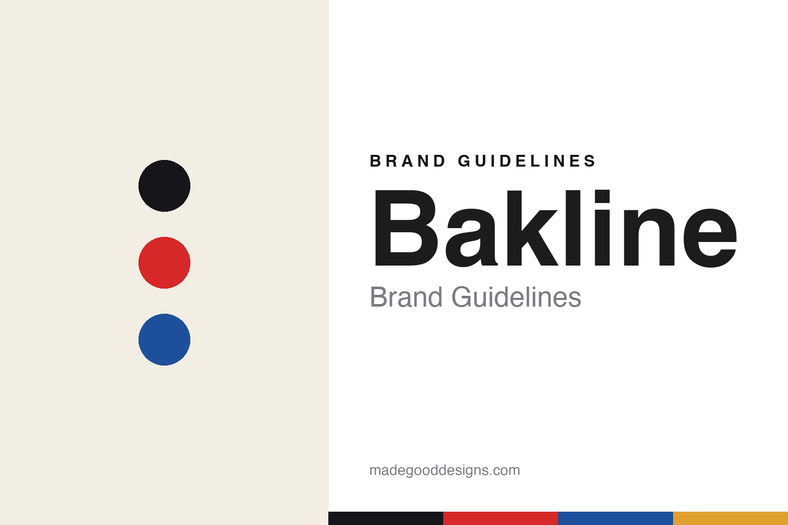
Bakline Brand Guidelines
Redefine fast.
Aa
Two constants: a bold, city palette and a bold poster register. Abstract homage — not the Bakline wordmark or logo.
Redefine fast
Bakline runs on art, sport and street culture.
Bakline is a lesson in community and culture as a brand. Founded in 2008 by Rob Schnabel and Matt Vosburgh as a rugby-apparel venture — pivoting to running in 2018 — the small, independent brand is based in Gowanus, Brooklyn, and blends “art, sport, and street culture.” Its name comes from rugby: when the backs attack, they form a line — back-line, Bakline.
Its brand identity is bold, city-proud and community-driven — marathon and city-pride capsule collections, run-club and charity programs, coaching, a podcast, and a rally cry: #RedefineFast, framing “fast” as a mindset open to all.
(Honest notes: it began as rugby apparel (2008) and became a running brand in 2018 — not a running brand from day one. Its pieces are hand-printed in the studio, though we don’t claim a specific “Made in USA” label. And there’s no official brand hex, so the colours here are an unofficial interpretation.)
Colour
Bakline lives in a bold, city palette. Click a swatch to copy the hex.
Bakline’s identity is bold, graphic and city-proud — a marathon red, an ink, a city blue, a gold, and a cream. The palette leans on a marathon red with ink and a city blue — the register of race bibs, city banners and hand-screened posters. It signals community, city pride and grassroots energy rather than corporate polish. The honest caveat: with no published brand hex, these tones are an original, unofficial interpretation, not first-party values.
The lesson is a bold, city palette signals community pride. Bakline’s world is a city marathon start line. For designers, it is a reminder that a marathon red with ink and a city blue reads as bold and community-driven — right for a brand rooted in a place and its runners. The takeaways: use bold, graphic colour; root it in a city; and treat any single hex as unofficial — using ink for small text so the red stays bold.
Typography
The register is a bold poster — loud and hand-printed.
Bakline’s identity carries a bold, community, hand-made spirit — city pride and screen-printed culture. A bold poster type captures the mood: it is loud and graphic, the register of a race poster and a hand-screened tee. Set in a bold city palette, the poster type feels loud and hand-printed — exactly the personality Bakline carries. It is bold rather than quiet, mirroring a screen-printed graphic. (Bakline’s real wordmark is a trademark we describe but do not reproduce, and the exact brand typeface is not ours to use.) Because the mark is not ours to use, the honest description is “a bold poster spirit,” shown here in a stand-in. The type behaves like the brand: bold, community and hand-made.
Aa
A bold poster spirit — loud and hand-printed. (Specimen set in Anton, a bold poster STAND-IN; NOT the Bakline wordmark, which is a trademark.)
City as identity
Bakline stands for city running community.
Bakline is a lesson in making a city and its runners the identity. A bold, city palette, marathon capsules and a deep run-club community make city pride the whole brand — graphic, grassroots, generous. The community is the differentiator. The differentiator is a bold, city-proud, community-driven identity.
For designers and brand-builders, Bakline offers a clear takeaway: a place and its people can be a brand. The lessons: root the brand in a city and its runners; build community (clubs, coaching, charity); and keep it hand-made and graphic. It is also a reminder to stay accurate: it began as rugby (2008) and became running in 2018, it’s Gowanus-Brooklyn, and the palette here is an unofficial interpretation. Bakline made a city the brand — proof that place and people can be the difference.
Explore & save
Keep Bakline’s identity on hand — save it to a board in the Made Good inspiration library.
Bakline identity set
Pin the bold city palette and the bold-poster register to your own board.


