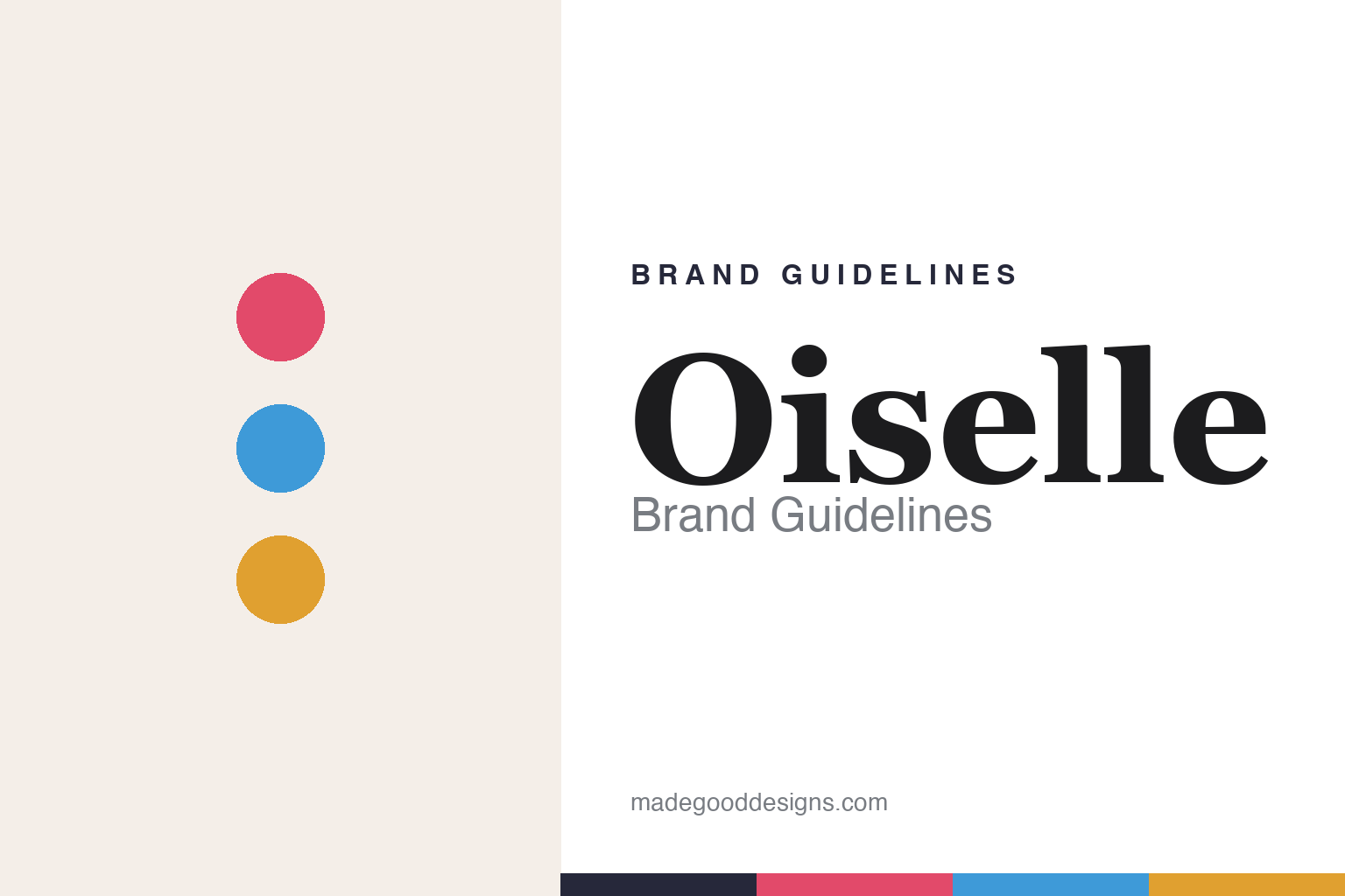
Oiselle Brand Guidelines
By women, for women.
Aa
Two constants: a bright, flight palette and a graceful serif register. Abstract homage — not the Oiselle wordmark or its bird motif.
By women, for women
Oiselle builds running for women, by women.
Oiselle is a lesson in a mission as a brand. Founded in 2007 by Sally Bergesen in Seattle, the woman-owned label makes performance running apparel “by women, for women,” with a feminist, community-driven spirit. Its name is the French feminine form of “bird” — a fitting nod to flight.
Its brand identity is empowering, community-led and flight-themed — the Volée women’s run club, the best-selling Roga short, and real advocacy: Oiselle was the first brand to sponsor a pregnant athlete (2013) and runs the Bras for Girls nonprofit.
(Honest notes: Sally Bergesen is the founder; the current CEO and owner is Margo Cramer. Oiselle merged with fellow running brand Janji in 2023, so it isn’t simply “independent.” Its identity leans on a bird/flight motif rather than a fixed logo we’d reproduce, and there’s no official brand hex, so the colours here are an unofficial interpretation.)
Colour
Oiselle lives in a bright, flight palette. Click a swatch to copy the hex.
Oiselle’s identity is bright, warm and empowering — a rose, a sky blue, a gold, a slate ink, and a cloud. The palette pairs a confident rose with a sky blue and a gold — the register of flight, dawn runs and joyful confidence. It signals empowerment, community and lightness rather than corporate seriousness. The honest caveat: with no published brand hex, these tones are an original, unofficial interpretation, not first-party values.
The lesson is a bright, flight palette signals empowerment. Oiselle’s world is a run at first light. For designers, it is a reminder that a rose, a sky blue and a gold read as confident and uplifting — right for a women-first, flight-themed brand. The takeaways: use bright, warm colour; keep a sense of lift; and treat any single hex as unofficial — using slate ink for small text so the colours stay bright.
Typography
The register is a graceful serif — confident and warm.
Oiselle’s identity carries an empowering, graceful, community spirit — flight, women and joy. A graceful serif captures the mood: it is confident and warm, the register of a considered, human brand. Set in a bright palette, the graceful serif feels confident and warm — exactly the personality Oiselle carries. It is graceful rather than corporate, mirroring a sense of flight. (Oiselle’s real wordmark and bird motif are trademarks we describe but do not reproduce, and the exact brand typeface is not ours to use.) Because the marks are not ours to use, the honest description is “a graceful serif spirit,” shown here in a stand-in. The type behaves like the brand: empowering, graceful and warm.
Aa
A graceful serif spirit — confident and warm. (Specimen set in Fraunces, a graceful serif STAND-IN; NOT the Oiselle wordmark or bird motif, which are trademarks.)
Community as identity
Oiselle stands for women’s running community.
Oiselle is a lesson in making a community the identity. A bright, flight palette, a women-first mission and real advocacy make community the whole brand — empowering, joyful, principled. The community is the differentiator. The differentiator is a women-first, community-driven, flight-themed identity.
For designers and brand-builders, Oiselle offers a clear takeaway: a genuine mission can be a brand. The lessons: build for a real community (women runners); back it with action (Bras for Girls, athlete advocacy); and let a warm identity lead. It is also a reminder to stay accurate: Sally Bergesen founded it (Margo Cramer now leads/owns it), it merged with Janji in 2023, and the palette here is an unofficial interpretation. Oiselle made community the brand — proof that a mission can be the difference.
Explore & save
Keep Oiselle’s identity on hand — save it to a board in the Made Good inspiration library.
Oiselle identity set
Pin the flight palette and the graceful-serif register to your own board.


