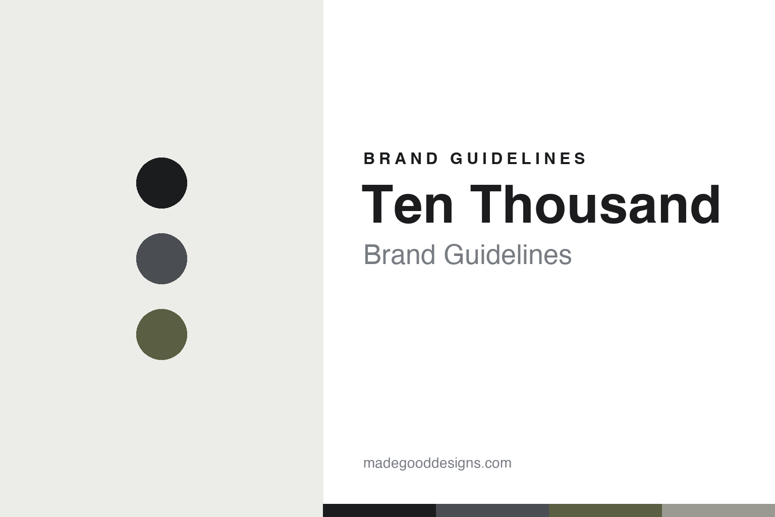
Ten Thousand Brand Guidelines
Essential training gear.
Aa
Two constants: an austere, essential palette and a clean grotesque register. Abstract homage — not the Ten Thousand wordmark or logo.
Essential training gear
Ten Thousand strips training gear to essentials.
Ten Thousand is a lesson in essentialism as a design language. Founded around 2016 by Keith Nowak and Eugenio Labadie in New York City, the direct-to-consumer brand makes minimal, no-frills men’s training apparel — “less is more,” proven rather than just designed.
Its brand identity is minimal, understated and tested — deliberately logo-light branding, muted colour, and gear developed and tested with a roster of athletes. The name nods to the 10,000-hours idea of mastery. Its flagship Interval Short won a Men’s Health “Best Training Short.”
(Honest notes: credit both founders — Keith Nowak and Eugenio Labadie — and note it’s New York-based (not LA). It’s founder-led but venture-backed, not bootstrapped. Its verified testing is with athletes (not “special forces”), and its giving-back is a “One In / One Out” gear-recycling program. There’s no official brand hex, so the tones here are an unofficial interpretation.)
Colour
Ten Thousand lives in an austere, essential palette. Click a swatch to copy the hex.
Ten Thousand’s identity is austere, muted and essential — an ink, a graphite, an olive, a stone, and an off-white. The palette leans on muted, utilitarian neutrals — ink, graphite and a muted olive — the register of essential, no-frills training gear. It signals restraint, function and quality rather than loud branding. The honest caveat: with no published brand hex, these tones are an original, unofficial interpretation, not first-party values.
The lesson is muted, utilitarian neutrals signal essentialism. Ten Thousand’s world is a stripped-back kit. For designers, it is a reminder that ink, graphite and olive read as essential and functional — right for a brand built on “less is more.” The takeaways: use muted neutrals; keep branding quiet; and treat any single hex as unofficial — using ink for small text so the palette stays austere.
Typography
The register is a clean grotesque — understated and functional.
Ten Thousand’s identity carries a minimal, understated, functional spirit — essential gear and quiet confidence. A clean grotesque captures the mood: it is neutral and functional, the register of a well-made, unbranded product. Set in an austere palette, the clean grotesque feels understated and functional — exactly the personality Ten Thousand carries. It is quiet rather than loud, mirroring logo-light gear. (Ten Thousand’s real wordmark is a trademark we describe but do not reproduce, and the exact brand typeface is not ours to use.) Because the mark is not ours to use, the honest description is “a clean grotesque spirit,” shown here in a stand-in. The type behaves like the brand: minimal, understated and functional.
Aa
A clean grotesque spirit — understated and functional. (Specimen set in Archivo, a clean grotesque STAND-IN; NOT the Ten Thousand wordmark, which is a trademark.)
Essentialism as identity
Ten Thousand stands for essential quality.
Ten Thousand is a lesson in making essentialism the identity. An austere palette, logo-light design and athlete-tested gear make essential quality the whole brand — minimal, proven, restrained. The essentialism is the differentiator. The differentiator is a minimal, essential, tested identity.
For designers and brand-builders, Ten Thousand offers a clear takeaway: restraint can be a brand. The lessons: strip to essentials (fewer, better products); keep branding quiet; and prove it (athlete testing). It is also a reminder to stay accurate: credit both founders, it’s NYC-based and venture-backed, and the palette here is an unofficial interpretation. Ten Thousand made essentialism the brand — proof that restraint can be the difference.
Explore & save
Keep Ten Thousand’s identity on hand — save it to a board in the Made Good inspiration library.
Ten Thousand identity set
Pin the essential palette and the clean-grotesque register to your own board.


