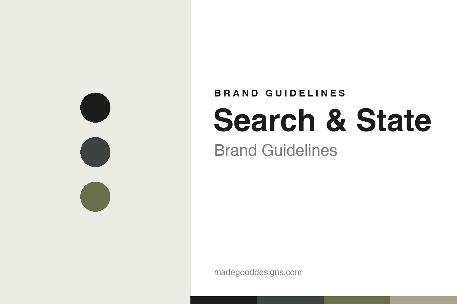
Search and State Brand Guidelines
Made in New York.
Aa
Two constants: a muted, utilitarian palette and a utilitarian sans register. Abstract homage — not the Search and State wordmark or logo.
Made in New York
Search and State cuts and sews cycling kit in Manhattan.
Search and State is a lesson in making as the whole brand. Founded around 2011 and launched in 2012 by Daniel Golden and Devin O’Brien in New York City’s Garment District, the independent brand cuts and sews every piece in-house in Midtown Manhattan, in small runs.
Its brand identity is minimal, premium and made-in-NYC — understated tailoring and branding, luxury performance fabrics, and a genuine domestic supply chain. Signature pieces include the S2-R race jersey, the S1-J jacket (“a jacket to last a lifetime”) and the UV-1 vest, in an “S#-X” naming system.
(Honest notes: the made-in-New-York story is the single load-bearing fact — this is genuinely cut and sewn in Manhattan, not just “designed” there. The look is understated, but the brand is equally known for bold camo and graphic limited editions, so it isn’t uniformly muted. And there’s no official brand hex, so the tones here are an unofficial interpretation.)
Colour
Search and State lives in a muted, utilitarian palette. Click a swatch to copy the hex.
Search and State’s identity is muted, utilitarian and refined — an ink, a graphite, a camo olive, a stone, and a bone. The palette leans on quiet, utilitarian tones — ink, graphite, olive — the register of understated tailoring, with a camo nod to its graphic side. It signals restraint, quality and craft rather than loud branding. The honest caveat: with no published brand hex, these tones are an original, unofficial interpretation, not first-party values.
The lesson is muted, utilitarian tones signal quiet, made-well quality. Search and State’s world is a Manhattan sewing room. For designers, it is a reminder that ink, graphite and olive read as refined and utilitarian — right for a brand built on domestic craft. The takeaways: use quiet, utilitarian tones; keep branding minimal; and treat any single hex as unofficial — using ink for small text so the palette stays quiet.
Typography
The register is a utilitarian sans — refined and restrained.
Search and State’s identity carries a refined, restrained, made-well spirit — domestic craft and quiet tailoring. A utilitarian sans captures the mood: it is refined and restrained, the register of a considered, minimally branded maker. Set in a muted palette, the utilitarian sans feels refined and restrained — exactly the personality Search and State carries. It is understated rather than loud, mirroring quiet tailoring. (Search and State’s real wordmark is a trademark we describe but do not reproduce, and the exact brand typeface is not ours to use.) Because the mark is not ours to use, the honest description is “a utilitarian sans spirit,” shown here in a stand-in. The type behaves like the brand: refined, restrained and made-well.
Aa
A utilitarian sans spirit — refined and restrained. (Specimen set in Inter Tight, a utilitarian sans STAND-IN; NOT the Search and State wordmark, which is a trademark.)
Making as identity
Search and State stands for made-in-NYC craft.
Search and State is a lesson in making domestic production the identity. A muted palette, understated branding and a genuine Manhattan sewing room make made-in-NYC craft the whole brand — refined, premium, honest. The making is the differentiator. The differentiator is a minimal, premium, made-in-NYC identity.
For designers and brand-builders, Search and State offers a clear takeaway: where and how you make it can be the brand. The lessons: own real production (cut and sew in-house); keep the branding quiet; and back longevity (a jacket to last a lifetime). It is also a reminder to stay accurate: it’s genuinely made in NYC (not just designed there), it balances minimalism with bold camo drops, and the palette here is an unofficial interpretation. Search and State made production the brand — proof that craft can be the difference.
Explore & save
Keep Search and State’s identity on hand — save it to a board in the Made Good inspiration library.
Search and State identity set
Pin the muted utilitarian palette and the utilitarian-sans register to your own board.


