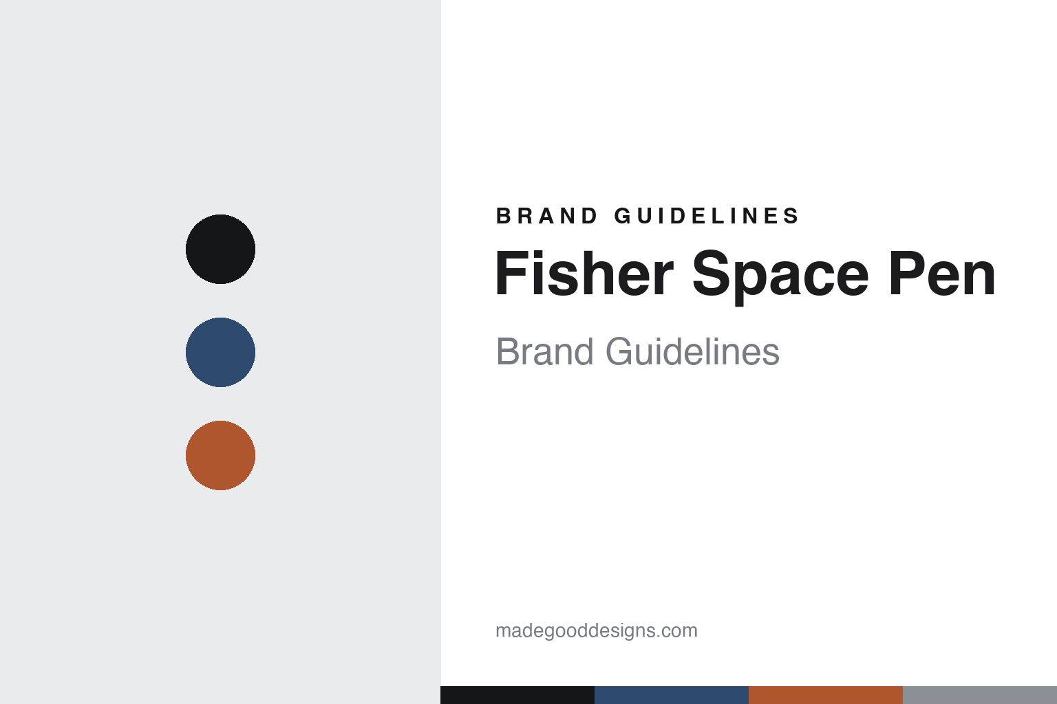
Fisher Space Pen Brand Guidelines
Writes anywhere.
Aa
Two constants: a blue-and-ember palette and an aerospace sans register. Abstract homage — not the Fisher Space Pen or packaging.
Writes anywhere
Fisher built its identity on a pen that writes in any conditions.
Fisher Space Pen is a lesson in a capability as identity. Built around a system Paul C. Fisher patented in the mid-1960s (filed 1965, granted 1966) and made in Boulder City, Nevada, it turned one engineering feat into a whole brand.
Its identity is the pressurized cartridge: a sealed cartridge pressurized with nitrogen and filled with thixotropic ink, so the pen writes upside down, in zero gravity, underwater, over grease and across extreme temperatures — the capability is the identity. Two designs are icons: the long, retractable AG7 “Astronaut” used on NASA missions, and the compact Bullet, short when capped and posting to full length when the cap is mounted — a design classic.
(Honest notes: the pen’s creation is credited partly to designers Friedrich Schächter and Erwin Rath, with Fisher behind the thixotropic ink, the AG7 patent and the company. And the famous myth is false: NASA did not commission it or “spend millions” — Fisher developed it privately, then NASA tested and simply bought a few hundred, at a few dollars each; the Soviets later did too. There’s no official brand hex, so these tones are an unofficial interpretation. This is design commentary and does not promote any product.)
Colour
Fisher Space Pen lives in a blue-and-ember palette. Click a swatch to copy the hex.
Fisher Space Pen’s identity is engineered, space-age and utilitarian — a space blue, an ink, an ember, a chrome, and a paper. The palette pairs a space blue with an ember — the register of the sky and a rocket’s burn. It signals engineering and capability rather than luxury. The honest caveat: with no published brand hex, these tones are an original, unofficial interpretation, not first-party values.
The lesson is a space blue with an ember signals an engineered, space-age brand. Fisher’s world is a pen that works where others fail. For designers, it is a reminder that a cool, aerospace palette with a warm accent reads as engineered and heroic — right for a pen defined by a capability. Because a mid ember fails as small text, keep type dark and let the ember live in the accents, palette and band. The takeaways: source the palette from the mission (space blue, chrome, ember); make the capability the hero; keep the form iconic (the Bullet); and treat any single hex as unofficial.
Typography
The register is an aerospace sans — engineered, clean, mid-century.
Fisher Space Pen’s identity carries an engineered, clean, mid-century spirit — a space mission and a machined pen. A technical, aerospace sans captures the mood: it is clean and slightly futuristic, the register of mid-century American engineering. Set in a blue-and-ember palette, the aerospace sans feels engineered and clean — exactly the personality Fisher carries. It is utilitarian rather than decorative, mirroring a tool built to work anywhere. (Fisher’s real pens and wordmark are works we describe but do not reproduce, and the exact typeface is not ours to use.) Because it is not ours to use, the honest description is “an aerospace sans spirit,” shown here in a stand-in. The type behaves like the brand: engineered, clean and mid-century.
Aa
An aerospace sans spirit — engineered and clean. (Specimen set in Space Grotesk, a technical grotesque STAND-IN; NOT the Fisher Space Pen packaging.)
A capability as identity
Fisher Space Pen stands for a pen that writes anywhere.
Fisher Space Pen is a lesson in making a capability the identity. A blue-and-ember palette, an aerospace sans and a pressurized cartridge make one capability the whole brand — engineered, clean, mid-century. The capability is the differentiator. The differentiator is a writes-anywhere identity.
For designers and brand-builders, Fisher offers a clear takeaway: turn one real capability into the whole brand. The lessons: solve a hard problem (writing in any conditions); make one form iconic (the Bullet); tell the truth about the story; and correct the myths. It is also a reminder to stay accurate: NASA didn’t commission it or spend millions — Fisher developed it privately and NASA bought a few hundred — and the palette here is an unofficial interpretation. Fisher made a capability the brand — proof that solving one hard problem can be the difference.
Explore & save
Keep Fisher Space Pen’s identity on hand — save it to a board in the Made Good inspiration library.
Fisher Space Pen identity set
Pin the blue-and-ember palette and the aerospace-sans register to your own board.


