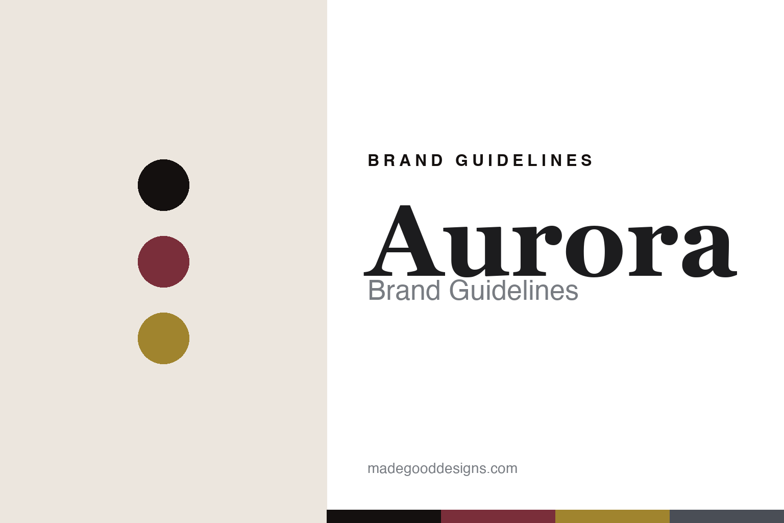
Aurora Brand Guidelines
The integrated maker.
Aa
Two constants: a burgundy-and-gold palette and a heritage serif register. Abstract homage — not the Aurora pen or packaging.
The integrated maker
Aurora makes its own nibs and its own resin, in Turin.
Aurora is a lesson in vertical integration as identity. Founded in 1919 in Turin by Isaia Levi — a textile merchant who financed the venture — it made the first true Italian fountain pens and has stayed in Turin ever since.
Its identity is that of a fully integrated maker. Aurora is among the very few pen houses — and, it says, the only one in Italy — to make its own nibs in-house, and it works in its own proprietary resin, Auroloid. That self-sufficiency underpins a century of heritage design: the compact, faceted Optima; the Aurora 88 (the 1947 rival to the Parker 51, designed by Marcello Nizzoli); and the minimalist steel Hastil, designed by Marco Zanuso and reportedly held in MoMA’s collection.
(Honest notes: it’s fair to call Aurora the maker of the first true Italian fountain pens, not “Italy’s oldest company.” Its continued family ownership (the Verona family) is reported rather than stated on the brand’s own pages. The Hastil is credited to Zanuso, possibly with Richard Sapper, around 1969–1970, and its MoMA placement is a single-source claim. There’s no official brand hex, so these tones are an unofficial interpretation. This is design commentary and does not promote any product.)
Colour
Aurora lives in a burgundy-and-gold palette. Click a swatch to copy the hex.
Aurora’s identity is heritage, Italian and refined — a burgundy, an ink, a dawn gold, a Turin slate, and a cream. The palette pairs a burgundy with a dawn gold — the register of a century-old Turin house and the “aurora” (dawn) in its name. It signals heritage and craft rather than novelty. The honest caveat: with no published brand hex, these tones are an original, unofficial interpretation, not first-party values.
The lesson is a burgundy with a gold signals a heritage, integrated maker. Aurora’s world is a self-made pen from Turin. For designers, it is a reminder that a deep, warm palette reads as heritage and considered — right for a house that makes everything itself. The takeaways: own the whole craft (nibs, resin); keep the palette heritage; anchor to a place (Turin, 1919); and treat any single hex as unofficial.
Typography
The register is a heritage serif — classical, Italian, considered.
Aurora’s identity carries a classical, Italian, considered spirit — a century of Turin craft. A refined, high-contrast serif captures the mood: it is elegant and heritage, the register of an Italian house. Set in a burgundy-and-gold palette, the heritage serif feels classical and Italian — exactly the personality Aurora carries. It is considered rather than loud, mirroring an integrated maker. (Aurora’s real pens, nibs and wordmark are works we describe but do not reproduce, and the exact typeface is not ours to use.) Because it is not ours to use, the honest description is “a heritage serif spirit,” shown here in a stand-in. The type behaves like the brand: classical, Italian and considered.
Aa
A heritage serif spirit — classical and Italian. (Specimen set in Prata, an elegant high-contrast serif STAND-IN; NOT the Aurora packaging.)
Integration as identity
Aurora stands for making everything itself.
Aurora is a lesson in making integration the identity. A burgundy-and-gold palette, a heritage serif and in-house nibs and resin make self-sufficiency the whole brand — classical, Italian, considered. The integration is the differentiator. The differentiator is a make-it-all-yourself identity.
For designers and brand-builders, Aurora offers a clear takeaway: own the whole craft. The lessons: make the hard parts yourself (nibs, resin); build a century of design on that base (Optima, 88, Hastil); root it in a place (Turin); and be honest about the claims. It is also a reminder to stay accurate: it made the first true Italian pens, the 88 was Nizzoli’s and the Hastil Zanuso’s, and the palette here is an unofficial interpretation. Aurora made integration the brand — proof that owning the craft can be the difference.
Explore & save
Keep Aurora’s identity on hand — save it to a board in the Made Good inspiration library.
Aurora identity set
Pin the burgundy-and-gold palette and the heritage-serif register to your own board.


