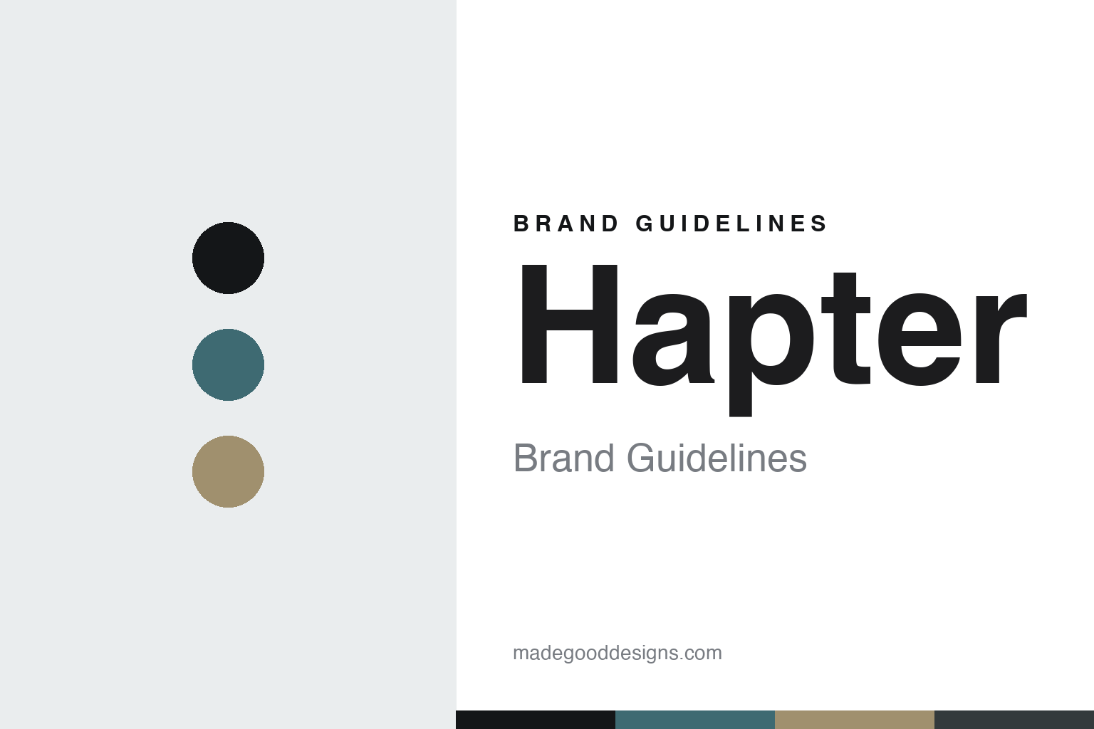
Hapter Brand Guidelines
The material frame.
Aa
Two constants: a steel-and-sand palette and a technical sans register. Abstract homage — not the Hapter frame or wordmark.
The material frame
Hapter builds frames from steel wrapped in textile, in its own Belluno workshop.
Hapter is a lesson in material invention as the identity. An Italian house from Belluno, it builds frames from a material no one else uses quite this way — surgical steel wrapped in woven textile — and makes them itself.
Its identity is the material frame. Hapter’s stainless-steel-and-textile frames — tactile, screwless, unmistakably raw — are the work it is known for. Eyewear as material. Recognition by touch.
(Honest notes: Hapter is an Italian eyewear brand from Belluno, in the Veneto — the heart of Italy’s historic eyewear district — founded in 2013 by Eric Balzan, with a co-founder, Mirko Forti, named in some sources. Its name comes from “haptic,” recognition by touch, and its origin story traces to WWII glacier goggles found in the Dolomites. Its signature is a material — surgical stainless-steel sheet combined with wrapped artisanal cotton textile or industrial rubber, in a screwless, soldered-look construction, with a patent-pending “8-GON” hinge that gives a tactile snap. On production, it is one hundred per cent made in Italy, in-house, in its own Belluno workshop it calls the Hapterìa, with bonding recipes it keeps secret — though, honestly, the signature cotton fabric is custom-woven by an external mill, Lanificio Cerruti 1881, so the fabric is Cerruti’s while the frame craft is Hapter’s own. It appears independent and founder-led, which we treat as likely rather than confirmed. It is in Belluno, in the Veneto — not Bergamo or Milan. Its “8-GON” hinge and model names are IP we describe but don’t reproduce. There’s no official brand hex — these tones are an unofficial interpretation. This is design commentary and does not promote any product.)
Colour
Hapter lives in a steel-and-sand palette. Click a swatch to copy the hex.
Hapter’s identity is raw, tactile and technical — a steel, an ink, a sand, a graphite, and a chalk. The palette leans steel and sand — the register of brushed steel and woven cotton textile. It signals material and craft rather than decoration. The honest caveat: with no published brand hex, these tones are an original, unofficial interpretation, not first-party values.
The lesson is a steel-and-sand palette signals a material identity. Hapter’s world is a raw, tactile, technical object. For designers, it is a reminder that a material combination — steel and textile — can be the whole identity, and that a raw, natural-plus-metal palette signals that invention. Because a mid steel can fail as small text, keep type dark and let the colour live in the accents, palette and band. The takeaways: invent the material; make it tactile; own the workshop; and treat any single hex as unofficial.
Typography
The register is a technical sans — precise, tactile, modern.
Hapter’s identity carries a precise, tactile, modern spirit — a raw, material object. A technical grotesque sans captures the mood: it is exact and current, the register of material-led design. Set in a steel-and-sand palette, the technical sans feels precise and tactile — exactly the personality Hapter carries. It is technical rather than decorative, mirroring a steel-and-textile frame. (Hapter’s real frames, the “8-GON” hinge and wordmark are works we describe but do not reproduce, and the exact typeface is not ours to use.) Because it is not ours to use, the honest description is “a technical sans spirit,” shown here in a stand-in. The type behaves like the brand: precise, tactile and modern.
Aa
A technical sans spirit — precise and tactile. (Specimen set in Space Grotesk, a technical grotesque sans STAND-IN; NOT the Hapter wordmark.)
Material invention as identity
Hapter stands for the material frame.
Hapter is a lesson in making a material the identity. A steel-and-sand palette, a technical sans and an own-made frame make material invention the whole brand — raw, tactile, technical. The material is the differentiator. The differentiator is a combination almost no one else makes: surgical steel wrapped in woven textile, joined without a screw, and finished in the house’s own Belluno workshop.
Put to work, the identity is material as design. A designer building in this spirit would invent — or radically recombine — a material, make its tactility the point, and keep the making in-house so the recipe stays proprietary, so the object is recognised as much by touch as by sight. The lesson Hapter teaches is that a material and an owned workshop can build a brand: a genuinely new construction, a patent-pending hinge, and a raw, technical design language give it an identity that can’t be copied off a catalogue. The material is the memory.
For designers and brand-builders, Hapter offers a clear takeaway: let an invented material carry the object. The lessons: invent the material; make it tactile; own the workshop; and be honest about the story. It is also a reminder to stay accurate: the signature fabric is woven by an outside mill, Cerruti, while the frame craft is Hapter’s own, and it is in Belluno, in the Veneto, not Bergamo — the palette here is an unofficial interpretation. And it is a reminder that made-where honesty can be a genuine boast: Hapter makes in its own Italian workshop, and that is worth stating plainly. Hapter made the material frame the brand — proof that an invented material and an owned workshop can be the difference.
Explore & save
Keep Hapter’s identity on hand — save it to a board in the Made Good inspiration library.
Hapter identity set
Pin the steel-and-sand palette and the technical-sans register to your own board.


