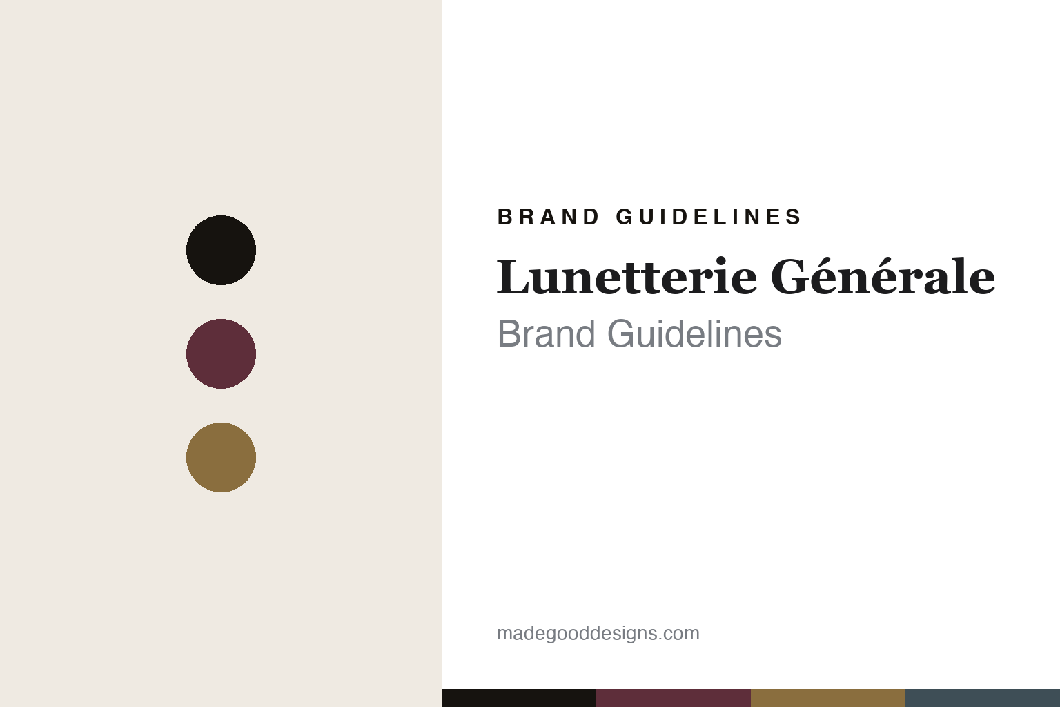
Lunetterie Générale Brand Guidelines
The quiet-luxury frame.
Aa
Two constants: a quiet-luxe palette and a Deco serif register. Abstract homage — not the Lunetterie Générale frames or Kamon mark.
The quiet-luxury frame
Lunetterie Générale pairs Montréal with Japan.
Lunetterie Générale is a lesson in quiet luxury as the identity. Founded in 2018 in Montréal by Julien Couture, it makes refined, restrained luxury eyewear — French sensibility, Japanese craft.
Its identity is the quiet-luxury frame. Lunetterie Générale makes small, author-driven collections of optical frames and sunglasses in cellulose acetate and beta-titanium, with Art Deco and classic-cinema influences and a logo drawn from Japanese family crests. Restraint as luxury. A frame that whispers.
(Honest notes: Lunetterie Générale was founded in 2018 (not earlier) by Julien Couture — a French-Canadian, self-taught designer with a marketing and filmmaking background, not the “French-born optician” sometimes claimed, and not anyone named “Guillaume Pariat,” which is a misattribution we drop. It is based in Montréal, Québec. Its “quiet luxury” identity blends French refinement with Japanese craft, and its logo is inspired by Japanese kamon crests. On production, the key fact: it is designed in Montréal but made in Japan (Sabae) — its own tagline is “luxury eyewear made in Japan.” It is independent and founder-led. We don’t claim a design award (it has exhibited at SILMO but isn’t a verified Silmo d’Or winner) or specific gold-plating. There’s no official brand hex — these tones are an unofficial interpretation. This is design commentary and does not promote any product.)
Colour
Lunetterie Générale lives in a quiet-luxe palette. Click a swatch to copy the hex.
Lunetterie Générale’s identity is refined, restrained and cinematic — a bordeaux, an ink, a gold, a slate, and a cream. The palette leans quiet luxe — the register of Deco elegance and understated craft. It signals restraint and quality rather than novelty. The honest caveat: with no published brand hex, these tones are an original, unofficial interpretation, not first-party values.
The lesson is a quiet-luxe palette signals a restraint-led luxury brand. Lunetterie Générale’s world is a refined, understated object. For designers, it is a reminder that “quiet luxury” — deep tones, Deco lines, no shouting — can be a whole identity, and that fusing two design cultures (French refinement, Japanese craft) can be a genuine story. Because a bordeaux can fail as small text, keep type dark and let the colour live in the accents, palette and band. The takeaways: whisper, don’t shout; fuse two cultures; keep it Deco; and treat any single hex as unofficial.
Typography
The register is a Deco serif — elegant, cinematic, restrained.
Lunetterie Générale’s identity carries an elegant, cinematic, restrained spirit — a refined, Deco object. A classical inscribed serif captures the mood: it is graceful and composed, the register of a quiet-luxury house. Set in a quiet-luxe palette, the Deco serif feels elegant and cinematic — exactly the personality Lunetterie Générale carries. It is restrained rather than flashy, mirroring understated craft. (Lunetterie Générale’s real frames and kamon-inspired mark are works we describe but do not reproduce, and the exact typeface is not ours to use.) Because it is not ours to use, the honest description is “a Deco serif spirit,” shown here in a stand-in. The type behaves like the brand: elegant, cinematic and restrained.
Aa
A Deco serif spirit — elegant and cinematic. (Specimen set in Marcellus, a classical inscribed serif STAND-IN; NOT the Lunetterie Générale mark.)
Quiet luxury as identity
Lunetterie Générale stands for the quiet-luxury frame.
Lunetterie Générale is a lesson in making quiet luxury the identity. A quiet-luxe palette, a Deco serif and a restrained frame make understatement the whole brand — refined, restrained, cinematic. The restraint is the differentiator. The differentiator is French refinement made with Japanese craft, kept deliberately quiet.
Put to work, the identity is confidence expressed as restraint. A designer building in this spirit would strip away logos and flash, lean on deep tones and Deco lines, and let materials and craft carry the luxury — trusting that the right customer reads quiet as expensive. The lesson Lunetterie Générale teaches is that a young brand can claim luxury credibly by borrowing craft it can’t yet build: designing in Montréal and manufacturing in Japan’s eyewear heartland gives real substance to a restrained aesthetic, and a crest-like logo lends heritage feeling without inventing a false history. Being honest about the founder and dropping unverified awards keeps that quiet confidence trustworthy.
For designers and brand-builders, Lunetterie Générale offers a clear takeaway: let restraint signal luxury. The lessons: whisper, don’t shout; fuse two cultures; keep it Deco; and be honest about the story. It is also a reminder to stay accurate: it was founded in 2018 by Julien Couture in Montréal, it is “quiet luxury,” and it is made in Japan — the palette here is an unofficial interpretation. And it is a reminder that borrowing craft can be more honest than faking heritage: rather than invent a century-old backstory, this brand simply designs in Montréal and makes in Japan’s finest eyewear region, letting real manufacturing carry the luxury claim. It is also a reminder that a crest-like mark lends gravity without deception — a kamon-inspired logo signals care and lineage as a design gesture, not a false historical claim, which is exactly the line a young luxury brand must walk. Lunetterie Générale made the quiet-luxury frame the brand — proof that restraint can be the difference.
Explore & save
Keep Lunetterie Générale’s identity on hand — save it to a board in the Made Good inspiration library.
Lunetterie Générale identity set
Pin the quiet-luxe palette and the Deco-serif register to your own board.