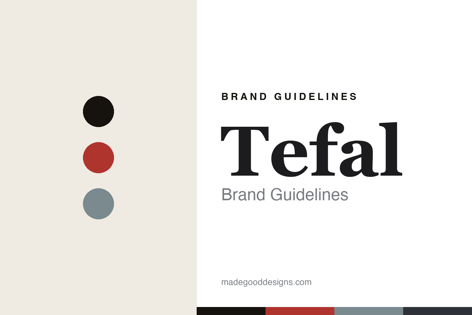
Tefal Brand Guidelines
The non-stick pan.
Aa
Two constants: a cookware-red palette and an everyday serif register. Abstract homage — not the Tefal pan, Thermo-Spot mark or wordmark.
The non-stick pan
Tefal invented the pan that food doesn’t stick to.
Tefal is a lesson in an invention as the identity. Founded in 1956 in France by engineer Marc Grégoire, it created the first non-stick frying pan — and built a whole brand on that one idea.
Its identity is the non-stick pan. Tefal makes non-stick cookware — plus a broad appliance range, from the ActiFry air fryer to kettles — but the pan is the object it is known for, marked by the red Thermo-Spot heat indicator. The pan that changed cooking. A category Tefal opened.
(Honest notes: Tefal was founded in 1956 in France by engineer Marc Grégoire, who applied PTFE (Teflon) to an aluminium pan — reportedly at his wife Colette’s suggestion, an anecdote we treat as brand lore rather than hard fact; the name “Tefal” combines Teflon and aluminium. Its signature is the non-stick frying pan, with the red Thermo-Spot heat indicator a genuine, registered feature. On production, cookware is made in France, at Rumilly in Haute-Savoie, while many small appliances are made offshore (exact countries aren’t stated), so we keep the made-in-France claim to the cookware. On ownership, it is part of Groupe SEB, which acquired it in 1968 — a foundational SEB brand, alongside Krups, Moulinex and Rowenta. In North America and Japan it trades as “T-fal,” to avoid a trademark clash with DuPont’s Teflon. There’s no official brand hex, and we reproduce no pan, Thermo-Spot mark or logo — these tones are an unofficial interpretation. This is design commentary and does not promote any product.)
Colour
Tefal lives in a cookware-red palette. Click a swatch to copy the hex.
Tefal’s identity is practical, French and everyday — a red, an ink, an aluminium, a charcoal, and a cream. The palette leans cookware red — the register of an everyday pan and its red heat dot. It signals utility and warmth rather than novelty. The honest caveat: with no published brand hex, these tones are an original, unofficial interpretation, not first-party values.
The lesson is a cookware-red palette signals an everyday kitchen essential. Tefal’s world is a practical, aluminium-and-red object. For designers, it is a reminder that inventing a category — the non-stick pan — can define a brand forever, and that a single functional cue (a red dot that shows heat) can become an identity. Because a red can fail as small text, keep type dark and let the colour live in the accents, palette and band. The takeaways: own the invention; keep it everyday; use one functional cue; and treat any single hex as unofficial.
Typography
The register is an everyday serif — warm, practical, legible.
Tefal’s identity carries a warm, practical, legible spirit — an everyday, useful object. A sturdy text serif captures the mood: it is friendly and readable, the register of a trusted household brand. Set in a cookware-red palette, the everyday serif feels warm and practical — exactly the personality Tefal carries. It is legible rather than showy, mirroring a pan used every day. (Tefal’s real pan, Thermo-Spot mark and wordmark are works we describe but do not reproduce, and the exact typeface is not ours to use.) Because it is not ours to use, the honest description is “an everyday serif spirit,” shown here in a stand-in. The type behaves like the brand: warm, practical and legible.
Aa
An everyday serif spirit — warm and practical. (Specimen set in Petrona, a sturdy text serif STAND-IN; NOT the Tefal wordmark.)
An invention as identity
Tefal stands for the non-stick pan.
Tefal is a lesson in making an invention the identity. A cookware-red palette, an everyday serif and a non-stick pan make a single idea the whole brand — practical, French, everyday. The invention is the differentiator. The differentiator is opening a category — the non-stick pan — that everyone now takes for granted.
Put to work, the identity is a first that never fades. A designer building in this spirit would anchor the brand to its founding idea and let a practical design language carry it, so a modern range still reads as “the non-stick people.” The lesson Tefal teaches is that inventing a category is a durable moat: being the pan that food doesn’t stick to made the name a household word, and a simple, functional cue — the red heat dot — keeps that identity legible across decades.
For designers and brand-builders, Tefal offers a clear takeaway: own the category you opened. The lessons: own the invention; keep it everyday; use one functional cue; and be honest about the story. It is also a reminder to stay accurate: it was founded in 1956 by Marc Grégoire, it invented the non-stick pan, and — importantly — it is part of Groupe SEB, having been acquired in 1968 — the palette here is an unofficial interpretation. And it is a reminder that made-where honesty matters even for a French icon: keeping the made-in-France claim to the cookware (Rumilly), rather than stretching it across the offshore appliance range, keeps the story trustworthy. It is a reminder, too, that names shift across markets: Tefal trades as “T-fal” in North America to avoid a trademark clash, a detail worth getting right. Tefal made the non-stick pan the brand — proof that an invention can be the difference.
Explore & save
Keep Tefal’s identity on hand — save it to a board in the Made Good inspiration library.
Tefal identity set
Pin the cookware-red palette and the everyday-serif register to your own board.


