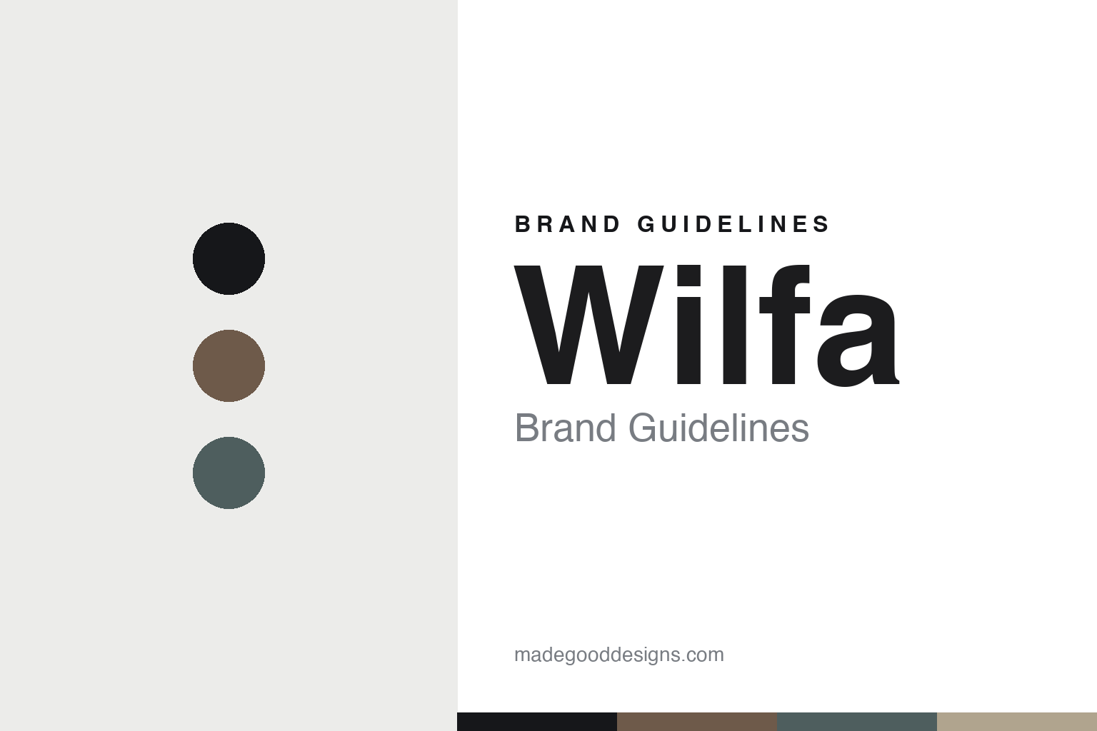
Wilfa Brand Guidelines
The coffee brewer.
Aa
Two constants: a Scandinavian-coffee palette and a Scandinavian sans register. Abstract homage — not the Wilfa brewer or wordmark.
The coffee brewer
Wilfa earned specialty-coffee credibility with one collaboration.
Wilfa is a lesson in credibility through collaboration as the identity. A Norwegian brand founded in 1948, it turned a broad appliance range into a specialty-coffee name by developing brewers and grinders with a champion barista.
Its identity is the coffee brewer. Wilfa makes precision drip coffee brewers and grinders — the Svart and Precision lines — that earned real standing in specialty coffee, alongside a wider range of home appliances. Coffee, taken seriously. A mainstream brand with barista credibility.
(Honest notes: Wilfa is a Norwegian company established in 1948, headquartered in Oslo (“Norwegian quality since 1948”). Its founder’s name isn’t documented in reliable sources, so we don’t claim it is named after a founder. Its modern signature is its specialty-coffee line — precision drip brewers and grinders developed with Tim Wendelboe, the 2004 World Barista Champion (the Svart/Precision brewer and the Uniform single-dose grinder), well regarded in specialty coffee — alongside a broad range of vacuums, climate and kitchen appliances. On production, it is designed in Norway and manufactured in China (from retailer sources rather than an official statement, so we flag it). On ownership, it describes itself as Norwegian-owned and operates as Wilfa AS, with no parent group found — it appears independent, though the specific owning entity isn’t confirmed. There’s no official brand hex, and we reproduce no brewer or logo — these tones are an unofficial interpretation. This is design commentary and does not promote any product.)
Colour
Wilfa lives in a Scandinavian-coffee palette. Click a swatch to copy the hex.
Wilfa’s identity is minimal, Scandinavian and considered — a coffee taupe, an ink, a slate, a sand, and a chalk. The palette leans Scandinavian coffee — the register of quiet Nordic design and specialty coffee. It signals craft and calm rather than novelty. The honest caveat: with no published brand hex, these tones are an original, unofficial interpretation, not first-party values.
The lesson is a Scandinavian-coffee palette signals credible, quiet design. Wilfa’s world is a minimal, considered object. For designers, it is a reminder that borrowing credibility — here from a champion barista — can reposition a mainstream brand, and that a muted, Nordic palette signals seriousness. Because a taupe can fail as small text, keep type dark and let the colour live in the accents, palette and band. The takeaways: borrow credibility; keep it minimal; take the craft seriously; and treat any single hex as unofficial.
Typography
The register is a Scandinavian sans — clean, minimal, calm.
Wilfa’s identity carries a clean, minimal, calm spirit — a considered, Nordic object. A quiet geometric sans captures the mood: it is understated and modern, the register of Scandinavian design. Set in a Scandinavian-coffee palette, the Scandinavian sans feels clean and minimal — exactly the personality Wilfa carries. It is calm rather than loud, mirroring a precise brewer. (Wilfa’s real brewer and wordmark are works we describe but do not reproduce, and the exact typeface is not ours to use.) Because it is not ours to use, the honest description is “a Scandinavian sans spirit,” shown here in a stand-in. The type behaves like the brand: clean, minimal and calm.
Aa
A Scandinavian sans spirit — clean and minimal. (Specimen set in Albert Sans, a quiet geometric sans STAND-IN; NOT the Wilfa wordmark.)
Credibility through collaboration as identity
Wilfa stands for the coffee brewer.
Wilfa is a lesson in earning credibility through collaboration. A Scandinavian-coffee palette, a Scandinavian sans and a precision brewer make specialty-coffee seriousness the whole brand — minimal, Nordic, considered. The collaboration is the differentiator. The differentiator is real barista credibility, borrowed from a champion and built into the product.
Put to work, the identity is trust transferred. A designer building in this spirit would partner with a genuine expert and let that expertise shape the product, so a mainstream brand gains standing it could not manufacture alone. The lesson Wilfa teaches is that the right collaborator is leverage: developing brewers and grinders with a World Barista Champion moved Wilfa from a generalist appliance maker to a name specialty-coffee people respect, and a quiet, Nordic design language keeps that seriousness intact.
For designers and brand-builders, Wilfa offers a clear takeaway: borrow credibility from a real expert. The lessons: borrow credibility; keep it minimal; take the craft seriously; and be honest about the story. It is also a reminder to stay accurate: it was founded in 1948 in Norway, its coffee standing comes from the Tim Wendelboe collaboration, and — importantly — its products are designed in Norway but made in China — the palette here is an unofficial interpretation. And it is a reminder to admit what isn’t known: because the founder’s name and the exact owning entity aren’t documented, we say so rather than invent them. It is a reminder, too, that made-where honesty matters even for a Scandinavian design brand: flagging the China manufacture as retailer-sourced, rather than asserting it, keeps the story trustworthy. Wilfa made the coffee brewer the brand — proof that borrowed credibility can be the difference.
Explore & save
Keep Wilfa’s identity on hand — save it to a board in the Made Good inspiration library.
Wilfa identity set
Pin the Scandinavian-coffee palette and the Scandinavian-sans register to your own board.


