Cuckoo Brand Guidelines
The pressure rice cooker.
Aa
Two constants: a premium-rice palette and a modern sans register. Abstract homage — not the Cuckoo cooker, bird mark or wordmark.
The pressure rice cooker
Cuckoo owns the Korean rice cooker.
Cuckoo is a lesson in owning a category as the identity. A South Korean company with roots in 1978, it launched the Cuckoo brand in 1998 and became the dominant name in Korean rice cookers.
Its identity is the pressure rice cooker. Cuckoo makes electric induction-heating pressure rice cookers — famous for higher pressure and voice-guided models — alongside water purifiers and other home appliances, but the rice cooker is the object it is known for. The rice cooker of Korean kitchens. A category it dominates at home.
(Honest notes: Cuckoo was founded in 1978 as Sungkwang Electronics, based in Yangsan, South Korea, beginning as an OEM rice-cooker maker; the Cuckoo brand launched in 1998, with the corporate name changed to Cuckoo in 2002 (the exact brand-launch year varies slightly by source). Its signature is the electric induction-heating (IH) pressure rice cooker — known for “talking,” voice-guided models — and it holds roughly a 70% share of the Korean rice-cooker market, alongside water and air purifiers and rental services. On production, it is tied to Yangsan, South Korea, though we can’t confirm every SKU is Korea-made, so we note the caveat. On ownership, it is Koo-family-controlled and publicly listed (a 2014 Korea Exchange IPO), with a 2018 restructuring creating Cuckoo Holdings and Cuckoo Homesys. One disambiguation: it is unrelated to the cuckoo bird, cuckoo clocks or the Cuckoo Sandbox software. There’s no official brand hex, and we reproduce no cooker, bird mark or logo — these tones are an unofficial interpretation. This is design commentary and does not promote any product.)
Colour
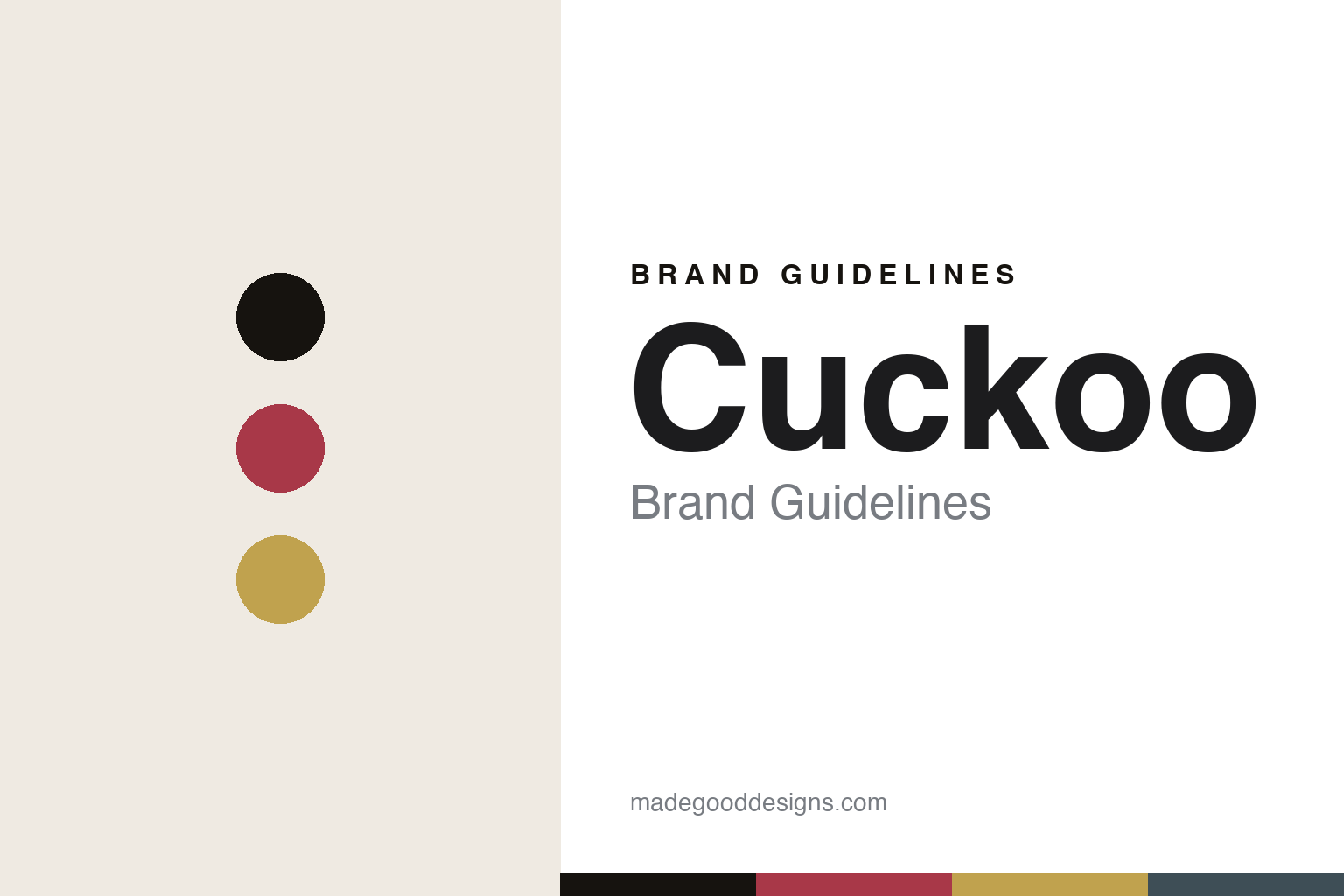
Cuckoo lives in a premium-rice palette. Click a swatch to copy the hex.
Cuckoo’s identity is premium, warm and Korean — a rose red, an ink, a rice gold, a slate, and a cream. The palette leans premium rice — the register of a high-end rice cooker and Korean home cooking. It signals quality and warmth rather than novelty. The honest caveat: with no published brand hex, these tones are an original, unofficial interpretation, not first-party values.
The lesson is a premium-rice palette signals a category-owning appliance. Cuckoo’s world is a premium, warm object. For designers, it is a reminder that dominating one staple category — the rice cooker — can define a brand, and that a warm, premium palette signals quality in a specialist appliance. Because a rose red can fail as small text, keep type dark and let the colour live in the accents, palette and band. The takeaways: own one category; signal premium; keep it warm; and treat any single hex as unofficial.
Typography
The register is a modern sans — clean, premium, confident.
Cuckoo’s identity carries a clean, premium, confident spirit — a warm, high-end object. A modern grotesque captures the mood: it is assured and contemporary, the register of a market-leading appliance. Set in a premium-rice palette, the modern sans feels clean and premium — exactly the personality Cuckoo carries. It is confident rather than fussy, mirroring a dominant, specialist machine. (Cuckoo’s real cooker, bird mark and wordmark are works we describe but do not reproduce, and the exact typeface is not ours to use.) Because it is not ours to use, the honest description is “a modern sans spirit,” shown here in a stand-in. The type behaves like the brand: clean, premium and confident.
Aa
A modern sans spirit — clean and premium. (Specimen set in Schibsted Grotesk, a modern grotesque STAND-IN; NOT the Cuckoo wordmark.)
Owning a category as identity
Cuckoo stands for the pressure rice cooker.
Cuckoo is a lesson in making category dominance the identity. A premium-rice palette, a modern sans and a pressure cooker make the rice cooker the whole brand — premium, warm, Korean. The dominance is the differentiator. The differentiator is owning a staple category — the rice cooker — at home so completely that the name stands for it.
Put to work, the identity is a category won. A designer building in this spirit would go deep in one staple appliance and make it the best in its market, so the brand becomes synonymous with the object itself. The lesson Cuckoo teaches is that dominance in one category is a durable position: holding around 70% of the Korean rice-cooker market makes “Cuckoo” shorthand for rice cooker at home, and a premium, warm design language keeps that leadership feeling aspirational rather than generic.
For designers and brand-builders, Cuckoo offers a clear takeaway: dominate one staple category. The lessons: own one category; signal premium; keep it warm; and be honest about the story. It is also a reminder to stay accurate: it began in 1978 as Sungkwang Electronics and launched the Cuckoo brand in 1998, it is based in Yangsan, and — importantly — it is Koo-family-controlled and publicly listed — the palette here is an unofficial interpretation. And it is a reminder that made-where honesty needs a caveat: tying production to Yangsan while noting that not every SKU is confirmed Korea-made keeps the story trustworthy. It is a reminder, too, that a company date and a brand date can differ: honouring both the 1978 origin and the 1998 brand launch is more accurate than collapsing them. Cuckoo made the rice cooker the brand — proof that owning a category can be the difference.
Explore & save
Keep Cuckoo’s identity on hand — save it to a board in the Made Good inspiration library.
Cuckoo identity set
Pin the premium-rice palette and the modern-sans register to your own board.