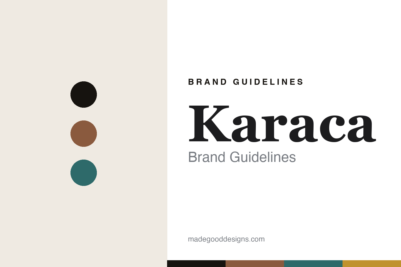
Karaca Brand Guidelines
The Turkish coffee maker.
Aa
Two constants: a coffee-culture palette and a coffee-culture serif register. Abstract homage — not the Karaca coffee maker or wordmark.
The Turkish coffee maker
Karaca turns a cultural ritual into an appliance.
Karaca is a lesson in a cultural ritual as the identity. A Turkish homeware brand founded in 1973, it grew from a glassware workshop into a group whose signature appliance automates a beloved ritual: Turkish coffee.
Its identity is the Turkish coffee maker. Karaca makes automatic Turkish coffee machines — the “Hatır” line — alongside tea makers and a broad homeware range, turning the ceremony of Turkish coffee into a countertop machine. A ritual made effortless. Coffee culture, in an appliance.
(Honest notes: Karaca was founded in 1973 in Istanbul (Süleymaniye) by Hüseyin Karaca and his sons, as “Karaca Züccaciye,” a decorative-glassware workshop that grew into today’s family-owned Karaca Group. Importantly, it is not the 1917 Turkish textile firm (“Çift Geyik Karaca”), which English searches often conflate — we correct that — and we drop any İpek Kağıt link as unfounded. Its broad homeware range spans tableware, porcelain and cookware, but its signature appliance for our purposes is the automatic Turkish coffee maker (the “Hatır” line, with an ember-style mode), alongside tea makers. On production, its core manufacturing and HQ are in Turkey (it even owns the German porcelain maker Weimar Porzellan), but small electrical appliances are likely partly offshore-sourced, so we don’t claim everything is made in Turkey. On ownership, it is the family-owned Karaca Group (around eleven brands). There’s no official brand hex, and we reproduce no coffee maker or porcelain pattern — these tones are an unofficial interpretation. This is design commentary and does not promote any product.)
Colour
Karaca lives in a coffee-culture palette. Click a swatch to copy the hex.
Karaca’s identity is warm, ritual and Turkish — a copper, an ink, a teal, an ochre, and a cream. The palette leans coffee culture — the register of Turkish coffee’s copper pots and warm ceremony. It signals ritual and heritage rather than novelty. The honest caveat: with no published brand hex, these tones are an original, unofficial interpretation, not first-party values.
The lesson is a coffee-culture palette signals a ritual-led brand. Karaca’s world is a warm, ceremonial object. For designers, it is a reminder that automating a cultural ritual — Turkish coffee — can be a whole identity, and that a copper-and-warm palette carries that heritage. Because a copper can fail as small text, keep type dark and let the colour live in the accents, palette and band. The takeaways: automate a ritual; honour the culture; keep it warm; and treat any single hex as unofficial.
Typography
The register is a coffee-culture serif — warm, elegant, characterful.
Karaca’s identity carries a warm, elegant, characterful spirit — a ceremonial, cultural object. A refined display serif captures the mood: it is graceful and warm, the register of a heritage ritual. Set in a coffee-culture palette, the coffee-culture serif feels warm and elegant — exactly the personality Karaca carries. It is characterful rather than plain, mirroring a cultural ceremony. (Karaca’s real coffee maker, porcelain patterns and wordmark are works we describe but do not reproduce, and the exact typeface is not ours to use.) Because it is not ours to use, the honest description is “a coffee-culture serif spirit,” shown here in a stand-in. The type behaves like the brand: warm, elegant and characterful.
Aa
A coffee-culture serif spirit — warm and elegant. (Specimen set in Cormorant Garamond, a refined display serif STAND-IN; NOT the Karaca wordmark.)
A cultural ritual as identity
Karaca stands for the Turkish coffee maker.
Karaca is a lesson in making a cultural ritual the identity. A coffee-culture palette, a coffee-culture serif and an automatic coffee maker make a beloved ceremony the whole brand — warm, ritual, Turkish. The ritual is the differentiator. The differentiator is automating Turkish coffee — a genuine cultural ceremony — into an everyday appliance.
Put to work, the identity is a ceremony made easy. A designer building in this spirit would take a meaningful ritual and design an appliance that honours it, so the product sells belonging and heritage as much as convenience. The lesson Karaca teaches is that a cultural ritual is a rich foundation: building an appliance around Turkish coffee ties a modern brand to a deep tradition, and a warm, ceremonial design language keeps that heritage present.
For designers and brand-builders, Karaca offers a clear takeaway: design around a ritual people cherish. The lessons: automate a ritual; honour the culture; keep it warm; and be honest about the story. It is also a reminder to stay accurate: it was founded in 1973 in Istanbul as a glassware workshop and grew into the family-owned Karaca Group — the palette here is an unofficial interpretation. And it is a reminder to correct the record: Karaca the homeware brand is not the 1917 Turkish textile firm that shares part of its name, and we drop unfounded corporate links rather than repeat them. It is a reminder, too, that made-where honesty matters even for a heritage brand: because small appliances are likely partly offshore-sourced, we say so rather than claim everything is made in Turkey. Karaca made the Turkish coffee maker the brand — proof that a cultural ritual can be the difference.
Explore & save
Keep Karaca’s identity on hand — save it to a board in the Made Good inspiration library.
Karaca identity set
Pin the coffee-culture palette and the coffee-culture-serif register to your own board.


