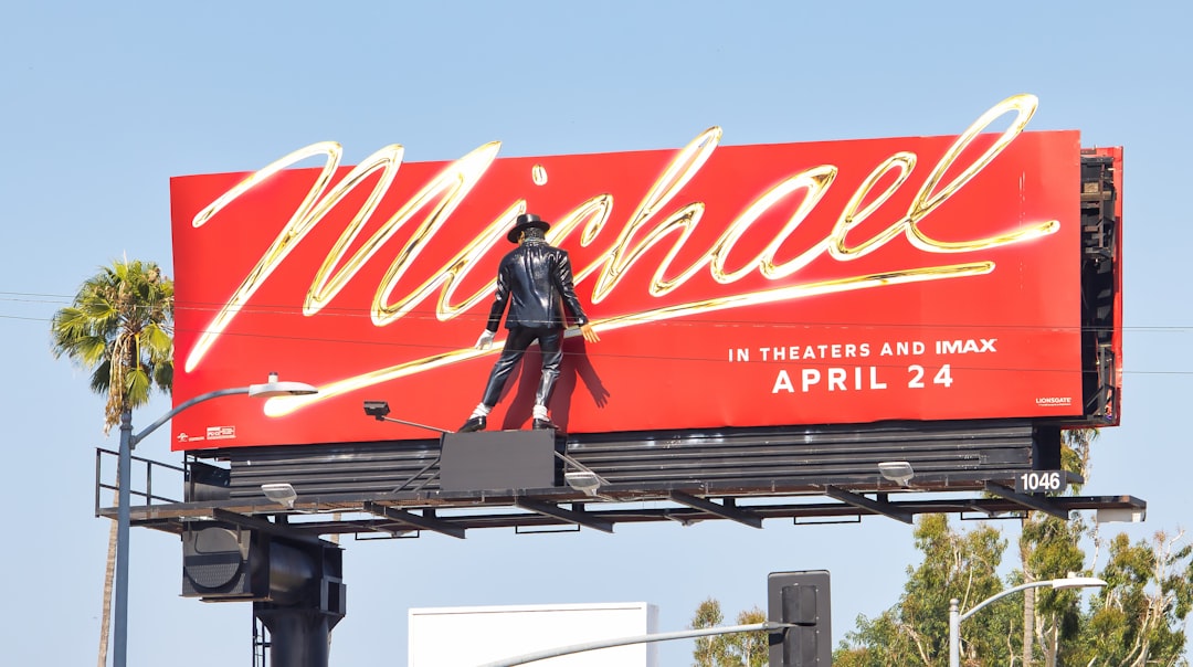
What Font Does Michael Jackson Use?
Few names in pop carry as much visual weight, so it is no surprise that designers constantly hunt for the michael jackson font. The honest answer is that Jackson never had one signature typeface. Instead, his art directors treated every album as a fresh identity, drawing custom lettering to match the mood of the music. That makes his catalog a masterclass in era-specific branding, the same lesson explored across our famous brand fonts hub. Below we break down the lettering era by era and point you to the free fonts that get closest.
What font does Michael Jackson use for branding/albums?
The lettering shifts dramatically by release. The Thriller wordmark is the most recognizable, warm, slightly condensed capitals with a bold, hand-finished feel and the now-iconic red-on-black treatment, leaning toward a confident script-display hybrid. Bad swung hard the other way, a jagged, scratched, graffiti-style logo that looked spray-painted and torn, matching the album’s harder, street-edged image. Dangerous used ornate, almost circus-poster display lettering wrapped into Mark Ryden’s surreal artwork, while later projects like HIStory leaned monumental and engraved. None of these are off-the-shelf fonts, they are bespoke logotypes, but each has a clear typographic family you can imitate. Even the smaller single sleeves followed the rule, the Off the Wall era leaned clean and disco-smooth, foreshadowing the bolder strokes to come. If you study his covers side by side, the lesson is consistency of intent rather than consistency of font, the letterforms always serve the persona of that exact moment.
Is there a free Michael Jackson font?
Yes and no. There is no official, licensed “Michael Jackson” typeface you can download, but fan communities have produced free recreations, most aimed at the Thriller and Bad logos. Search font-sharing sites for “Thriller” and you will find tribute fonts that mimic the bold red logotype letterforms. For everyday use, you are usually better off pairing a strong commercial-friendly display face to the era you want than relying on a single fan file, since fan fonts vary wildly in quality and licensing. A genre-correct free font also gives you a full character set, the fan recreations often only include the handful of letters needed to spell the album title, which leaves you stuck the moment you need a different word. Treat fan fonts as a starting reference and reach for a complete free face when you actually build a layout.
Free fonts that look like the Michael Jackson font
Because the King of Pop’s identity is era-driven, your free alternative should follow the album, not the artist. Here is a practical map.
| Use case | Michael Jackson uses | Free alternative |
|---|---|---|
| Logo / wordmark | Custom bold Thriller script-display capitals | A heavy display serif or brush face like Bigshot One or Bevan |
| Album covers | Scratched graffiti lettering (Bad), ornate display (Dangerous) | A rough grunge face such as Rubik Wet Paint or a distressed stencil |
| Merch / body | Clean supporting sans on tour merchandise | Oswald or Anton for bold, tall, poster-ready caps |
Why does Michael Jackson use this kind of type?
Jackson was a total performer who understood that an album was a theatrical event, not just a record. The typography had to carry that drama. The Thriller logo’s warmth and weight signaled accessibility and crossover ambition, the most commercial sound of his career deserved a friendly, larger-than-life mark. By Bad, he was reinventing his image as edgier and more independent, so the scratched, graffiti lettering broadcast grit and rebellion before you heard a note. This is type as costume change, each cover styled to telegraph the persona inside, which is exactly why no single face could ever represent him. The strategy also kept him visually current across two decades, a static logo would have aged him, while fresh lettering every cycle made each release feel like an event. For designers, the takeaway is powerful: branding does not require one locked typeface, it requires a clear point of view for every chapter. Jackson’s catalog proves that a consistent attitude can unify wildly different fonts.
Can I use the Michael Jackson font for my own project?
Be careful. Michael Jackson’s name, likeness, and album logos are protected by trademark and estate rights, so recreating the Thriller or Bad logo for merchandise, a business, or anything commercial can land you in legal trouble. Using a similar free font for a personal tribute, a fan edit, or a school project is generally fine, but always confirm the license of any fan font before publishing. For a plain-English breakdown of where the lines fall, read our font licensing guide before you ship anything public.
Frequently Asked Questions
What is the Thriller font called?
The Thriller logo is custom lettering, not a named retail font. Its bold, slightly condensed, script-leaning capitals were drawn specifically for the 1982 album artwork. Fan recreations circulate online under names like “Thriller,” but the original is a bespoke logotype, so any download is an approximation rather than the genuine typeface.
What font is used on the Bad album cover?
The Bad cover uses a custom scratched, graffiti-style logotype designed to look spray-painted and torn. It is not a downloadable font. To recreate the vibe, pair a distressed grunge display face with a rough texture overlay, which approximates the raw, street-art feel of the original lettering.
Is there a free Michael Jackson font I can download?
There is no official free font, but fan-made tribute fonts exist for the Thriller and Bad logos on free font-sharing sites. Quality and licensing vary, so check each file’s terms. For reliable results, many designers instead pair a free heavy display face to match whichever Jackson era they are referencing.
What fonts go well with a Michael Jackson tribute design?
For a Thriller mood, pair a bold display serif with a clean tall sans like Oswald. For a Bad-era look, combine a grunge stencil with a simple geometric sans. Browse our best vintage fonts roundup for eighties-flavored options that complement his catalog.
Did Michael Jackson use the same font on every album?
No. One of the defining traits of his branding is that nearly every album received its own custom lettering, from the warm Thriller logo to the scratched Bad graffiti to the chrome of Dangerous. This deliberate reinvention is why there is no single “Michael Jackson font,” only a sequence of era-specific logotypes.

