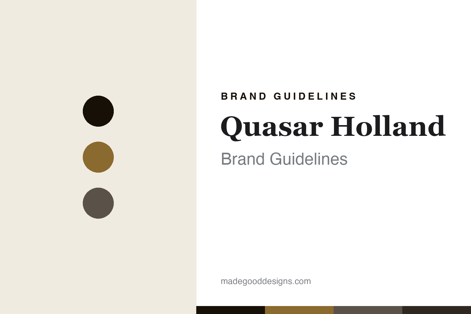
Quasar Holland Brand Guidelines
Cast in-house, in Giessen.
Aa
Two constants: a bronze-and-pewter palette and a luxe serif register. Abstract homage — not a Quasar Holland fixture or wordmark.
Cast in-house, in Giessen
Quasar Holland makes sculptural statement lighting in its own Dutch workshop.
Quasar Holland is a lesson in in-house making as the identity. A Dutch decorative-lighting house, it designs and manufactures sculptural, high-end statement fixtures in its own production hall in Giessen — the making is done under its own roof, and that is the belief the whole brand rests on.
Its identity is cast in-house, in Giessen. Quasar Holland’s avant-garde, cast-metal chandeliers and bespoke luminaires, built for hospitality and public spaces, are the work it is known for. Statement light, made at home. A family house that keeps its craft in one place.
(Honest notes, so the story stays precise. Quasar Holland is a Dutch brand based in Giessen, in the Netherlands; it was launched internationally at Euroluce in Milan in 1992 by Teun van Gammeren — so we frame 1992 as the international-launch date — and is now run by his sons, Arjens and John van Gammeren, as a second-generation family business. Its signature is avant-garde, decorative, sculptural statement lighting: cast-metal designs in finishes like raw and polished aluminium and bronze, highly bespoke and customisable, strong in hospitality, public space and large-scale chandeliers. On production, the honest point that is the heart of its identity: it manufactures in-house at its own Giessen facility, though we frame that as in-house making rather than a claim that literally every component of every line is Dutch-made. On ownership, it is independent and family-owned — its North American presence is handled by the distributor Zaneen, which is a distribution partner, not an owner. A couple of notes: its claim to have been first to put an LED into a decorative fixture is a self-reported one, which we attribute rather than assert, and it should not be confused with the unrelated “Quasar” electronics and telecom companies. Its named collections are IP we describe but never reproduce, and there is no official brand hex — these tones are an unofficial interpretation. This is design commentary and does not promote any product.)
Colour
Quasar Holland lives in a bronze-and-pewter palette. Click a swatch to copy the hex.
Quasar Holland’s identity is warm, metallic and luxe — a bronze, an ink, a pewter, a graphite, and a cream. The palette leans bronze and pewter: the register of cast metal and a warm, high-end interior. It signals craft and material over novelty. The honest caveat: with no published brand hex, these values are an original, unofficial interpretation, not first-party colours.
The lesson is a bronze-and-pewter palette signals a metal-cast, in-house identity. Quasar Holland’s world is a warm, metallic, luxe object. For designers, it is a reminder that a palette drawn from a real material — here, cast metal in bronze and pewter tones — can carry a maker’s identity more truthfully than a trend colour. Because a mid bronze can fail as small text, keep type dark and let the colour live in the accents, palette and band. The takeaways: root the palette in your material; keep it warm and metallic; make it yourself; and treat any single hex as unofficial.
Typography
The register is a luxe serif — refined, warm, high-end.
Quasar Holland’s identity carries a refined, warm, high-end spirit — a luxe object, not a mass one. A luxe serif captures the mood: elegant and substantial, the register of a decorative, bespoke lighting house. Set in a bronze-and-pewter palette, the luxe serif feels refined and warm — exactly the personality Quasar Holland carries. It is elegant rather than plain, mirroring a cast-metal chandelier. (Quasar Holland’s real fixtures, collections and wordmark are things we describe but do not reproduce, and the exact typeface is not ours to use.) Because it is not ours to use, the honest description is “a luxe-serif spirit,” shown here in a stand-in. The type behaves like the brand: refined, warm and high-end.
Aa
A luxe-serif spirit — refined and warm. (Specimen set in Playfair Display, a luxe-serif STAND-IN; NOT the Quasar Holland wordmark.)
In-house making as identity
Quasar Holland stands for cast in-house, in Giessen.
Quasar Holland is a lesson in making in-house production the identity. A bronze-and-pewter palette, a luxe serif and a workshop in Giessen make “we cast it ourselves” the whole brand — warm, metallic and refined. The making is the differentiator. The differentiator is keeping design and manufacture under one roof, so a bespoke, cast-metal fixture is fully the house’s own, from drawing to finish.
Put to work, the identity is a maker’s ethic as design. A house building in this spirit would keep its production close — its own workshop, its own hands — and let that control show in the quality and the customisation, so the customer buys into genuine making, not just a look. The lesson Quasar Holland teaches is that real in-house manufacture plus a warm, material-true design language can build a brand: the workshop gives it authenticity, and the craft gives it substance. The making is the personality, and the material is the proof.
For designers and brand-builders, Quasar Holland offers a clear takeaway: keep the making close and let it show. The lessons: manufacture in-house; root the palette in your material; offer real craft; and be honest about the story. It is also a reminder to stay accurate: Quasar Holland launched internationally in 1992, is a second-generation Dutch family business, and manufactures in-house at its Giessen facility — its LED “first” is a self-reported claim, Zaneen is a distributor rather than an owner, and the palette here is an unofficial interpretation. Quasar Holland made in-house casting the brand — proof that where you make it can be the difference.
Explore & save
Keep Quasar Holland’s identity on hand — save it to a board in the Made Good inspiration library.
Quasar Holland identity set
Pin the bronze-and-pewter palette and the luxe-serif register to your own board.


