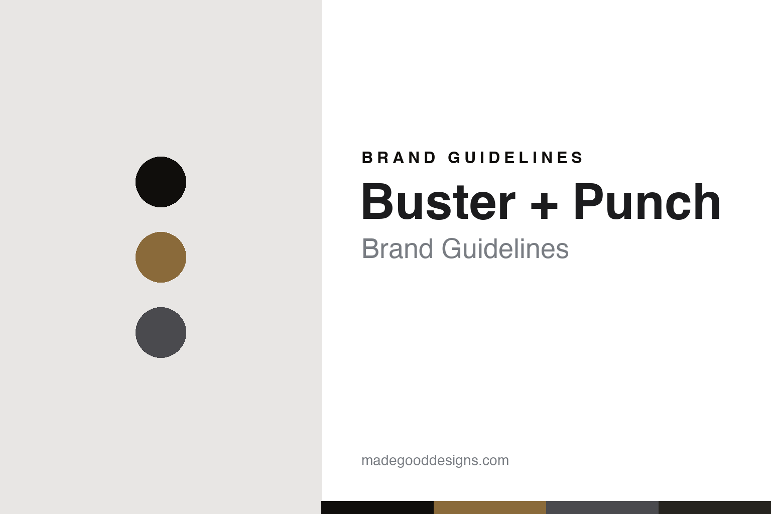
Buster + Punch Brand Guidelines
Detailing the overlooked.
Aa
Two constants: a brass-and-gunmetal palette and an industrial sans register. Abstract homage — not a Buster + Punch product or wordmark.
Detailing the overlooked
Buster + Punch turns the overlooked fittings of a home into design objects.
Buster + Punch is a lesson in the overlooked detail as the identity. A British design house from London, it built its name on taking the mundane fittings of a home — light switches, dimmers, sockets, door hardware and bulbs — and remaking them as tactile, solid-metal design objects.
Its identity is detailing the overlooked. Buster + Punch’s knurled solid metal, blackened and smoked finishes, and exposed-filament bulbs, carried with a rock-and-roll edge, are the work it is known for. The mundane, made precious. A brand that sweats the small parts.
(Honest notes, so the story stays precise. Buster + Punch is a British brand from London, launched in 2013 (its company incorporated in late 2012) by Massimo Buster Minale — who trained as an architect at Foster + Partners and Richard Rogers and customised vintage motorbikes by night, so we describe him as an architect and motorbike-customiser, not an “automotive designer.” Its signature is “detailing the overlooked”: turning switches, dimmers, sockets, door and cabinet hardware, hooks and bulbs into design objects, with cross-knurled solid metal, blackened, smoked and gunmetal finishes, and a motorcycle-and-London-subculture attitude. An important framing point: it is a design-led hardware-and-interiors house for which lighting is one core category, not a pure lighting brand, and we frame it that way honestly. On ownership, it is not a bootstrapped independent: it is venture and growth-equity backed, with investors including Mobeus Equity Partners and a chief executive, Martin Preen, while Minale remains founder and creative director — though it is not owned by a larger design conglomerate. On production, it markets a British-metalwork, “made in England” narrative, but sourcing records indicate some components are made in Asia, so the honest framing is that it is designed in London with UK finishing and assembly, and some components manufactured abroad. The company is vocally anti-knockoff, so we treat its wordmark, its knurled detailing and its product silhouettes as protected and never reproduce them, and there is no official brand hex — these tones are an unofficial interpretation. This is design commentary and does not promote any product.)
Colour
Buster + Punch lives in a brass-and-gunmetal palette. Click a swatch to copy the hex.
Buster + Punch’s identity is industrial, tactile and dark — a brass, an ink, a gunmetal, a graphite, and a smoke. The palette leans brass and gunmetal: the register of solid, knurled metal and a blackened, smoky finish. It signals material and detail over softness. The honest caveat: with no published brand hex, these values are an original, unofficial interpretation, not first-party colours.
The lesson is a brass-and-gunmetal palette signals an industrial, detail-led identity. Buster + Punch’s world is an industrial, tactile, dark object. For designers, it is a reminder that a palette of real metal tones — warm brass against cold gunmetal — can carry a brand obsessed with the feel of a fitting in the hand. Because a mid brass can fail as small text, keep type dark and let the colour live in the accents, palette and band. The takeaways: obsess over the detail; root the palette in metal; keep it tactile; and treat any single hex as unofficial.
Typography
The register is an industrial sans — solid, confident, machined.
Buster + Punch’s identity carries a solid, confident, machined spirit — a hard-edged object, not a soft one. An industrial sans captures the mood: heavy, blunt and precise, the register of knurled metal and machined parts. Set in a brass-and-gunmetal palette, the industrial sans feels solid and confident — exactly the personality Buster + Punch carries. It is machined rather than delicate, mirroring a knurled metal knob. (Buster + Punch’s real products, detailing and wordmark are things we describe but do not reproduce, and the exact typeface is not ours to use.) Because it is not ours to use, the honest description is “an industrial-sans spirit,” shown here in a stand-in. The type behaves like the brand: solid, confident and machined.
Aa
An industrial-sans spirit — solid and machined. (Specimen set in Archivo, an industrial-sans STAND-IN; NOT the Buster + Punch wordmark or detailing.)
A detail as identity
Buster + Punch stands for detailing the overlooked.
Buster + Punch is a lesson in making the overlooked detail the identity. A brass-and-gunmetal palette, an industrial sans and a fixation on switches, hardware and bulbs make small parts the whole brand — industrial, tactile and dark. The detail is the differentiator. The differentiator is treating the mundane fittings everyone ignores as objects worth designing, executed in solid, knurled metal with a consistent, dark attitude.
Put to work, the identity is an obsession as design. A house building in this spirit would find the overlooked parts of its category and lavish design on them, so the customer notices — and values — details that competitors treat as afterthoughts. The lesson Buster + Punch teaches is that a genuine obsession with detail plus a strong material language can build a brand: the overlooked object gives it a niche, and the finish gives it desirability. The detail is the personality, and the metal is the proof — with the ownership and the making described honestly rather than romanticised.
For designers and brand-builders, Buster + Punch offers a clear takeaway: design the parts everyone else ignores. The lessons: find the overlooked detail; execute it in real material; keep the attitude consistent; and be honest about the story. It is also a reminder to stay accurate: Buster + Punch launched in 2013, its founder Massimo Buster Minale is an architect and motorbike-customiser rather than an automotive designer, it is venture and growth-equity backed rather than a bootstrapped independent, and its “made in England” narrative is best framed as UK finishing and assembly with some components made abroad — it is a hardware-and-lighting house rather than a pure lighting brand, and the palette here is an unofficial interpretation. Buster + Punch made the overlooked detail the brand — proof that a small part can be the difference.
Explore & save
Keep Buster + Punch’s identity on hand — save it to a board in the Made Good inspiration library.
Buster + Punch identity set
Pin the brass-and-gunmetal palette and the industrial-sans register to your own board.


