What Font Does Renault Use?
Curious about what font Renault uses? The recognizable elements are the geometric diamond logo and a set of clean, modern capitals, both crafted specifically for the brand rather than pulled from a font shop. Below we cover the wordmark, the reported corporate type, and the free fonts that come closest. For more automotive breakdowns, start at our famous brand fonts hub, or see how French rival Peugeot compares in our Peugeot font guide.
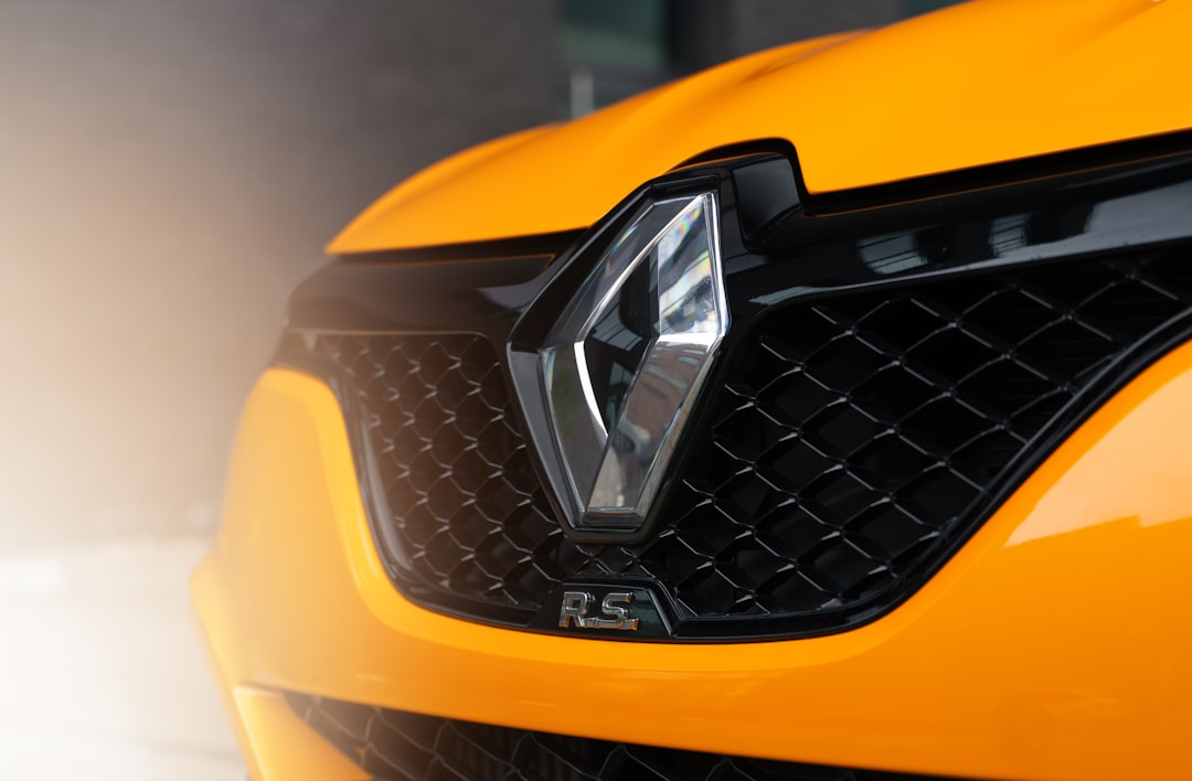
What font is the Renault logo?
Renault’s current wordmark sets “RENAULT” in upright sans-serif capitals with a clean, geometric construction and balanced spacing, positioned alongside or beneath the redesigned interlocking-diamond emblem. The letterforms favor simple, near-monolinear strokes and open shapes, giving the name a crisp, contemporary feel that matches the flat, minimal logo. This is custom lettering tuned to sit harmoniously with the rhombus mark, so it is not a font you can install. The defining quality is restraint: nothing decorative, just confident, even capitals.
What is Renault’s brand typeface?
For wider communications, Renault is reported to use a bespoke corporate sans, referenced in brand materials under names like Renault Life and Renault Group, designed to flex across advertising, digital products, and in-car interfaces. It is a clean, humanist-leaning sans built for legibility and a modern French character. As is standard for carmakers, that typeface is proprietary and not freely distributed, so treat specific names as informed observation rather than something you can verify by downloading. The dependable takeaway is the style: an upright, geometric-to-humanist sans with no ornament.
Free fonts that look like the Renault font
You can build a convincingly Renault-like layout with free, open-licensed type by leaning on geometric sans-serifs and keeping everything clean and minimal.
| Use case | Renault uses | Free alternative |
|---|---|---|
| Logo / wordmark | Custom geometric caps | Jost or Montserrat (caps, even tracking) |
| Headlines | Custom “Renault” sans (reported) | Montserrat or Jost SemiBold |
| Body / UI | Clean humanist sans | Inter or Source Sans 3 |
Jost is the standout free choice here: its geometric, Futura-inspired shapes echo the clean roundness of Renault’s modern capitals. Montserrat works for sturdier headlines, and Inter keeps interface and body copy neutral and readable. For more ideas, see our best sans-serif fonts collection.
Why does Renault use this kind of type?
Renault’s recent rebranding pushed hard toward minimalism, and the typography follows that lead. A flat, geometric sans reads as forward-looking and tech-aware, which suits a brand investing heavily in electric models and software-defined cars. Clean capitals also play nicely with the simplified diamond emblem, letting the logo and name feel like one cohesive system rather than two competing elements. By avoiding serifs, italics, or decorative flourishes, Renault signals clarity and efficiency, values that translate well to digital screens and global markets where a neutral, legible look travels easily. It is a deliberately modern, slightly understated identity for a brand reinventing itself for the EV era.
Can I use the Renault font for my own project?
Renault’s name, diamond emblem, and wordmark are registered trademarks. You must not reproduce them, or a close imitation, to brand your own products or suggest any affiliation with Renault. That restriction applies regardless of which font you use to recreate the look. The free alternatives above are safe for your own original designs as long as you honor each font’s license. Before publishing anything commercial, review our font licensing guide so you understand exactly what is permitted.
Frequently Asked Questions
What font does the Renault logo use?
The Renault logo uses custom geometric sans-serif capitals rather than a retail font, designed to pair with the diamond emblem. You cannot download it directly. To approximate it, set Jost or Montserrat in capitals with even spacing, which captures the clean, modern roundness of the original wordmark.
Is the Renault font free to download?
No. Renault’s wordmark and its reported bespoke corporate sans are proprietary and not publicly distributed. The closest free substitutes are Jost, Montserrat, and Inter. You can use those in your own original projects within their licenses, but you cannot legally recreate Renault’s trademarked logo for commercial purposes.
What is the Renault brand typeface called?
Renault is reported to use a custom corporate sans referenced in brand materials under names such as Renault Life and Renault Group. These are proprietary fonts rather than downloadable ones, so the names are best treated as informed observation. The practical takeaway is a clean, modern, humanist-leaning sans.
Does Renault use a geometric font?
Yes, broadly speaking. Renault’s modern wordmark and emblem lean geometric, with simple, near-monolinear strokes and open, rounded shapes. That geometric character reinforces the brand’s minimal, tech-forward repositioning. Free geometric sans-serifs like Jost capture this feel better than grotesque or humanist faces with more contrast.
Can I use a Renault-style font commercially?
You can use free alternatives such as Jost, Montserrat, or Inter commercially if their licenses allow it, which they generally do. What you cannot do is copy Renault’s trademarked diamond emblem or wordmark to brand your own goods. Keep your work original and confirm each font’s license before release.


