What Font Does Peugeot Use?
Want to know what font Peugeot uses? The short version is that the modern Peugeot mark relies on its sculpted lion crest plus a clean, confident set of spaced-out capitals, both custom-drawn for the brand. This guide explains the wordmark, the reported supporting type, and the free fonts that recreate the effect. For more carmaker typography, browse our famous brand fonts hub, or compare Peugeot’s French rival in our Rolls-Royce font guide.
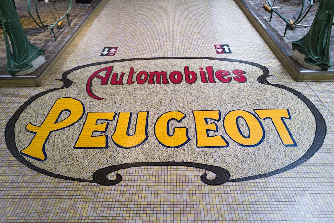
What font is the Peugeot logo?
Beneath the three-dimensional lion shield, “PEUGEOT” is set in upright sans-serif capitals with notably wide, even letter-spacing. The letterforms are clean and geometric in feel, with consistent stroke weight and open counters that read clearly at any size. This is a custom wordmark rather than an off-the-shelf font, refined over successive rebrands to feel premium and contemporary. The defining trait is the tracking: the generous space between letters gives the name a calm, deliberate, slightly luxurious cadence that you can approximate but not download directly.
What is Peugeot’s brand typeface?
For broader communications, Peugeot is reported to use a bespoke corporate sans, often referred to in brand circles as a custom “Peugeot” typeface, designed to carry the same modern French elegance as the wordmark. It is a clean, neutral sans built for clarity across digital interfaces, signage, and print. As with most carmakers, that proprietary font is not distributed publicly, so any specific name should be treated as informed observation rather than confirmed fact. What designers can reliably take away is the direction: an upright, well-spaced, contemporary sans with no decorative quirks.
Free fonts that look like the Peugeot font
You can capture the spaced, premium-modern Peugeot feel using free, open-source type. The key moves are wide letter-spacing on headlines and a neutral sans for everything else.
| Use case | Peugeot uses | Free alternative |
|---|---|---|
| Logo / wordmark | Custom letter-spaced caps | Montserrat or Archivo (caps, wide tracking) |
| Headlines | Custom “Peugeot” sans (reported) | Archivo or Montserrat SemiBold |
| Body / UI | Clean neutral sans | Inter or Source Sans 3 |
Montserrat set in capitals with wide tracking mimics the wordmark’s calm geometry beautifully. Archivo offers a touch more grotesque grit for headlines, and Inter keeps interface text crisp and unobtrusive. For more pairings, see our best sans-serif fonts guide.
Why does Peugeot use this kind of type?
Peugeot has positioned itself as an upmarket, design-led French brand, and its typography does the diplomatic work of signaling premium without shouting. Wide letter-spacing reads as composure and confidence, the typographic equivalent of speaking slowly and clearly. A geometric, even-weighted sans feels engineered and modern, aligning with the brand’s clean dashboards and sculptural exterior design. By keeping the lion as the emotional centerpiece and letting the type stay disciplined and neutral, Peugeot creates a hierarchy where the crest carries heritage and prestige while the words deliver quiet, legible authority. It is a measured, distinctly European approach that suits a marque trying to climb the perceived-quality ladder.
Can I use the Peugeot font for my own project?
The Peugeot name, lion emblem, and wordmark are registered trademarks. You should not reproduce them, or a near-identical imitation, to brand your own products or imply any link to Peugeot. Even using the same look on a competing automotive product invites legal trouble. The free alternatives listed above are fine for your own original designs, provided you respect each font’s license terms. Before any commercial release, walk through our font licensing guide to stay on the right side of the line.
Frequently Asked Questions
What font is used in the Peugeot logo?
The Peugeot wordmark uses custom, letter-spaced sans-serif capitals rather than a downloadable font. The spacing and proportions were drawn specifically for the brand. To recreate the look, set Montserrat or Archivo in caps and widen the tracking until the letters breathe the way the original mark does.
Does Peugeot use Montserrat?
Peugeot does not officially use Montserrat; its identity relies on a custom wordmark and a reported bespoke brand sans. However, Montserrat is the most popular free stand-in because its geometric forms and clean caps closely echo the spaced, modern feel of the Peugeot lettering when tracked out wide.
Is the Peugeot font a serif or sans-serif?
It is sans-serif. Both the letter-spaced wordmark and Peugeot’s reported marketing typeface are clean sans-serifs with no decorative serifs. This keeps the brand reading as modern, engineered, and French-premium, and it ensures legibility across dashboard screens, signage, and digital channels.
Why is the Peugeot wordmark so widely spaced?
Wide letter-spacing reads as composure and luxury. It slows the eye, gives the name a deliberate rhythm, and signals premium positioning. For Peugeot, which markets itself as an upmarket French brand, that calm, spacious treatment communicates confidence and quality far more effectively than tightly packed letters would.
Can I download the exact Peugeot font for free?
No. Peugeot’s wordmark and corporate sans are proprietary and not distributed publicly. The closest free options are Montserrat, Archivo, and Inter, which you can use for your own original projects within their licenses. Just avoid recreating Peugeot’s trademarked logo or wordmark for commercial use.


