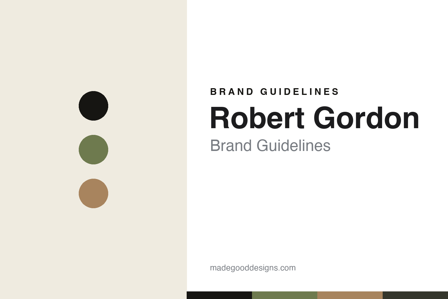
Robert Gordon Brand Guidelines
The family pottery.
Aa
Two constants: an olive-and-clay palette and a warm sans register. Abstract homage — not a Robert Gordon piece or wordmark.
The family pottery
Robert Gordon has thrown and glazed stoneware in Victoria for three generations.
Robert Gordon is a lesson in a family pottery as the identity. An Australian pottery from Victoria, it makes hand-crafted stoneware in its own factory — a family business across generations.
Its identity is the family pottery. Robert Gordon’s hand-decorated, high-fired stoneware — earthy reactive glazes, made in Australia — is the work it is known for. Clay as a family trade. The pottery, kept in the family.
(Honest notes: Robert Gordon is an Australian family pottery in Pakenham, Victoria. Its lineage begins with June Dyson and Colin Gordon, who set up studios around 1945; their son Robert “Andy” Gordon and his wife Barbara started “Pack Track Pottery” in Gembrook in 1978, which became Robert Gordon Pottery and moved to a purpose-built Pakenham factory in 1987, now run by the third generation, Hannah and Bobby Gordon — so its “since 1945” framing is the studio lineage, while the Robert Gordon business itself dates to the late 1970s, and we flag both. Its signature is hand-crafted stoneware — hand-decorated, high-fired tableware and homewares with earthy reactive glazes, made from recycled clay in solar-assisted kilns, plus contract and restaurant ware. On production, an honest nuance: its core range is genuinely made in its own Pakenham factory — the largest production pottery in Australia — but the brand also imports designed-in-Australia collections made with offshore partners, so it is not a blanket “made in Australia.” It is independent and family-run. Its glaze names and collections are IP we describe but don’t reproduce. There’s no official brand hex — these tones are an unofficial interpretation. This is design commentary and does not promote any product.)
Colour
Robert Gordon lives in an olive-and-clay palette. Click a swatch to copy the hex.
Robert Gordon’s identity is earthy, warm and honest — an olive, an ink, a clay, a graphite, and an oat. The palette leans olive and clay — the register of earthy reactive glazes on high-fired stoneware. It signals craft and place rather than novelty. The honest caveat: with no published brand hex, these tones are an original, unofficial interpretation, not first-party values.
The lesson is an olive-and-clay palette signals a family pottery. Robert Gordon’s world is an earthy, warm, honest object. For designers, it is a reminder that a family and a place — three generations of the same pottery — can be the whole identity, and that an earthy, natural palette signals that craft. Because a mid olive can fail as small text, keep type dark and let the colour live in the accents, palette and band. The takeaways: keep it in the family; own the making; be honest about the range; and treat any single hex as unofficial.
Typography
The register is a warm sans — friendly, grounded, humane.
Robert Gordon’s identity carries a friendly, grounded, humane spirit — an earthy, handmade object. A humanist, warm sans captures the mood: it is approachable and honest, the register of family craft. Set in an olive-and-clay palette, the warm sans feels friendly and grounded — exactly the personality Robert Gordon carries. It is warm rather than clinical, mirroring a high-fired stoneware piece. (Robert Gordon’s real pieces and wordmark are works we describe but do not reproduce, and the exact typeface is not ours to use.) Because it is not ours to use, the honest description is “a warm sans spirit,” shown here in a stand-in. The type behaves like the brand: friendly, grounded and humane.
Aa
A warm sans spirit — friendly and grounded. (Specimen set in Figtree, a humanist warm sans STAND-IN; NOT the Robert Gordon wordmark.)
A family pottery as identity
Robert Gordon stands for the family pottery.
Robert Gordon is a lesson in making a family and a factory the identity. An olive-and-clay palette, a warm sans and a hand-crafted piece make the family pottery the whole brand — earthy, warm, honest. The pottery is the differentiator. The differentiator is continuity and place: three generations making stoneware in their own Australian factory, from recycled clay in solar-assisted kilns.
Put to work, the identity is a family trade as design. A pottery building in this spirit would keep the craft in the family, own its factory, and let its earthy, honest character run through everything — while being straight about which ranges are made at home and which are imported. The lesson Robert Gordon teaches is that a family, a factory and honesty can build a brand: real Australian manufacture, a recognisable earthy look, and a warm, grounded design language give it a credibility that a purely offshore brand can’t claim — as long as the made-where story is told plainly. The family is the trust, and the factory is the proof.
For designers and brand-builders, Robert Gordon offers a clear takeaway: own the making, and be honest about the range. The lessons: keep the craft in the family; own the factory; disclose what’s imported; and be honest about the story. It is also a reminder to stay accurate: its “since 1945” framing is the studio lineage, while the Robert Gordon business dates to the late 1970s, and its core range is Australian-made while some collections are imported — the palette here is an unofficial interpretation. Robert Gordon made the family pottery the brand — proof that continuity can be the difference.
Explore & save
Keep Robert Gordon’s identity on hand — save it to a board in the Made Good inspiration library.
Robert Gordon identity set
Pin the olive-and-clay palette and the warm-sans register to your own board.


