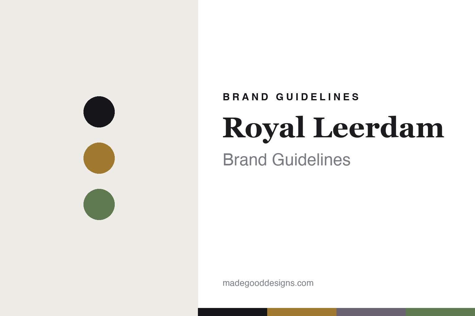
Royal Leerdam Brand Guidelines
The Copier glass.
Aa
Two constants: a topaz-and-smoke palette and a heritage serif register. Abstract homage — not the Royal Leerdam glass or packaging.
The Copier glass
Royal Leerdam made Dutch glass a design story.
Royal Leerdam is a lesson in design as heritage. Founded in the 1870s in Leerdam, the Netherlands, the glassworks became, in the 20th century, one of the great names of design-led “democratic” Dutch glass — glass shaped by designers for everyday life, and celebrated art glass alongside it.
Its identity is design-led Dutch glass, anchored by Andries (A.D.) Copier — for decades the factory’s leading designer (tied to Leerdam from 1914 to 1971) — with a roster that also drew in de Bazel, Berlage and even Frank Lloyd Wright. Its Unica art-glass one-offs, its Serica series, and its Gildeglas wine service (introduced 1930, still made) tell the story. Design, made a Dutch heritage.
(Honest notes: the design romance is largely historical. The founding is best given as the 1870s (sources point to the mid-1870s, not a clean 1878); ownership changed hands many times — through Libbey and, since 2022, the Dutch firm Anders Invest — and art-glass production at Leerdam ended in 2020, moving to Royal Delft, with utility production split between the Netherlands and Portugal. So we don’t claim current tableware is “made in the Netherlands.” There’s no official brand hex, so these tones are an unofficial interpretation. This is design commentary and does not promote any product.)
Colour
Royal Leerdam lives in a topaz-and-smoke palette. Click a swatch to copy the hex.
Royal Leerdam’s identity is designed, Dutch and quietly historic — a topaz, an ink, a smoke, a moss, and an ivory. The palette pairs a topaz with a smoke — the register of Copier’s art and utility glass. It signals design and heritage rather than novelty. The honest caveat: with no published brand hex, these tones are an original, unofficial interpretation, not first-party values.
The lesson is a topaz with a smoke signals a design-led glass heritage. Royal Leerdam’s world is a designed, everyday glass with an art-glass soul. For designers, it is a reminder that “democratic design” — good glass for daily life — can be a lasting identity. Because a mid topaz can fail as small text, keep type dark and let the colour live in the accents, palette and band. The takeaways: make design the heritage; keep the democratic mission; name the designers; and treat any single hex as unofficial.
Typography
The register is a heritage serif — designed, Dutch, historic.
Royal Leerdam’s identity carries a designed, Dutch, historic spirit — a designed, everyday glass. A classic old-style serif captures the mood: it is dignified and considered, the register of a royal-warranted heritage. Set in a topaz-and-smoke palette, the heritage serif feels designed and historic — exactly the personality Royal Leerdam carries. It is considered rather than flashy, mirroring democratic design glass. (Royal Leerdam’s real glass and wordmark are works we describe but do not reproduce, and the exact typeface is not ours to use.) Because it is not ours to use, the honest description is “a heritage serif spirit,” shown here in a stand-in. The type behaves like the brand: designed, Dutch and historic.
Aa
A heritage serif spirit — designed and historic. (Specimen set in EB Garamond, a classic old-style serif STAND-IN; NOT the Royal Leerdam packaging.)
Design as heritage
Royal Leerdam stands for design-led democratic Dutch glass.
Royal Leerdam is a lesson in making design the heritage. A topaz-and-smoke palette, a heritage serif and a designed, everyday glass make design the whole brand — designed, Dutch, historic. The design is the differentiator. The differentiator is Copier’s democratic Dutch glass.
For designers and brand-builders, Royal Leerdam offers a clear takeaway: a design mission can become a lasting identity. The lessons: make design the heritage; keep the democratic mission; name the designers; and be honest about the present. It is also a reminder to stay accurate: it was founded in the 1870s, its ownership passed through Libbey to Anders Invest (2022), art glass ended at Leerdam in 2020, production is split NL/Portugal, and the palette here is an unofficial interpretation. Royal Leerdam made design the heritage — proof that democratic design can be the difference.
Explore & save
Keep Royal Leerdam’s identity on hand — save it to a board in the Made Good inspiration library.
Royal Leerdam identity set
Pin the topaz-and-smoke palette and the heritage-serif register to your own board.


