Tele Vue Brand Guidelines
The wide-field eyepiece house.
Aa
Two constants: a Nagler-gold palette and a legacy-serif register. Abstract homage — not a Tele Vue product or mark; no eyepiece, telescope or logo is reproduced.
The wide-field eyepiece house
Tele Vue is the New York optics house founded by the late Al Nagler, whose ultra-wide eyepieces gave amateur astronomers a spacewalk view.
Tele Vue brings the deep-sky round its eyepiece node — the New York house that made the view through the telescope, not just the telescope, into the thing you buy. It was founded in 1977 by Al Nagler, with his wife Judi, and grew from a small operation into the reference name in wide-field eyepieces. Al Nagler, who was born in 1935, died in October 2025; his son David Nagler, who joined the company in 1998, is its president, and it remains a private, family-owned business. Tele Vue designs and sells the optics, and its answer to a round about where telescopes are made is a careful one: designed and one-hundred-per-cent quality-controlled in New York, with the optics manufactured in Japan and Taiwan.
Its identity is the wide-field eyepiece house. The founder’s legacy, the ultra-wide view and the New York design-and-QC are the story here. An eyepiece, wide-field. The wide-field eyepiece house.
(Honest notes, so the founder is honoured in the past tense and the where-made claim is precise. Tele Vue sells eyepieces and small refractors as its heroes — the Nagler ultra-wides that started in 1982, the hundred-degree Ethos, the Panoptic and Delos lines, and compact Nagler-Petzval refractors such as the TV-85 and NP101 — and we report its performance language as the brand’s own. On the founder: Al Nagler died in October 2025, so we write of him as the late founder and describe his legacy in the past tense, with David Nagler continuing the company. On where it is made, a nuance that matters: Tele Vue’s optics are designed in the USA and every unit is quality-controlled in New York, but the eyepieces themselves are manufactured in Japan and Taiwan — so we say designed and QC’d in New York, made in Japan and Taiwan, and do not call them made in the USA. Its designs, the model names and the logo are IP we describe but do not reproduce; there is no official brand hex; these tones are an unofficial interpretation.)
Colour
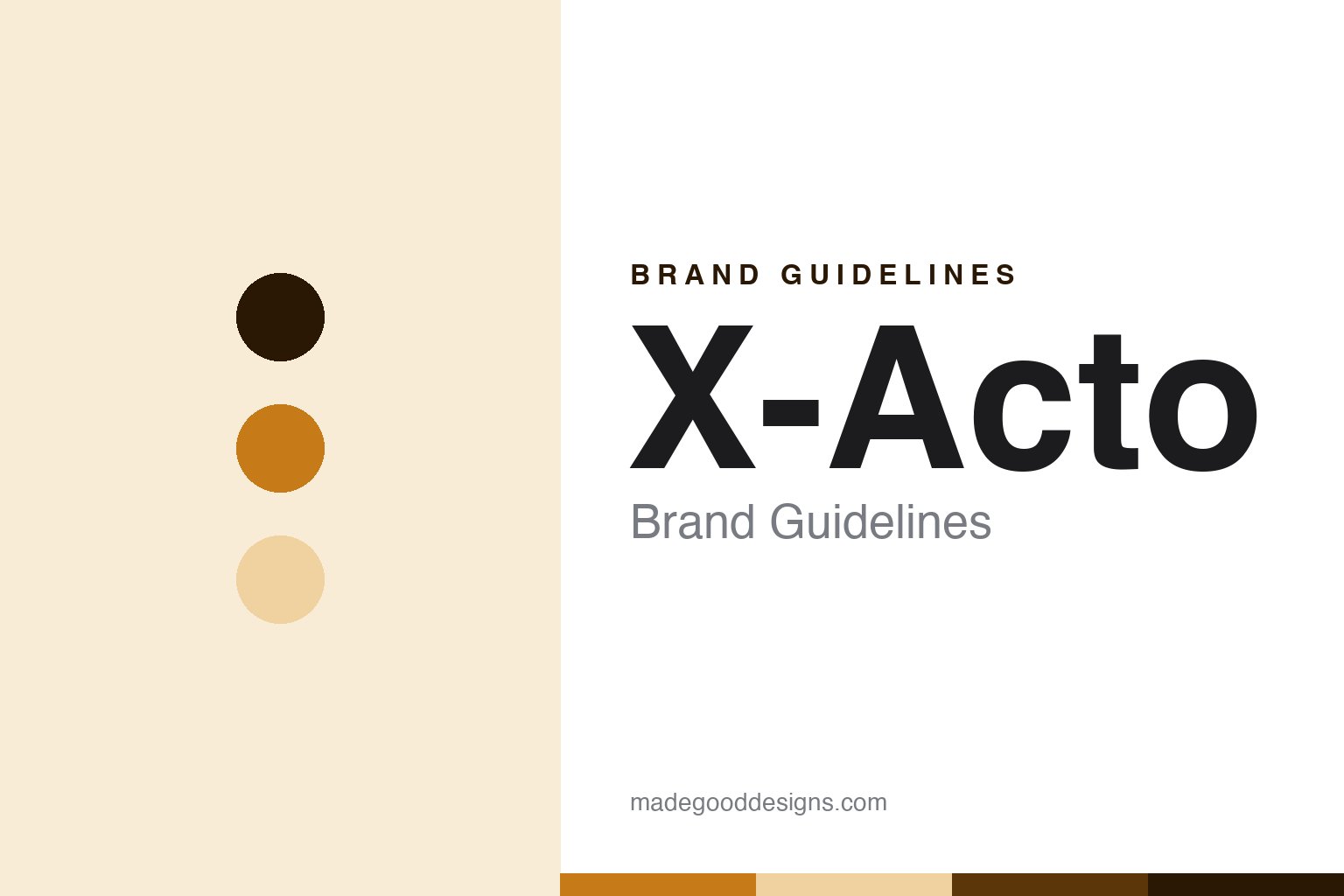
Tele Vue lives in a Nagler gold. Click a swatch to copy the hex.
Tele Vue’s identity is storied, optical and wide — a Nagler gold, an ink, a pale sand, a deep bronze, and a paper. The palette leans Nagler gold and pale sand: a warm, refined register that nods to coated glass and a life spent in optics rather than a loud logo colour. It signals a wide-field eyepiece house — considered, storied and made to be looked through. The honest caveat: with no published brand hex, these values are an original, unofficial interpretation, not first-party colours.
The lesson is a Nagler gold signals a storied, optical identity. Tele Vue’s world is a wide, immersive view — the sky spread out to the edges of the field. For designers, it is a reminder that a warm Nagler gold and a soft pale sand can carry a maker brand — an optical, storied tone held as colour, not a product shot. Because these tones can fail as small text, keep type dark and let the colour live in the accents, palette and band. The takeaways: honour Al Nagler in the past tense; date it to 1977; state the designed-in-NY, made-in-Asia reality; and treat any single hex as unofficial.
Typography
The register is a legacy serif — storied, optical, considered.
Tele Vue’s identity carries a storied, optical, considered spirit — a founder’s optics house, not a mass maker. A legacy serif captures the mood: elegant, warm and confident, the register of a brand built on a lifetime of eyepiece design. Set in a Nagler-gold palette, the legacy serif feels storied and considered — exactly the personality Tele Vue carries. It behaves like a made, optical thing rather than a loud logo, mirroring coated glass and machined barrels. (Tele Vue’s real eyepieces, refractors and model names are things we describe but do not reproduce, and the exact typeface is not ours to use.) Because it is not ours to use, the honest description is “a legacy-serif brand,” shown here in a stand-in. The type behaves like the brand: storied, optical and considered.
Aa
A legacy-serif brand — storied and optical. (Specimen set in Cormorant Garamond, a legacy-serif STAND-IN; NOT the Tele Vue logo or any eyepiece.)
The deep sky
Tele Vue stands for the wide-field eyepiece house.
Tele Vue brings the round its eyepiece node. A Nagler-gold palette, a legacy serif and a 1977 founding make one thing — the wide-field eyepiece house — the whole identity: storied, optical and wide. The founder’s legacy is the pitch, and the ultra-wide view is the proof. The point is the house that made the view itself the product, in a round about where telescopes are made and who designs the optics.
Put to work, the identity is the brand told straight, the founder honoured and the where-made claim precise. A maker in this spirit would honour Al Nagler in the past tense, date it to 1977, and state the designed-in-NY, made-in-Asia reality. A reader in this spirit would keep the facts right: Tele Vue sells eyepieces and small refractors as its heroes, led by the Nagler ultra-wides and the hundred-degree Ethos; it was founded in 1977 by Al Nagler, who died in 2025, with David Nagler now president; it is a private, family-owned company; and its optics are designed and QC’d in New York but manufactured in Japan and Taiwan. Tele Vue sits among the round’s American design houses, after Astro-Physics. The honest editorial moves are to date it to 1977, to write the founder in the past tense, to keep the where-made claim precise, and to protect the model names as marks.
For designers and brand-builders, Tele Vue continues the deep sky: let a founder’s optical legacy be the identity — and be precise that designed-and-QC’d is not made-in-country. The lessons: build a brand on a distinctive experience rather than a spec; honour a late founder honestly; separate design and quality control from where a product is manufactured; describe signature products rather than depict them; and never reproduce a logo. It is also a reminder to stay precise: Tele Vue is the New York optics house founded by the late Al Nagler, whose ultra-wide eyepieces gave amateur astronomers a spacewalk view — with the palette here an unofficial interpretation. The hook is Nagler’s own path: before Tele Vue, he designed the optics for the Apollo and Gemini Lunar-Module astronaut simulators, and he spent the rest of his life building eyepieces that gave amateurs at the telescope something of that immersive, walk-in-space wide-field feeling. Read that way, Tele Vue is less an eyepiece than a window: storied, optical, considered. The lesson for a brand is that a founder’s legacy and honest sourcing reinforce each other, and naming where things are made keeps the story earned. Tele Vue made the-wide-field-eyepiece-house the identity — proof that the view carries a round.
Explore & save
Keep Tele Vue’s identity on hand — save it to a board in the Made Good inspiration library.
Tele Vue identity set
Pin the Nagler-gold palette and the legacy-serif register to your own board.