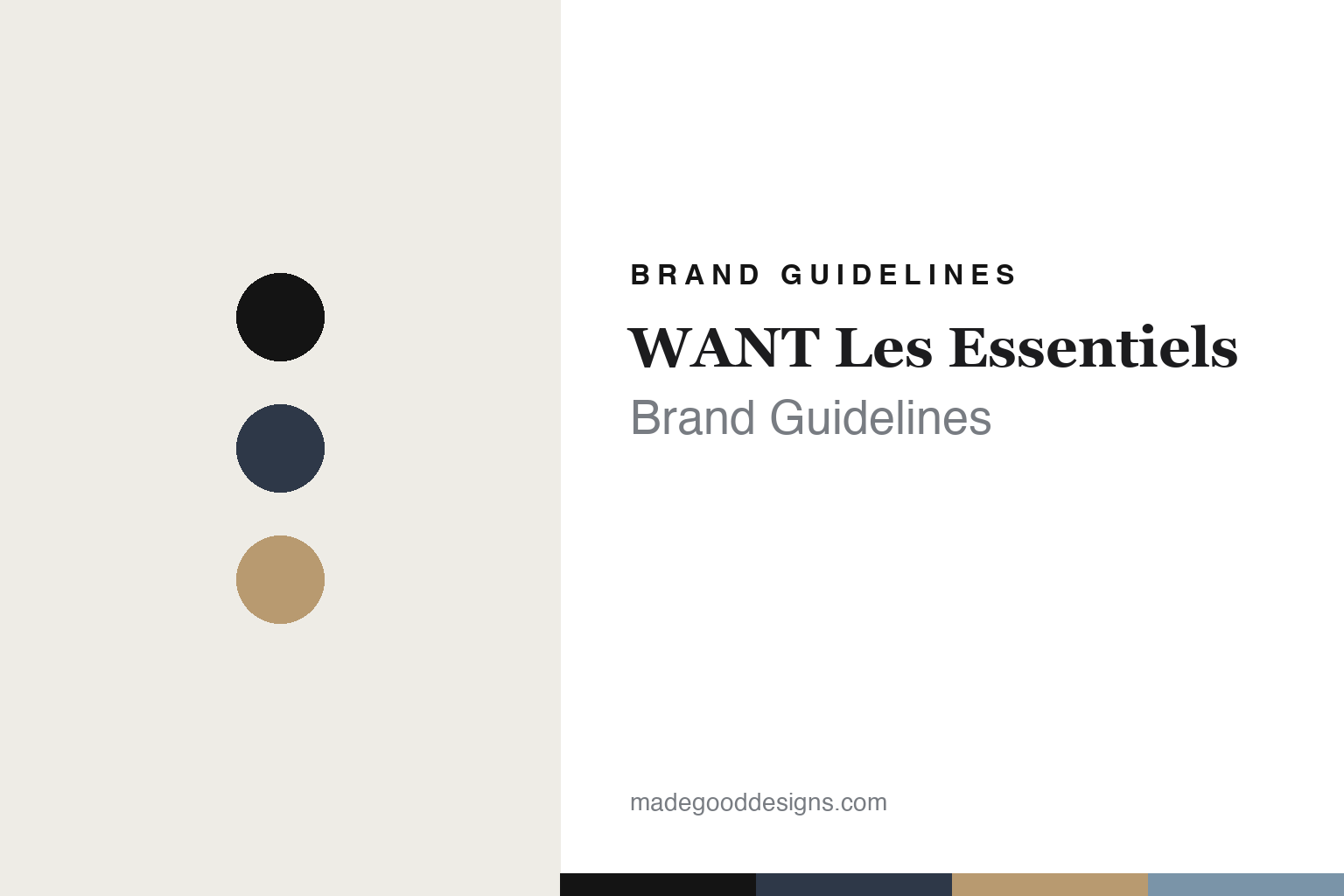
WANT Les Essentiels Brand Guidelines
The airport code.
Aa
Two constants: a navy-and-tan palette and a refined serif register. Abstract homage — not the WANT Les Essentiels products or packaging.
The airport code
WANT Les Essentiels names its bags for airports.
WANT Les Essentiels is a lesson in a naming system as identity. Founded in 2007 in Montreal by twin brothers Byron and Dexter Peart, it built a refined, minimalist travel label with one clever tell: it names its bags for airports.
Its identity is minimalist premium travel bags with airport-code names. Totes, weekenders, backpacks and briefcases in understated leather and canvas carry names like O’Hare (its best-seller), Kastrup and Kenyatta — the codes of the world’s airports turned into a coherent, travel-native vocabulary. Quiet luxury, mapped to the departures board.
(Honest notes: the founding year is 2007 (not 2006), and the Peart twins are confirmed. The founders left in 2018 to build another venture; the brand is currently active and speaks of a 2024 “new chapter,” but its current owner isn’t disclosed, so we hedge the ownership. Its manufacturing location isn’t stated. We use the verified O’Hare/Kastrup/Kenyatta names and drop unconfirmed ones. There’s no official brand hex, so these tones are an unofficial interpretation. This is design commentary and does not promote any product.)
Colour
WANT Les Essentiels lives in a navy-and-tan palette. Click a swatch to copy the hex.
WANT Les Essentiels’ identity is refined, minimal and well-travelled — a deep navy, an ink, a warm tan, a sky, and a cream. The palette pairs a navy with a tan — the register of quiet-luxury travel goods. It signals restraint and travel rather than novelty. The honest caveat: with no published brand hex, these tones are an original, unofficial interpretation, not first-party values.
The lesson is a navy with a tan signals a minimalist travel brand. WANT’s world is an understated, airport-named bag. For designers, it is a reminder that a coherent naming system — airports, here — can give a whole range identity and meaning. Because a deep navy can fail as small text, keep type dark and let the colour live in the accents, palette and band. The takeaways: build a naming system; keep the design restrained; let the theme carry meaning; and treat any single hex as unofficial.
Typography
The register is a refined serif — minimal, travelled, quiet.
WANT Les Essentiels’ identity carries a minimal, travelled, quiet spirit — an understated travel bag. A refined roman serif captures the mood: it is elegant and calm, the register of quiet luxury. Set in a navy-and-tan palette, the refined serif feels minimal and travelled — exactly the personality WANT carries. It is restrained rather than showy, mirroring understated travel goods. (WANT’s real products and wordmark are works we describe but do not reproduce, and the exact typeface is not ours to use.) Because it is not ours to use, the honest description is “a refined serif spirit,” shown here in a stand-in. The type behaves like the brand: minimal, travelled and quiet.
Aa
A refined serif spirit — minimal and travelled. (Specimen set in Marcellus, a refined roman serif STAND-IN; NOT the WANT Les Essentiels packaging.)
A naming system as identity
WANT Les Essentiels stands for airport-named travel bags.
WANT Les Essentiels is a lesson in making a naming system the identity. A navy-and-tan palette, a refined serif and an understated bag make airport-code naming the whole brand — minimal, travelled, quiet. The system is the differentiator. The differentiator is a range mapped to the world’s airports.
For designers and brand-builders, WANT offers a clear takeaway: a coherent naming system can carry a brand. The lessons: build a naming system; keep the design restrained; let the theme mean something; and be honest about the story. It is also a reminder to stay accurate: it’s a 2007 Montreal brand founded by the Peart twins, now in a post-founder “new chapter” with an undisclosed owner, and the palette here is an unofficial interpretation. WANT made a naming system the brand — proof that a system can be the difference.
Explore & save
Keep WANT Les Essentiels’s identity on hand — save it to a board in the Made Good inspiration library.
WANT Les Essentiels identity set
Pin the navy-and-tan palette and the refined-serif register to your own board.


