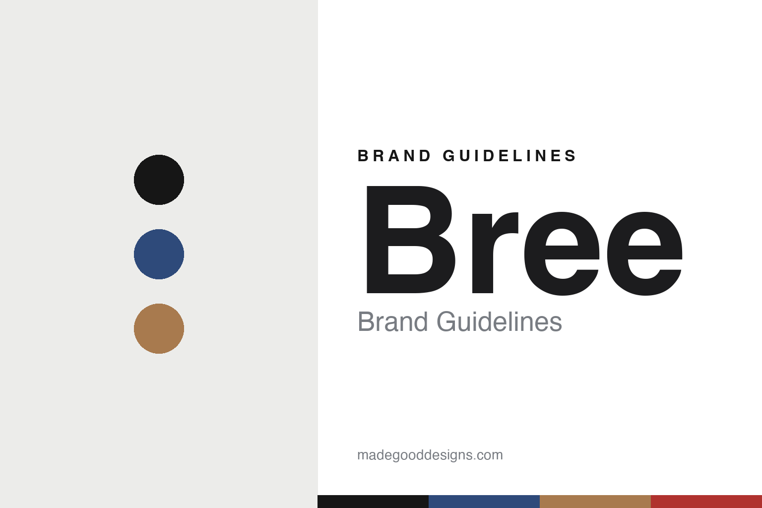
Bree Brand Guidelines
The Bauhaus leather.
Aa
Two constants: a blue-and-tan palette and a Bauhaus sans register. Abstract homage — not the Bree products or packaging.
The Bauhaus leather
Bree makes leather goods form-follows-function.
Bree is a lesson in Bauhaus, in leather. Founded in 1970 in Hamburg by Wolf Peter Bree and his wife Renate Bree, the German house built its bags on a design creed rather than a trend.
Its identity is form-follows-function leather goods. Bree’s language, in its own words, is “inspired by the Bauhaus tradition” — “clarity in thinking, reduction in expression” — high-quality natural leather made into clean, functional bags and business goods where nothing is decorative for its own sake. Reduction as luxury, in a material that ages beautifully.
(Honest notes: the surname is Bree (no accent), and the founders are Wolf Peter and Renate Bree. Importantly, the original company went insolvent and was dissolved in 2024; the brand rights were acquired by Müller & Meirer Lederwarenfabrik, so Bree today is a brand under new ownership, not the family firm. We keep to the verified Bauhaus/leather identity and drop unconfirmed line names and specific award claims; its current manufacturing country isn’t confirmed. There’s no official brand hex, so these tones are an unofficial interpretation. This is design commentary and does not promote any product.)
Colour
Bree lives in a blue-and-tan palette. Click a swatch to copy the hex.
Bree’s identity is functional, reductive and German — a Bauhaus blue, an ink, a leather tan, a Bauhaus red, and a chalk. The palette nods to Bauhaus primaries with a leather tan — the register of form-follows-function design. It signals reduction and craft rather than novelty. The honest caveat: with no published brand hex, these tones are an original, unofficial interpretation, not first-party values.
The lesson is Bauhaus primaries with a leather tan signal a reductive design house. Bree’s world is a clean, functional leather bag. For designers, it is a reminder that a design philosophy — form follows function — can be the whole identity of a leather brand. Because a mid blue can fail as small text, keep type dark and let the colour live in the accents, palette and band. The takeaways: adopt a design creed; strip the decoration; let material and function speak; and treat any single hex as unofficial.
Typography
The register is a Bauhaus sans — functional, reductive, German.
Bree’s identity carries a functional, reductive, German spirit — a form-follows-function bag. A geometric Bauhaus-lineage sans captures the mood: it is clean and rational, the register of reductive design. Set in a blue-and-tan palette, the Bauhaus sans feels functional and reductive — exactly the personality Bree carries. It is essential rather than decorative, mirroring form-follows-function leather. (Bree’s real products and wordmark are works we describe but do not reproduce, and the exact typeface is not ours to use.) Because it is not ours to use, the honest description is “a Bauhaus sans spirit,” shown here in a stand-in. The type behaves like the brand: functional, reductive and German.
Aa
A Bauhaus sans spirit — functional and reductive. (Specimen set in Jost, a geometric Bauhaus-lineage sans STAND-IN; NOT the Bree packaging.)
Bauhaus, in leather
Bree stands for form-follows-function leather goods.
Bree is a lesson in making a design creed the identity. A blue-and-tan palette, a Bauhaus sans and a functional leather bag make form-follows-function the whole brand — functional, reductive, German. The creed is the differentiator. The differentiator is Bauhaus reduction, in leather.
For designers and brand-builders, Bree offers a clear takeaway: let a design philosophy define the brand. The lessons: adopt a creed; strip the decoration; let material and function speak; and be honest about the story. It is also a reminder to stay accurate: it’s a 1970 Hamburg house founded by Wolf Peter and Renate Bree, dissolved in 2024 and now a brand under Müller & Meirer, and the palette here is an unofficial interpretation. Bree made a creed the brand — proof that a philosophy can be the difference.
Explore & save
Keep Bree’s identity on hand — save it to a board in the Made Good inspiration library.
Bree identity set
Pin the blue-and-tan palette and the Bauhaus-sans register to your own board.


