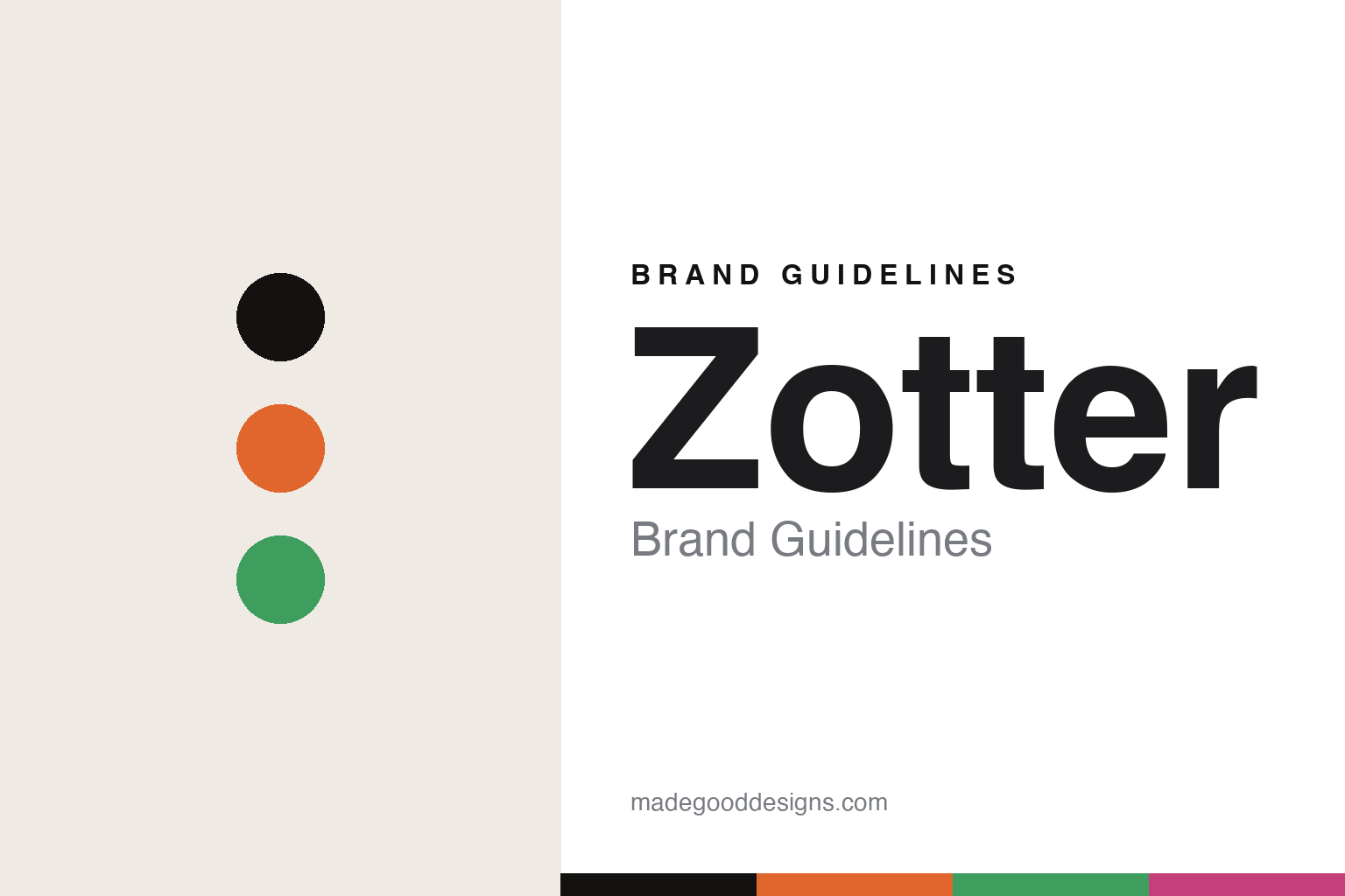
Zotter Brand Guidelines
The wrapper is a canvas.
Aa
Two constants: a bright, illustrated palette and a plain sans register. Abstract homage — not the Zotter packaging.
The wrapper is a canvas
Zotter turns every wrapper into a riot of illustration.
Zotter is a lesson in the wrapper as a canvas. Founded in 1999 in Riegersburg, Styria, by Josef Zotter — a confectioner who rebuilt after an earlier business failed — it is an independent, family-owned maker now passing to the next generation, with daughter Julia Zotter taking over leadership in 2026.
Its identity has three signatures. First, the wildly colourful, hand-drawn illustrated wrappers, drawn by the illustrator Andreas H. Gratze, who has designed every Zotter wrapper since 1994. Second, the hand-scooped (handgeschöpfte) layered bars — a distinctive production method. Third, a deep eco ethos: 100% organic since 2006, Fairtrade since 2004, and a headline that says it plainly — “100% organic + fair trade + bean-to-bar.” The lines are playful — Labooko single-origin bars, Mitzi Blue discs, hundreds of adventurous flavours.
(Honest notes: Zotter’s own bean-to-bar production, from its own roastery, dates to 2007 — 2004 was Fairtrade and 2006 organic, so we don’t collapse the dates. It’s widely regarded as one of Europe’s bean-to-bar pioneers rather than a documented “first.” The wordmark is a plain lowercase “zotter,” kept understated so the Gratze artwork carries the identity. There’s no official brand hex, so these tones are an unofficial interpretation.)
Colour
Zotter lives in a bright, illustrated palette. Click a swatch to copy the hex.
Zotter’s identity is colourful, playful and hand-drawn — a berry, an ink, a bright orange, a grass, and a cream. The palette gathers a berry, an orange and a grass green — the register of a riotous illustrated wrapper. It signals joy and craft rather than restraint. The honest caveat: with no published brand hex, these tones are an original, unofficial interpretation, not first-party values.
The lesson is a set of bright, hand-drawn hues signals an illustrated wrapper. Zotter’s world is a wall of tiny paintings. For designers, it is a reminder that a plain wordmark plus riotous illustration reads as playful and artisanal — right for a maker that treats the wrapper as a canvas. The takeaways: commission a real illustrator (and keep them for decades); let the artwork be loud and the wordmark quiet; and — because bright hues fail as small text — keep type dark and let the colour live in the palette and band; treat any single hex as unofficial.
Typography
The register is a plain sans — quiet, so the art can be loud.
Zotter’s identity carries a quiet-wordmark, loud-artwork spirit — a plain logotype wrapped in illustration. A plain sans captures the mood: it is clean and understated, deliberately stepping back so the art can shout. Set in a bright palette, the plain sans feels calm against the colour — exactly the balance Zotter strikes. It is quiet rather than decorative, letting the wrapper do the talking. (Zotter’s real wrappers and wordmark are works we describe but do not reproduce, and the exact typeface is not ours to use.) Because it is not ours to use, the honest description is “a plain sans spirit,” shown here in a stand-in. The type behaves like the brand: quiet, so the art can be loud.
Aa
A plain sans spirit — quiet against the colour. (Specimen set in Hanken Grotesk, a clean grotesque STAND-IN; NOT the Zotter packaging.)
The wrapper as a canvas
Zotter stands for illustration as identity.
Zotter is a lesson in making the wrapper a canvas. A bright palette, a plain sans and decades of illustration make artwork the whole brand — colourful, playful, hand-drawn. The illustrated wrapper is the differentiator. The differentiator is an art-led, eco-grounded identity.
For designers and brand-builders, Zotter offers a clear takeaway: commit to an illustrator and let them carry the brand. The lessons: keep one artist for the long run (Gratze, since 1994); keep the wordmark plain; ground the joy in real ethics (organic, Fairtrade); and be honest about the dates. It is also a reminder to stay accurate: bean-to-bar dates to 2007, it’s a pioneer not a documented “first,” and the palette here is an unofficial interpretation. Zotter made the wrapper a canvas — proof that illustration can be the difference.
Explore & save
Keep Zotter’s identity on hand — save it to a board in the Made Good inspiration library.
Zotter identity set
Pin the bright illustrated palette and the plain-sans register to your own board.


