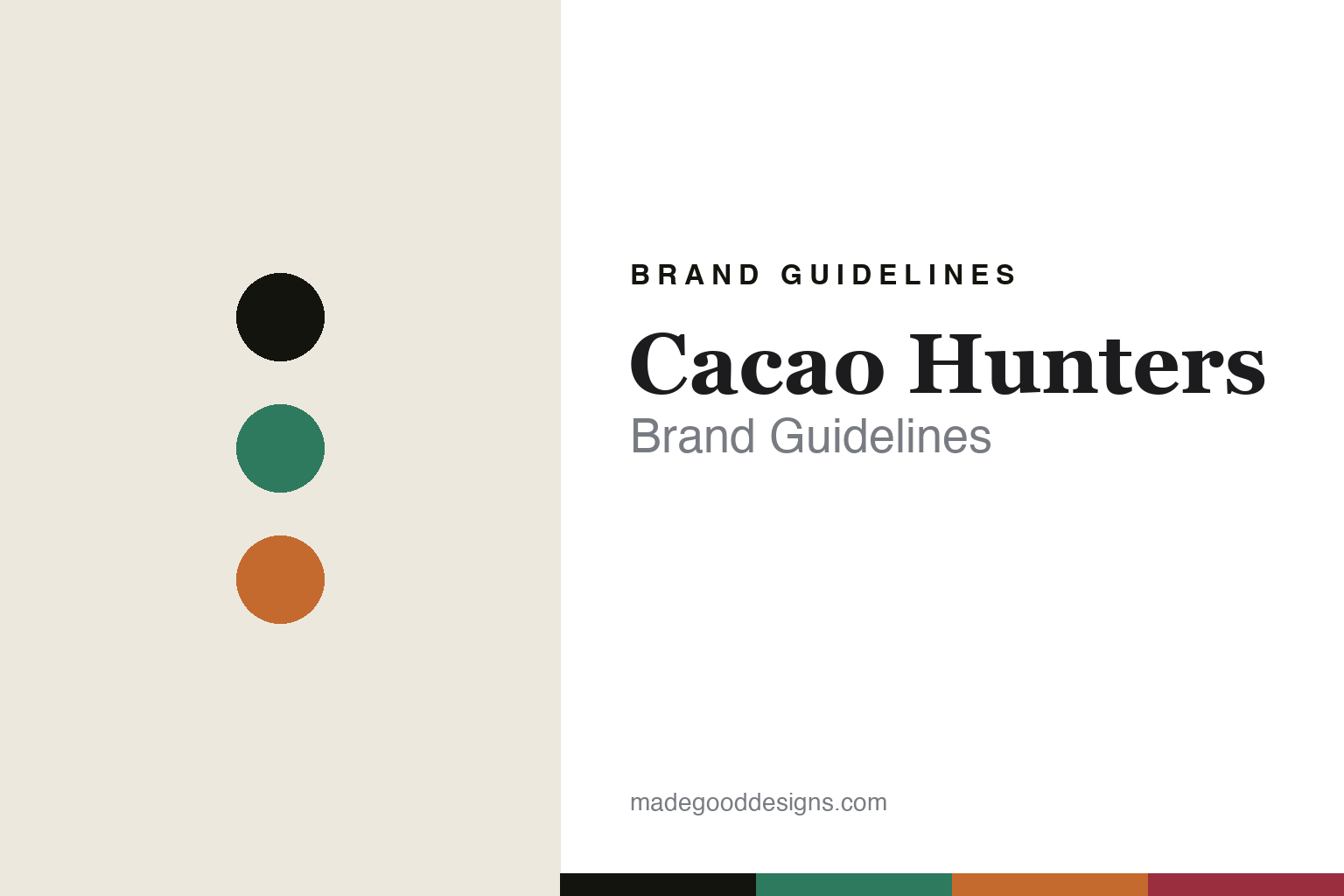
Cacao Hunters Brand Guidelines
The Colombian origin.
Aa
Two constants: a green-and-orange palette and a region serif register. Abstract homage — not the Cacao Hunters packaging.
The Colombian origin
Cacao Hunters built a brand on Colombia’s regions and communities.
Cacao Hunters is a lesson in origin as identity. Based in Popayán and founded around 2013 in Colombia, it is an origin-country maker built on the country’s regions and the communities who grow its cacao.
Its identity is community single-origin: bars sourced from named Colombian regions and communities — the Arhuaco people harvesting wild cacao in the Sierra Nevada de Santa Marta, plus Tumaco and Arauca — working with 2,300-plus farming families in long-term relationships. The packaging is refined and colourful, region-forward, with a design sensibility often attributed to co-founder Mayumi Ogata; the naming is region-and-percentage: Arhuacos 72%, Sierra Nevada 64%, Tumaco Milk 53%. The award record is vast — 190-plus awards, with Tumaco Milk named a “World’s Best Milk Chocolate.”
(Honest notes: Cacao Hunters is widely reported to have joined Japan’s Meiji group around 2021 (via its parent, Cacao de Colombia), so we don’t describe it as independent. Its founders are widely reported as Carlos Ignacio Velasco and Mayumi Ogata, and the design credit to Ogata is often attributed rather than firmly confirmed. There’s no official brand hex, so these tones are an unofficial interpretation.)
Colour
Cacao Hunters lives in a green-and-orange palette. Click a swatch to copy the hex.
Cacao Hunters’ identity is colourful, regional and warm — a Sierra green, an ink, a cacao orange, a Colombia red, and a cream. The palette gathers a Sierra green, a cacao orange and a Colombia red — the register of a region-forward wrapper. It signals origin and community rather than commodity. The honest caveat: with no published brand hex, these tones are an original, unofficial interpretation, not first-party values.
The lesson is a green with a warm orange signals a region-forward origin brand. Cacao Hunters’ world is a map of Colombian regions. For designers, it is a reminder that a colourful, place-derived palette reads as warm and rooted — right for a community-sourced maker. The takeaways: colour-code the regions; name by community and percentage; keep the packaging refined and region-forward; and treat any single hex as unofficial.
Typography
The register is a region serif — warm, refined, place-forward.
Cacao Hunters’ identity carries a warm, refined, place-forward spirit — a Colombian region and a farming community. A region serif captures the mood: it is soft and considered, the register of a place-led brand. Set in a green-and-orange palette, the region serif feels warm and refined — exactly the personality Cacao Hunters carries. It is place-forward rather than loud, mirroring a region-coded wrapper. (Cacao Hunters’ real packaging is work we describe but do not reproduce, and the exact typeface is not ours to use.) Because it is not ours to use, the honest description is “a region serif spirit,” shown here in a stand-in. The type behaves like the brand: warm, refined and place-forward.
Aa
A region serif spirit — warm and refined. (Specimen set in Fraunces, a soft old-style serif STAND-IN; NOT the Cacao Hunters packaging.)
Origin as identity
Cacao Hunters stands for Colombia’s regions and communities.
Cacao Hunters is a lesson in making origin the identity. A green-and-orange palette, a region serif and community sourcing make Colombia the whole brand — warm, refined, place-forward. The origin is the differentiator. The differentiator is a community, region-coded identity.
For designers and brand-builders, Cacao Hunters offers a clear takeaway: let the regions and communities be the brand. The lessons: name the place and the people (Arhuaco, Tumaco); colour-code the origins; keep the packaging refined; and be honest about ownership. It is also a reminder to stay accurate: it’s reported to be part of Japan’s Meiji group since around 2021, its founders and design credit are attributed, and the palette here is an unofficial interpretation. Cacao Hunters made origin the brand — proof that place and community can be the difference.
Explore & save
Keep Cacao Hunters’s identity on hand — save it to a board in the Made Good inspiration library.
Cacao Hunters identity set
Pin the green-and-orange palette and the region-serif register to your own board.


