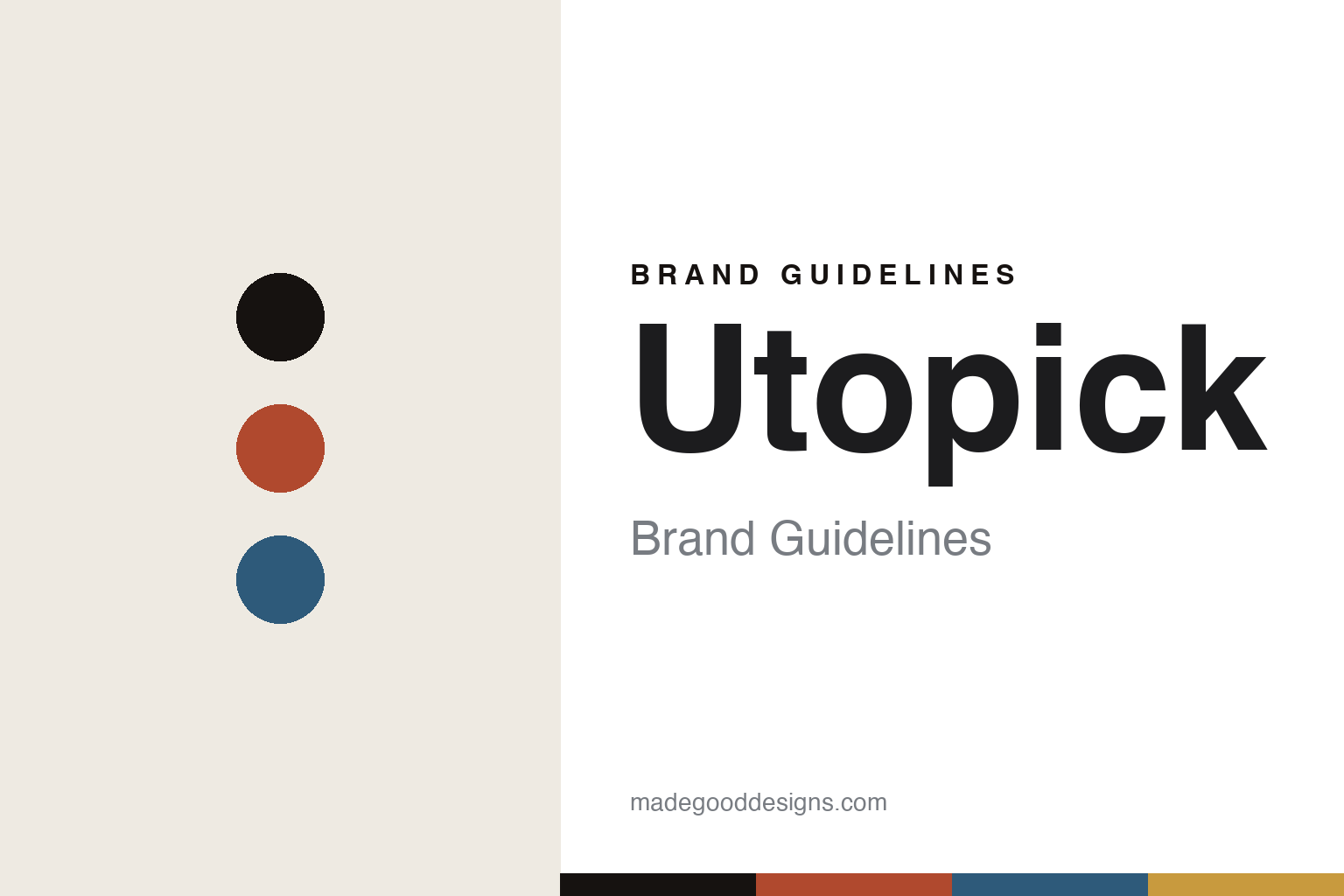
Utopick Brand Guidelines
The paper boat.
Aa
Two constants: a coral-and-sea-blue palette and a geometric sans register. Abstract homage — not the Utopick packaging.
The paper boat
Utopick folds its wrapper into a paper boat.
Utopick is a lesson in a folded object as identity. A Valencian bean-to-bar maker founded in the mid-2010s by Paco Llopis (a master chocolatier) and Juana Rojas, it built its fame on one of craft chocolate’s most celebrated packages.
Its identity is the origami paper boat. Designed by the Valencia studio Lavernia & Cienfuegos (in 2016), the wrapper turns the idea of cocoa’s ocean voyage into a hand-folded paper boat: the front forms two triangles, each a different colour and texture, and the chocolate bar itself is pre-cut into large triangles that echo the wrapper. The pack unfolds and refolds as a keepsake, with a paper ship as the logo. The design swept the awards — a Pentawards Gold in 2017, plus The Dieline, LAUS, ADCV and Art Directors Club of Europe honours.
(Honest notes: the celebrated packaging is the work of Lavernia & Cienfuegos, not an in-house team, and belongs to the 2016–17 era — Utopick has since relaunched (“we’re back”), so we tie the origami design to that moment. Its cacao is sourced from Colombia and Latin America, with a Mediterranean identity — not “Valencian ingredients.” There’s no official brand hex, so these tones are an unofficial interpretation.)
Colour
Utopick lives in a coral-and-sea-blue palette. Click a swatch to copy the hex.
Utopick’s identity is geometric, Mediterranean and playful — an origami coral, an ink, a sea blue, a warm gold, and a cream. The palette pairs an origami coral with a sea blue — the register of a folded paper boat and an ocean voyage. It signals craft and cleverness rather than novelty. The honest caveat: with no published brand hex, these tones are an original, unofficial interpretation, not first-party values.
The lesson is a coral with a sea blue signals a folded, voyaging wrapper. Utopick’s world is a paper boat that holds a chocolate bar. For designers, it is a reminder that a warm, two-colour geometric palette reads as clever and considered — right for an origami concept. The takeaways: give the pack a second life (a foldable object); echo the wrapper in the product (triangle-cut bar); tie the palette to the story (coral, sea blue); and — because a bright coral fails as small text — keep type dark and let the colour live in the palette and band; treat any single hex as unofficial.
Typography
The register is a geometric sans — clean, clever, geometric.
Utopick’s identity carries a clean, clever, geometric spirit — a folded paper boat and a triangle-cut bar. A geometric sans captures the mood: it is neat and modern, the register of a considered design object. Set in a coral-and-sea-blue palette, the geometric sans feels clean and clever — exactly the personality Utopick carries. It is geometric rather than ornate, mirroring a folded wrapper. (Utopick’s real packaging is work we describe but do not reproduce, and the exact typeface is not ours to use.) Because it is not ours to use, the honest description is “a geometric sans spirit,” shown here in a stand-in. The type behaves like the brand: clean, clever and geometric.
Aa
A geometric sans spirit — clean and clever. (Specimen set in Poppins, a geometric sans STAND-IN; NOT the Utopick packaging.)
A folded object as identity
Utopick stands for a wrapper you can fold.
Utopick is a lesson in making a folded object the identity. A coral-and-sea-blue palette, a geometric sans and an origami paper boat make a clever package the whole brand — clean, clever, geometric. The fold is the differentiator. The differentiator is an origami-wrapper, triangle-bar identity.
For designers and brand-builders, Utopick offers a clear takeaway: make the package a designed object. The lessons: give the wrapper a second life (it folds); echo it in the product (triangle-cut bar); tie it to a story (cocoa’s voyage); and credit the makers. It is also a reminder to stay accurate: the origami is Lavernia & Cienfuegos’ 2016 work, the brand has since relaunched, and the palette here is an unofficial interpretation. Utopick made a folded object the brand — proof that a designed package can be the difference.
Explore & save
Keep Utopick’s identity on hand — save it to a board in the Made Good inspiration library.
Utopick identity set
Pin the coral-and-sea-blue palette and the geometric-sans register to your own board.


