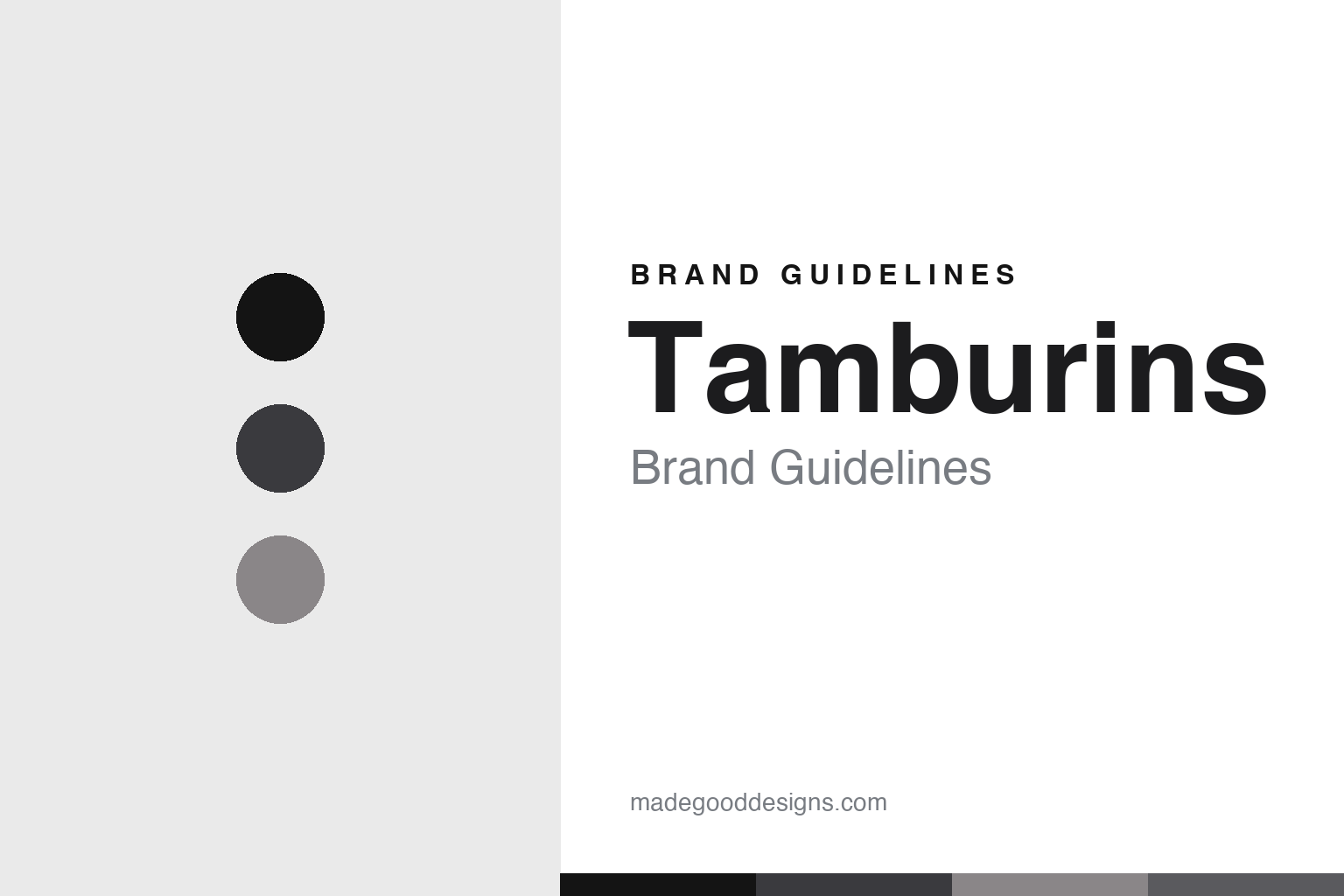
Tamburins Brand Guidelines
Scent as sculpture.
Aa
Two constants: a graphite-and-stone palette and a gallery sans register. Abstract homage — not the Tamburins packaging.
Scent as sculpture
Tamburins turns fragrance and cream into art objects.
Tamburins is a lesson in the object as identity. Founded in 2017 in Seoul, it presents fragrance and body care as sculptural art objects — and it does so with the design language of a gallery.
Its identity has two threads. First, art-object packaging: egg-shaped lip balms, “Shell” hand products, chain hand creams and perfume balms, in a minimalist, monochrome, sculptural register. Second, theatrical retail: Tamburins appears inside the kinetic, sculpture-filled “HAUS” flagships, where large robotic installations turn shopping into an exhibition. The naming is object- and material-led — Shell, egg, chain, Blue Hinoki, Evening Glow.
(Honest notes: Tamburins isn’t an independent indie house — it’s a house brand of IICOMBINED, the same Korean company behind the eyewear brand Gentle Monster (and Nudake), so it’s a sibling of Gentle Monster and shares its design DNA and retail, rather than being “owned by” it. It began as a hand-cream and body-care brand, with perfume a later expansion. There’s no official brand hex, so these tones are an unofficial interpretation. This is design commentary and does not promote fragrance use.)
Colour
Tamburins lives in a graphite-and-stone palette. Click a swatch to copy the hex.
Tamburins’ identity is sculptural, minimal and gallery-like — a graphite, an ink, a stone, a slate, and a gallery white. The palette pairs a graphite with a stone — the register of a monochrome art object. It signals sculpture and restraint rather than beauty-counter colour. The honest caveat: with no published brand hex, these tones are an original, unofficial interpretation, not first-party values.
The lesson is a graphite with a stone signals an art-object brand. Tamburins’ world is a gallery of sculptural vessels. For designers, it is a reminder that a monochrome, sculptural palette reads as art and restraint — right for a brand that treats products as objects. The takeaways: keep the palette monochrome and sculptural; treat each product as an object; stage the retail as an exhibition; and treat any single hex as unofficial.
Typography
The register is a gallery sans — minimal, sculptural, austere.
Tamburins’ identity carries a minimal, sculptural, austere spirit — a monochrome object and a kinetic gallery. A gallery sans captures the mood: it is wide, clean and austere, the register of an exhibition label. Set in a graphite-and-stone palette, the gallery sans feels minimal and sculptural — exactly the personality Tamburins carries. It is austere rather than decorative, mirroring an art object. (Tamburins’ real packaging and wordmark are works we describe but do not reproduce, and the exact typeface is not ours to use.) Because it is not ours to use, the honest description is “a gallery sans spirit,” shown here in a stand-in. The type behaves like the brand: minimal, sculptural and austere.
Aa
A gallery sans spirit — minimal and sculptural. (Specimen set in Archivo, an austere grotesque STAND-IN; NOT the Tamburins packaging.)
The object as identity
Tamburins stands for beauty as sculpture.
Tamburins is a lesson in making the object the identity. A graphite-and-stone palette, a gallery sans and sculptural packaging make the object the whole brand — minimal, sculptural, austere. The object is the differentiator. The differentiator is an art-object, gallery-retail identity.
For designers and brand-builders, Tamburins offers a clear takeaway: treat the product as an art object. The lessons: sculpt the packaging (egg, shell, chain); keep the palette monochrome; stage the store as an exhibition; and be honest about the ownership. It is also a reminder to stay accurate: it’s an IICOMBINED brand (a Gentle Monster sibling) from 2017, it began in hand cream, and the palette here is an unofficial interpretation. Tamburins made the object the brand — proof that sculpture can be the difference.
Explore & save
Keep Tamburins’s identity on hand — save it to a board in the Made Good inspiration library.
Tamburins identity set
Pin the graphite-and-stone palette and the gallery-sans register to your own board.