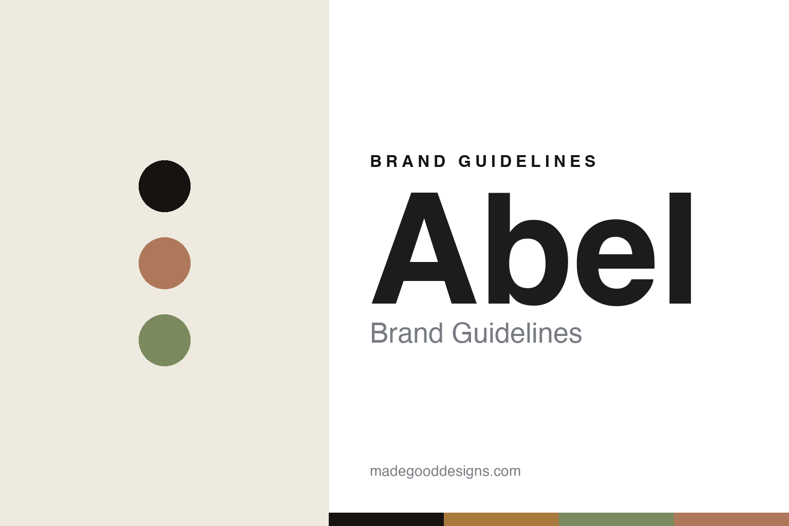
Abel Brand Guidelines
Natural, modern.
Aa
Two constants: an amber-and-green palette and a clean sans register. Abstract homage — not the Abel packaging.
Natural, modern
Abel makes 100%-natural perfume feel contemporary.
Abel is a lesson in a standard as identity. Founded in 2013 by Frances Shoemack — a former winemaker — with the perfumer Isaac Sinclair, and now based in New Zealand, it set out to make natural perfume feel modern rather than earnest.
Its identity is 100% natural: bold, contemporary fragrances made only with natural ingredients, free from the petrochemicals most perfumery relies on — a genuinely difficult, distinguishing standard. The design matches: clean, warm and modern, with amber glass, an earthy palette and a quiet wordmark. The naming is a design story in itself, splitting into two registers — mineral colour-and-note names (Cyan Nori, Pink Iris, Green Cedar, Cobalt Amber) and playful, domestic ones (The Apartment, Laundry Day, Coat Check).
(Honest notes: Abel is founder-led, founded in 2013 (originally out of Amsterdam) and now New Zealand-based, though we don’t pin a specific city. Its 100%-natural positioning is the confirmed hook; we describe the sustainability ethos without asserting specific carbon-neutral or refill claims, and there’s no named external designer. There’s no official brand hex, so these tones are an unofficial interpretation. This is design commentary and does not promote fragrance use.)
Colour
Abel lives in an amber-and-green palette. Click a swatch to copy the hex.
Abel’s identity is natural, warm and modern — an amber, an ink, a natural green, a warm clay, and a cream. The palette pairs an amber with a natural green — the register of natural ingredients and amber glass. It signals nature and modernity rather than earnestness. The honest caveat: with no published brand hex, these tones are an original, unofficial interpretation, not first-party values.
The lesson is an amber with a natural green signals modern, natural perfume. Abel’s world is a warm, clean bottle. For designers, it is a reminder that a warm, natural palette reads as contemporary and honest — right for a 100%-natural house that refuses the hippie cliché. The takeaways: source the palette from the materials (amber, green, clay); keep the design clean and modern; name in two registers (colour-note and domestic); and treat any single hex as unofficial.
Typography
The register is a clean sans — modern, warm, quiet.
Abel’s identity carries a modern, warm, quiet spirit — natural ingredients and a clean bottle. A clean sans captures the mood: it is friendly and contemporary, the register of a modern natural brand. Set in an amber-and-green palette, the clean sans feels modern and warm — exactly the personality Abel carries. It is quiet rather than loud, mirroring an understated bottle. (Abel’s real packaging is work we describe but do not reproduce, and the exact typeface is not ours to use.) Because it is not ours to use, the honest description is “a clean sans spirit,” shown here in a stand-in. The type behaves like the brand: modern, warm and quiet.
Aa
A clean sans spirit — modern and warm. (Specimen set in Figtree, a clean modern sans STAND-IN; NOT the Abel packaging.)
A standard as identity
Abel stands for natural, done modern.
Abel is a lesson in making a standard the identity. An amber-and-green palette, a clean sans and a 100%-natural standard make a difficult promise the whole brand — modern, warm, quiet. The standard is the differentiator. The differentiator is a natural, contemporary identity.
For designers and brand-builders, Abel offers a clear takeaway: make a hard standard the whole brand — and design it modern. The lessons: commit to a difficult standard (100% natural); design it clean and contemporary (not earthy cliché); name in two clever registers; and be honest about the claims. It is also a reminder to stay accurate: it’s a 2013 house, New Zealand-based, and the palette here is an unofficial interpretation. Abel made a standard the brand — proof that a hard promise, well-designed, can be the difference.
Explore & save
Keep Abel’s identity on hand — save it to a board in the Made Good inspiration library.
Abel identity set
Pin the amber-and-green palette and the clean-sans register to your own board.


