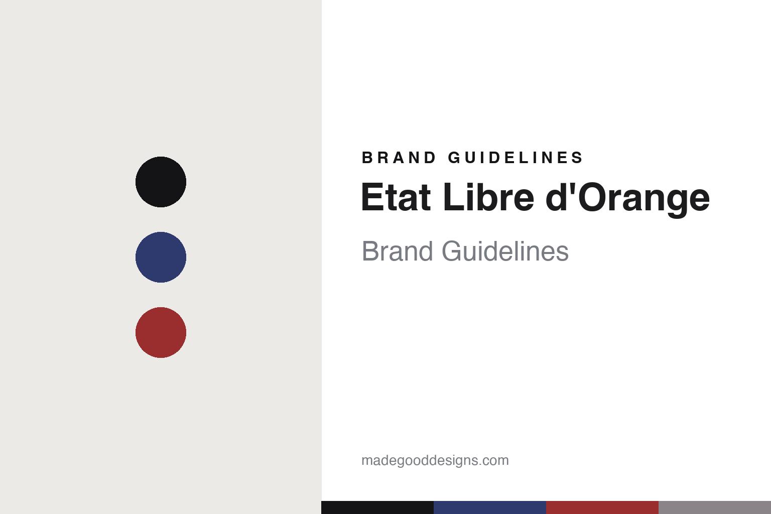
Etat Libre d’Orange Brand Guidelines
The free state.
Aa
Two constants: a blue-and-red palette and a poster sans register. Abstract homage — not the Etat Libre d’Orange packaging.
The free state
Etat Libre d’Orange makes provocation the brand.
Etat Libre d’Orange is a lesson in a stance as identity. Founded in 2006 by Etienne de Swardt (operating as Éditions des Sens) and based in Paris, it built a niche house on a spirit of freedom and provocation — “perfume as freedom.”
Its identity works on three levels. The name itself is a pun: it riffs on the historical Orange Free State to mean, literally, a “free state.” The reputation is provocateur — a legacy of transgressive, irreverent names and concepts that critics dubbed “olfactory libertinage” (its current voice is more theatrical: “life becomes a stage”). And the design is the anchor: a uniform, identical flacon runs across the whole line — “every flask is identical, the only variants being the colour, name and embellishments surrounding the logo” — under a blue-white-red cockade, the French revolutionary rosette, set over a white disc.
(Honest notes: the founder and 2006 date are verified; the house’s current independence and ownership are not something we confirmed, so we don’t assert “still independent.” The provocation is the house’s established reputation and naming legacy — reported titles like Jasmin et Cigarette, Fat Electrician and Rien — rather than a current slogan. There’s no official brand hex, so these tones are an unofficial interpretation. This is design commentary and does not promote fragrance use.)
Colour
Etat Libre d’Orange lives in a blue-and-red palette. Click a swatch to copy the hex.
Etat Libre d’Orange’s identity is provocative, bold and revolutionary — a cockade blue, an ink, a cockade red, a silver, and a cream. The palette pairs a revolutionary blue with a red — the register of a tricolore cockade and a manifesto. It signals freedom and provocation rather than pretty restraint. The honest caveat: with no published brand hex, these tones are an original, unofficial interpretation, not first-party values.
The lesson is a blue with a red signals a provocateur, insignia-led brand. Etat’s world is one uniform bottle with a revolutionary badge. For designers, it is a reminder that a bold, insignia palette plus a uniform format reads as a manifesto — right for “perfume as freedom.” The takeaways: unify the bottle and vary only the graphics; adopt an insignia (a cockade); let the names carry the provocation; and treat any single hex as unofficial.
Typography
The register is a poster sans — bold, declarative, revolutionary.
Etat Libre d’Orange’s identity carries a bold, declarative, revolutionary spirit — a manifesto and a cockade. A heavy poster sans captures the mood: it is loud and declarative, the register of a broadside. Set in a blue-and-red palette, the poster sans feels bold and revolutionary — exactly the personality Etat projects. It is declarative rather than delicate, mirroring a manifesto. (Etat Libre d’Orange’s real bottles, cockade and wordmark are works we describe but do not reproduce, and the exact typeface is not ours to use.) Because it is not ours to use, the honest description is “a poster sans spirit,” shown here in a stand-in. The type behaves like the brand: bold, declarative and revolutionary.
Aa
A poster sans spirit — bold and declarative. (Specimen set in Anton, a heavy poster sans STAND-IN; NOT the Etat Libre d’Orange packaging.)
A stance as identity
Etat Libre d’Orange stands for perfume as freedom.
Etat Libre d’Orange is a lesson in making a stance the identity. A blue-and-red palette, a poster sans and a uniform flacon under a cockade make a stance the whole brand — bold, declarative, revolutionary. The stance is the differentiator. The differentiator is a provocateur, freedom identity.
For designers and brand-builders, Etat offers a clear takeaway: take a stance and design the whole system around it. The lessons: unify the format (one flacon); adopt an insignia (a cockade); let the names do the provoking; and be honest about the business. It is also a reminder to stay accurate: it’s a 2006 de Swardt house, the name is a “free state” pun, current ownership is not something we assert, and the palette here is an unofficial interpretation. Etat Libre d’Orange made a stance the brand — proof that a point of view can be the difference.
Explore & save
Keep Etat Libre d’Orange’s identity on hand — save it to a board in the Made Good inspiration library.
Etat Libre d’Orange identity set
Pin the blue-and-red palette and the poster-sans register to your own board.


