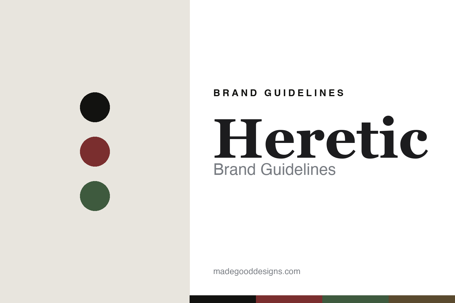
Heretic Brand Guidelines
Naturally derived.
Aa
Two constants: a blood-and-botanical palette and a gothic serif register. Abstract homage — not the Heretic packaging.
Naturally derived
Heretic makes natural perfumery dark and modern.
Heretic is a lesson in a standard with an attitude as identity. Founded by the perfumer Douglas Little and run from a Los Angeles studio, it makes natural-leaning perfumery feel provocative rather than sterile — a “dirty naturals” take.
Its identity has two threads. First, the naturally-derived standard: every ingredient is “100% natural or naturally derived as defined by ISO 9235,” blended in organic sugarcane alcohol, vegan and cruelty-free by intention, free from phthalates and parabens — natural perfumery pushed “far beyond clean.” Second, a gothic, occult editorial art direction: collections like Nosferatu and the Blood Series, an Edward Gorey artist collaboration, and a clean modern apothecary presentation with dark, literary labels. The naming leans into it — a “Dirty ___” motif (Dirty Coconut, Dirty Grass, Dirty Hinoki) beside gothic titles like Midnight Toker and Häxan.
(Honest notes: the accurate claim is “naturally derived (per ISO 9235),” not a flat “100% natural.” The founding year isn’t confirmed — “mid-2010s, around 2015” is reported. Douglas Little’s work for goop was a past creative collaboration, not ownership. We present the brand as founder-led without asserting its exact ownership structure. There’s no official brand hex, so these tones are an unofficial interpretation. This is design commentary and does not promote fragrance use.)
Colour
Heretic lives in a blood-and-botanical palette. Click a swatch to copy the hex.
Heretic’s identity is dark, botanical and provocative — a blood red, a char, a botanical green, a dark amber, and a bone. The palette pairs a blood red with a botanical green — the register of a gothic apothecary. It signals nature and edge rather than sterility. The honest caveat: with no published brand hex, these tones are an original, unofficial interpretation, not first-party values.
The lesson is a blood red with a botanical green signals a dark, natural brand. Heretic’s world is a botanical with an occult streak. For designers, it is a reminder that a dark, botanical palette reads as natural and provocative — right for a house that refuses the earnest, hippie cliché of natural perfumery. The takeaways: pair the botanicals with an edge (blood, char); keep the presentation clean but dark; name with attitude (“Dirty ___”); and treat any single hex as unofficial.
Typography
The register is a gothic serif — literary, dark, refined.
Heretic’s identity carries a literary, dark, refined spirit — a gothic apothecary and a botanical. A literary serif with a dark edge captures the mood: it is elegant and slightly gothic, the register of an occult book. Set in a blood-and-botanical palette, the gothic serif feels literary and dark — exactly the personality Heretic carries. It is refined rather than crude, holding the provocation in a clean frame. (Heretic’s real bottles and wordmark are works we describe but do not reproduce, and the exact typeface is not ours to use.) Because it is not ours to use, the honest description is “a gothic serif spirit,” shown here in a stand-in. The type behaves like the brand: literary, dark and refined.
Aa
A gothic serif spirit — literary and dark. (Specimen set in Spectral, a literary serif STAND-IN; NOT the Heretic packaging.)
A standard with an attitude
Heretic stands for natural, done dark.
Heretic is a lesson in making a standard-with-an-attitude the identity. A blood-and-botanical palette, a gothic serif and a naturally-derived standard make a provocative promise the whole brand — literary, dark, refined. The attitude is the differentiator. The differentiator is a natural, gothic identity.
For designers and brand-builders, Heretic offers a clear takeaway: take a virtuous standard and give it an edge. The lessons: commit to a standard (naturally derived); refuse the earnest cliché; design it dark and literary; and be honest about the claims. It is also a reminder to stay accurate: the claim is “naturally derived per ISO 9235” (not “100% natural”), the founding year is reported, the goop link was a past collaboration, and the palette here is an unofficial interpretation. Heretic made a standard-with-an-attitude the brand — proof that a promise, well-styled, can be the difference.
Explore & save
Keep Heretic’s identity on hand — save it to a board in the Made Good inspiration library.
Heretic identity set
Pin the blood-and-botanical palette and the gothic-serif register to your own board.


