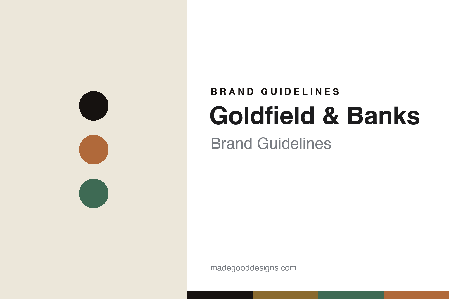
Goldfield & Banks Brand Guidelines
The landscape, in scent.
Aa
Two constants: a gold-and-green palette and a refined sans register. Abstract homage — not the Goldfield & Banks packaging.
The landscape, in scent
Goldfield & Banks bottles the Australian landscape.
Goldfield & Banks is a lesson in a landscape as identity. Founded in 2016 in Sydney by Dimitri Weber — a Belgian-French perfumer — it built an Australian luxury fragrance house on native botanicals, with the tagline “The Landscape, In Scent.”
Its identity is Australian native botanicals: oils like Australian sandalwood, Buddha wood, boronia, blue cypress and golden wattle, composed with French perfumery savoir-faire. The design is refined and minimalist, with landscape-led art direction and a circular “GB” monogram plus a clean wordmark. The scents are named for place, ingredient and mood — Pacific Rock Moss, Bohemian Lime, Southern Bloom, Desert Rosewood — across a Native Collection and a Botanical Series.
(Honest notes: the house is founder-led. The “Joseph Banks” reading of the name is an evocative interpretation, not a documented fact, so we don’t assert it. It’s an Australian identity with Franco-Swiss execution (its oils are composed with houses like Firmenich and produced partly in Melbourne), rather than “entirely made in Australia.” There’s no official brand hex, so these tones are an unofficial interpretation. This is design commentary and does not promote fragrance use.)
Colour
Goldfield & Banks lives in a gold-and-green palette. Click a swatch to copy the hex.
Goldfield & Banks’ identity is refined, natural and Australian — a goldfields gold, an ink, a native green, an ochre, and a cream. The palette pairs a goldfields gold with a native green — the register of the Australian landscape. It signals place and luxury rather than novelty. The honest caveat: with no published brand hex, these tones are an original, unofficial interpretation, not first-party values.
The lesson is a gold with a native green signals an Australian-landscape brand. Goldfield & Banks’ world is the Australian bush translated to a bottle. For designers, it is a reminder that a warm, land-derived palette reads as refined and rooted — right for a native-botanical house. The takeaways: source the palette from the landscape (gold, green, ochre); keep the bottle minimal and the art direction landscape-led; name for place and ingredient; and treat any single hex as unofficial.
Typography
The register is a refined sans — clean, luxurious, landscape-led.
Goldfield & Banks’ identity carries a clean, luxurious, landscape-led spirit — the Australian bush and a minimal bottle. A refined sans captures the mood: it is elegant and modern, the register of understated luxury. Set in a gold-and-green palette, the refined sans feels clean and luxurious — exactly the personality Goldfield & Banks carries. It is landscape-led rather than loud, mirroring a minimal flacon. (Goldfield & Banks’ real bottles and monogram are works we describe but do not reproduce, and the exact typeface is not ours to use.) Because it is not ours to use, the honest description is “a refined sans spirit,” shown here in a stand-in. The type behaves like the brand: clean, luxurious and landscape-led.
Aa
A refined sans spirit — clean and luxurious. (Specimen set in Jost, a refined geometric sans STAND-IN; NOT the Goldfield & Banks packaging.)
A landscape as identity
Goldfield & Banks stands for Australia in a bottle.
Goldfield & Banks is a lesson in making a landscape the identity. A gold-and-green palette, a refined sans and native botanicals make Australia the whole brand — clean, luxurious, landscape-led. The landscape is the differentiator. The differentiator is a native-botanical, place-led identity.
For designers and brand-builders, Goldfield & Banks offers a clear takeaway: let a real place lead the design. The lessons: build on native ingredients (sandalwood, boronia); keep the bottle minimal and the imagery land-led; name for place and mood; and be honest about the making. It is also a reminder to stay accurate: it’s a 2016 Sydney house, the name’s meaning is an interpretation, and the palette here is an unofficial interpretation. Goldfield & Banks made the landscape the brand — proof that a place can be the difference.
Explore & save
Keep Goldfield & Banks’s identity on hand — save it to a board in the Made Good inspiration library.
Goldfield & Banks identity set
Pin the gold-and-green palette and the refined-sans register to your own board.


