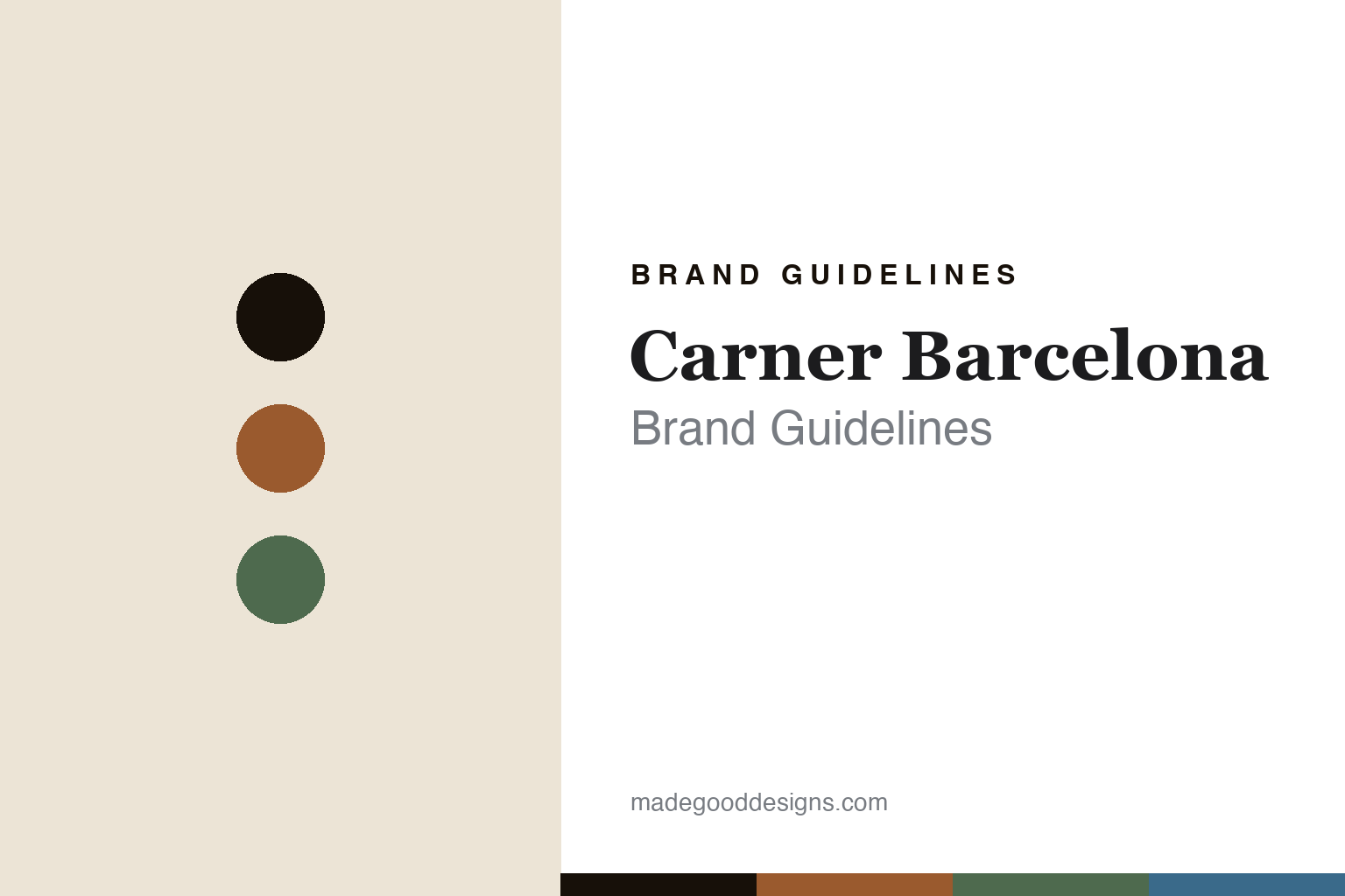
Carner Barcelona Brand Guidelines
The Mediterranean alma.
Aa
Two constants: a wood-and-olive palette and a Mediterranean serif register. Abstract homage — not the Carner Barcelona packaging.
The Mediterranean alma
Carner Barcelona bottles the soul of the Mediterranean.
Carner Barcelona is a lesson in a place and a craft as identity. A family-founded house led by Sara Carner with her siblings Joaquim and Ingrid, it set out to capture the Mediterranean “alma” — soul — from Barcelona.
Its identity has two threads. First, that Mediterranean, Barcelona spirit: “crafting the Mediterranean alma, from Barcelona to the world,” with fragrances inspired by the sea, the light and the landscape. Second — the design signature — the wooden cap, “inspired by the textures of the Mediterranean landscape,” atop handmade packaging; the family’s craft heritage runs deep, its founder the daughter of a third-generation leather artisan. The scents are named for that world — Tardes, Cuirs, Bo-Bo, Sal y Limón, La Playa, Isla Bohemia.
(Honest notes: the wooden cap is the verified signature — not a leather, rope or tassel detail. The house is family-founded and independent; its founding year isn’t published, so the widely-cited “around 2010” is reported rather than confirmed. We don’t attribute the bottle to any named designer, and we don’t assert vegan or sustainability claims we couldn’t verify. There’s no official brand hex, so these tones are an unofficial interpretation. This is design commentary and does not promote fragrance use.)
Colour
Carner Barcelona lives in a wood-and-olive palette. Click a swatch to copy the hex.
Carner Barcelona’s identity is Mediterranean, warm and artisanal — a wood terracotta, an ink, an olive, a sea blue, and a sand. The palette pairs a wood terracotta with an olive — the register of a Mediterranean landscape and a wooden cap. It signals place and craft rather than gloss. The honest caveat: with no published brand hex, these tones are an original, unofficial interpretation, not first-party values.
The lesson is a wood with an olive signals a Mediterranean, artisanal brand. Carner’s world is Barcelona translated to a bottle. For designers, it is a reminder that a warm, land-and-sea palette reads as rooted and crafted — right for a house built on a place. The takeaways: source the palette from the landscape (wood, olive, sea blue, sand); make one crafted detail the signature (the wooden cap); name for the place; and treat any single hex as unofficial.
Typography
The register is a Mediterranean serif — classical, warm, elegant.
Carner Barcelona’s identity carries a classical, warm, elegant spirit — a Mediterranean light and a wooden cap. A classical Roman serif captures the mood: it is timeless and warm, the register of a southern-European elegance. Set in a wood-and-olive palette, the Mediterranean serif feels classical and warm — exactly the personality Carner carries. It is elegant rather than loud, mirroring an artisanal bottle. (Carner Barcelona’s real bottle, cap and wordmark are works we describe but do not reproduce, and the exact typeface is not ours to use.) Because it is not ours to use, the honest description is “a Mediterranean serif spirit,” shown here in a stand-in. The type behaves like the brand: classical, warm and elegant.
Aa
A Mediterranean serif spirit — classical and warm. (Specimen set in Marcellus, a classical Roman serif STAND-IN; NOT the Carner Barcelona packaging.)
A place as identity
Carner Barcelona stands for Barcelona in a bottle.
Carner Barcelona is a lesson in making a place the identity. A wood-and-olive palette, a Mediterranean serif and a wooden cap make Barcelona the whole brand — classical, warm, artisanal. The place is the differentiator. The differentiator is a Mediterranean, craft-led identity.
For designers and brand-builders, Carner Barcelona offers a clear takeaway: let a place and a craft lead the design. The lessons: root the palette in the landscape; make one crafted detail the signature (a wooden cap); name for the place; and be honest about the heritage. It is also a reminder to stay accurate: it’s a family-founded Barcelona house, the cap is wooden, its founding year is reported, and the palette here is an unofficial interpretation. Carner Barcelona made a place the brand — proof that a landscape can be the difference.
Explore & save
Keep Carner Barcelona’s identity on hand — save it to a board in the Made Good inspiration library.
Carner Barcelona identity set
Pin the wood-and-olive palette and the Mediterranean-serif register to your own board.


