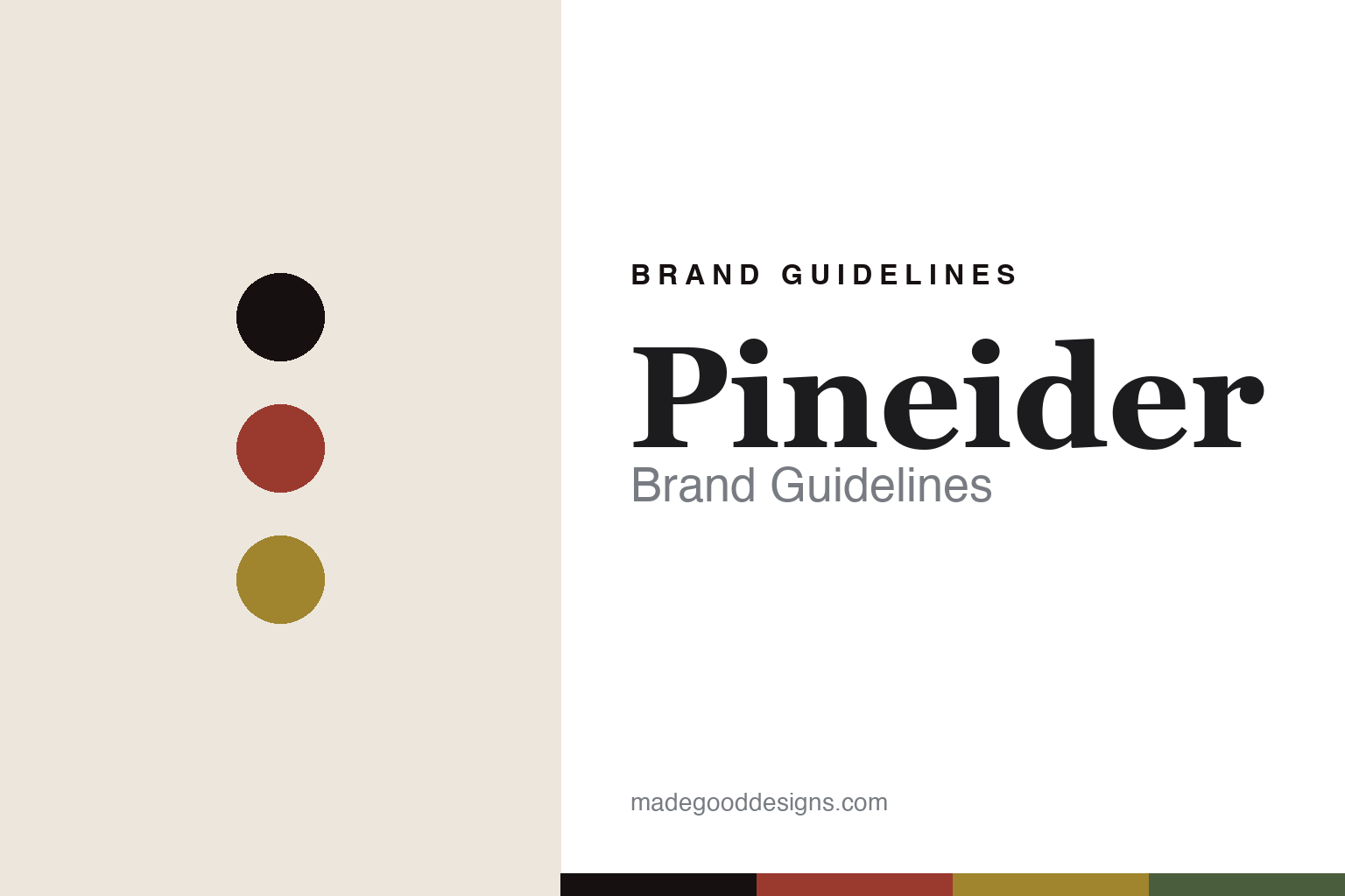
Pineider Brand Guidelines
Paper, then pens.
Aa
Two constants: a red-and-gold palette and a Florentine serif register. Abstract homage — not the Pineider pen or packaging.
Paper, then pens
Pineider built modern pens on a 250-year paper heritage.
Pineider is a lesson in heritage plus innovation as identity. Founded in 1774 in Florence, its historic heart is fine paper — for over two centuries it has made letterhead, envelopes and correspondence cards, alongside fine Florentine leather.
Its identity today joins that Florentine stationery heritage to modern pen innovation. The modern fountain-pen program is designed by Dante Del Vecchio — the co-founder of Visconti, who joined Pineider after leaving that house — and is known for the “Quill” magnetic cap and clip and a hyper-flexible nib (marketed as the “LGP”). The pen collections carry names like Avatar, Arco, Tempi Moderni (Modern Times), Rock, Classic and Forged Carbon.
(Honest notes: the 1774 lineage is the paper house — the luxury fountain-pen program is a modern relaunch, so it isn’t “pens since 1774.” The founder Francesco Pineider and its storied clientele are widely reported rather than confirmed on the brand’s own page, and current ownership is uncertain, so we don’t assert it. The Del Vecchio design link is widely reported. There’s no official brand hex, so these tones are an unofficial interpretation. This is design commentary and does not promote any product.)
Colour
Pineider lives in a red-and-gold palette. Click a swatch to copy the hex.
Pineider’s identity is Florentine, heritage and luxurious — a Florentine red, an ink, a Florentine gold, a Tuscan green, and a cream. The palette pairs a Florentine red with a gold — the register of Renaissance Florence and fine stationery. It signals heritage and luxury rather than novelty. The honest caveat: with no published brand hex, these tones are an original, unofficial interpretation, not first-party values.
The lesson is a Florentine red with a gold signals a heritage-luxury brand. Pineider’s world is Florence rendered in paper, leather and pens. For designers, it is a reminder that a rich, Florentine palette reads as heritage and luxurious — right for a 250-year house. The takeaways: root the palette in the place (Florentine red, gold); honour the historic craft (paper); add modern innovation (the pens); and treat any single hex as unofficial.
Typography
The register is a Florentine serif — classical, luxurious, Italian.
Pineider’s identity carries a classical, luxurious, Italian spirit — a Renaissance city and fine paper. A classical Florentine serif captures the mood: it is elegant and timeless, the register of Italian letters. Set in a red-and-gold palette, the Florentine serif feels classical and luxurious — exactly the personality Pineider carries. It is heritage rather than modern, mirroring a 250-year house. (Pineider’s real pens and wordmark are works we describe but do not reproduce, and the exact typeface is not ours to use.) Because it is not ours to use, the honest description is “a Florentine serif spirit,” shown here in a stand-in. The type behaves like the brand: classical, luxurious and Italian.
Aa
A Florentine serif spirit — classical and luxurious. (Specimen set in Cormorant Garamond, a delicate literary serif STAND-IN; NOT the Pineider packaging.)
Heritage plus innovation
Pineider stands for Florentine heritage, modern pens.
Pineider is a lesson in making heritage plus innovation the identity. A red-and-gold palette, a Florentine serif and a paper-house heritage joined to modern pen design make heritage-plus-innovation the whole brand — classical, luxurious, Italian. The pairing is the differentiator. The differentiator is a heritage-and-innovation identity.
For designers and brand-builders, Pineider offers a clear takeaway: join a deep heritage to a modern innovation. The lessons: honour the historic craft (Florentine paper); bring in modern design (Del Vecchio’s pens); name from place and era (Tempi Moderni); and be honest about the timeline. It is also a reminder to stay accurate: the 1774 lineage is the paper house and the pens are a modern relaunch, and the palette here is an unofficial interpretation. Pineider made heritage-plus-innovation the brand — proof that pairing old and new can be the difference.
Explore & save
Keep Pineider’s identity on hand — save it to a board in the Made Good inspiration library.
Pineider identity set
Pin the red-and-gold palette and the Florentine-serif register to your own board.


