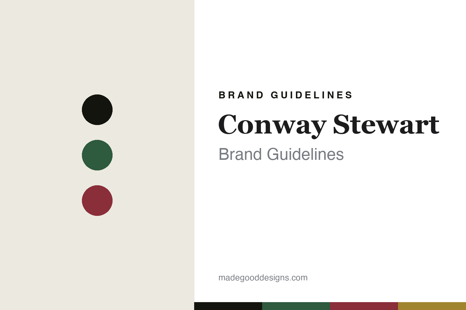
Conway Stewart Brand Guidelines
Colour, in Britain.
Aa
Two constants: a green-and-claret palette and a British serif register. Abstract homage — not the Conway Stewart pen or packaging.
Colour, in Britain
Conway Stewart built its identity on colourful British materials.
Conway Stewart is a lesson in material colour as identity. Founded in 1905 in London by Frank Jarvis and Tommy Garner — both from De La Rue — it became a classic British pen maker, and after a long gap it is now hand-made in England again.
Its identity is colourful patterned materials: historically the maker celebrated its rich casein (an early milk-protein plastic) and vivid coloured plastics, and today it works in marbled acrylics and resins with 18ct gold nibs and silver trims. The other thread is a quintessentially British heritage, expressed through commemorative editions — most famously the Churchill and “Their Finest Hour” pens.
(Honest notes: the “Conway Stewart” name is an unverified legend — neither founder was called Conway or Stewart. And it isn’t a continuous “since 1905” house: production ceased in 1975, the name was revived in the 1990s, and after a 2014 receivership the brand was acquired by Bespoke British Pens Ltd, who make it today in Emsworth, Hampshire. Casein is a vintage-era material; modern pens are chiefly acrylic. There’s no official brand hex, so these tones are an unofficial interpretation. This is design commentary and does not promote any product.)
Colour
Conway Stewart lives in a green-and-claret palette. Click a swatch to copy the hex.
Conway Stewart’s identity is colourful, British and heritage — a British green, an ink, a claret, a casein amber, and a cream. The palette pairs a British green with a claret — the register of rich patterned casein and British heritage. It signals colour and tradition rather than restraint. The honest caveat: with no published brand hex, these tones are an original, unofficial interpretation, not first-party values.
The lesson is a British green with a claret signals a colourful, heritage brand. Conway Stewart’s world is a patterned, jewel-toned pen. For designers, it is a reminder that a rich, saturated palette reads as heritage and characterful — right for a house built on colourful materials. The takeaways: make the material the colour (casein, marbled acrylic); keep the palette rich and British; commemorate through editions; and treat any single hex as unofficial.
Typography
The register is a British serif — heritage, refined, colourful.
Conway Stewart’s identity carries a heritage, refined, colourful spirit — a patterned British pen. A high-contrast British serif captures the mood: it is traditional and refined, the register of an old English maker. Set in a green-and-claret palette, the British serif feels heritage and refined — exactly the personality Conway Stewart carries. It is colourful rather than plain, mirroring a marbled body. (Conway Stewart’s real pens and wordmark are works we describe but do not reproduce, and the exact typeface is not ours to use.) Because it is not ours to use, the honest description is “a British serif spirit,” shown here in a stand-in. The type behaves like the brand: heritage, refined and colourful.
Aa
A British serif spirit — heritage and refined. (Specimen set in Playfair Display, a high-contrast serif STAND-IN; NOT the Conway Stewart packaging.)
Material colour as identity
Conway Stewart stands for colourful British pens.
Conway Stewart is a lesson in making material colour the identity. A green-and-claret palette, a British serif and colourful patterned materials make material colour the whole brand — heritage, refined, colourful. The colour is the differentiator. The differentiator is a colourful, British-heritage identity.
For designers and brand-builders, Conway Stewart offers a clear takeaway: let the material carry the colour. The lessons: choose expressive materials (casein, marbled acrylic); keep the palette rich; commemorate through editions; and be honest about the history. It is also a reminder to stay accurate: the name is a legend, it isn’t a continuous line (ceased 1975, revived, now made by Bespoke British Pens Ltd), and the palette here is an unofficial interpretation. Conway Stewart made colour the brand — proof that a material can be the difference.
Explore & save
Keep Conway Stewart’s identity on hand — save it to a board in the Made Good inspiration library.
Conway Stewart identity set
Pin the green-and-claret palette and the British-serif register to your own board.


