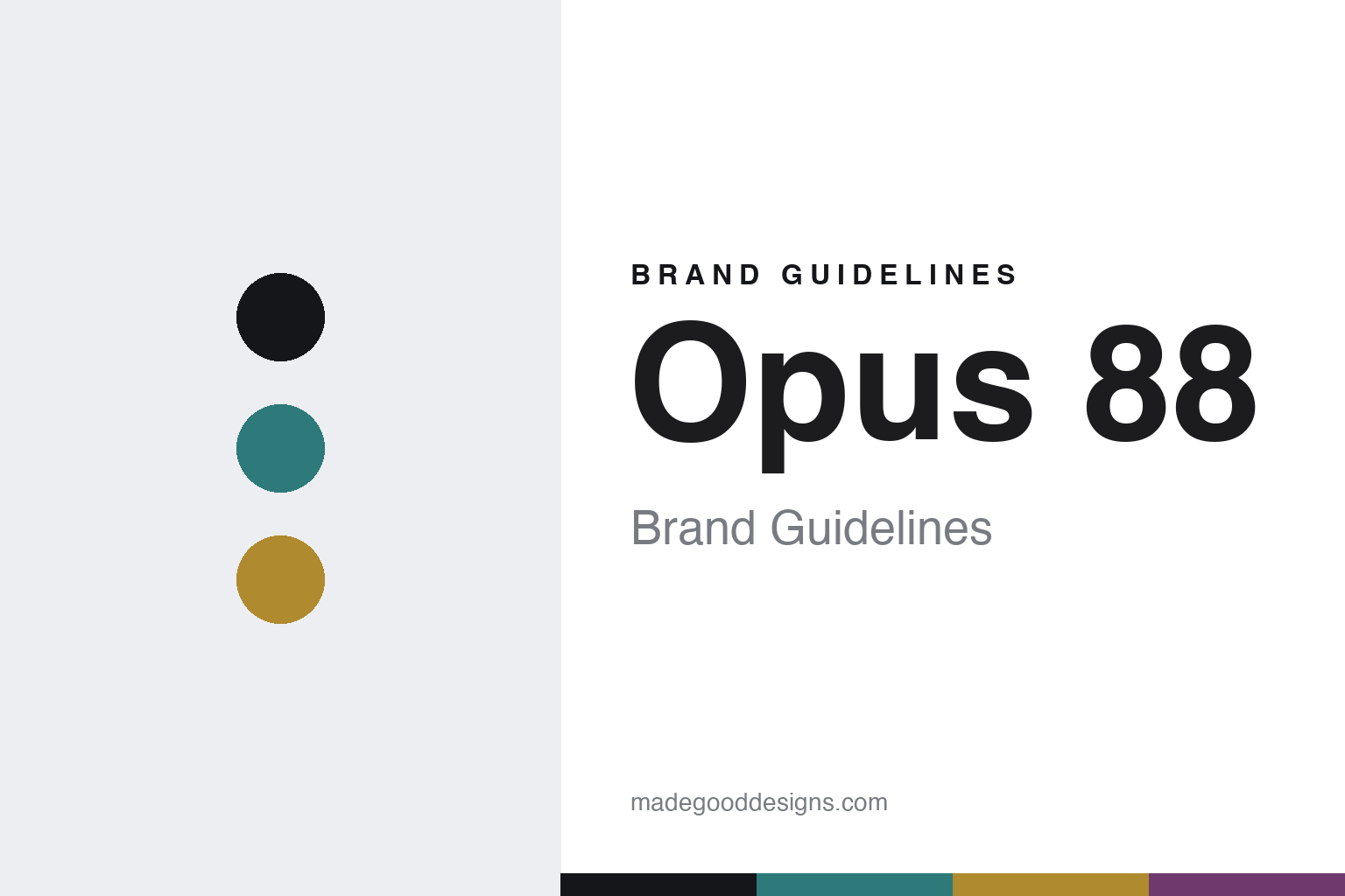
Opus 88 Brand Guidelines
The eyedropper.
Aa
Two constants: a teal-and-amber palette and a clean sans register. Abstract homage — not the Opus 88 pen or packaging.
The eyedropper
Opus 88 built its identity on a high-capacity eyedropper pen.
Opus 88 is a lesson in a filling system as identity. A Taiwanese pen maker, it became known internationally for reviving one specific mechanism — the Japanese-style eyedropper — in large, colourful, affordable pens.
Its identity is the eyedropper with a shut-off valve: the whole barrel is the ink reservoir, filled directly with an eyedropper, and an end knob operates a shut-off valve that seals the ink for travel and prevents burping — the mechanism is the whole point. The pens are large, often translucent demonstrators in bright resin (and solid colours), offered at strong value with steel nibs. The models carry names like Demonstrator, Omar, Jazz and Harmony.
(Honest notes: Opus 88 is Taiwanese, but its founding history — including the sometimes-cited “1988” origin and the “longtime manufacturer, newer own-brand” story — is widely reported rather than something we could confirm here, so we present it cautiously. The eyedropper-with-shut-off-valve mechanism, the translucent bodies and the value are the well-documented core. There’s no official brand hex, so these tones are an unofficial interpretation. This is design commentary and does not promote any product.)
Colour
Opus 88 lives in a teal-and-amber palette. Click a swatch to copy the hex.
Opus 88’s identity is colourful, translucent and functional — a demonstrator teal, an ink, an ink amber, a violet, and a paper. The palette pairs a demonstrator teal with an ink amber — the register of translucent resin and visible ink. It signals fun and function rather than luxury. The honest caveat: with no published brand hex, these tones are an original, unofficial interpretation, not first-party values.
The lesson is a teal with an amber signals a translucent, eyedropper brand. Opus 88’s world is a big, bright pen you can see the ink in. For designers, it is a reminder that a translucent, colourful palette reads as fun and functional — right for a demonstrator eyedropper. The takeaways: make the mechanism the story (eyedropper + shut-off valve); show the ink (translucent bodies); keep the value high; and treat any single hex as unofficial.
Typography
The register is a clean sans — functional, clear, unfussy.
Opus 88’s identity carries a functional, clear, unfussy spirit — a translucent body and a simple mechanism. A clean geometric sans captures the mood: it is plain and legible, the register of a functional product. Set in a teal-and-amber palette, the clean sans feels functional and clear — exactly the personality Opus 88 carries. It is unfussy rather than decorative, letting the translucent body carry the colour. (Opus 88’s real pens and wordmark are works we describe but do not reproduce, and the exact typeface is not ours to use.) Because it is not ours to use, the honest description is “a clean sans spirit,” shown here in a stand-in. The type behaves like the brand: functional, clear and unfussy.
Aa
A clean sans spirit — functional and clear. (Specimen set in Jost, a clean geometric sans STAND-IN; NOT the Opus 88 packaging.)
A mechanism as identity
Opus 88 stands for the eyedropper pen.
Opus 88 is a lesson in making a mechanism the identity. A teal-and-amber palette, a clean sans and the eyedropper-with-shut-off-valve make one mechanism the whole brand — functional, clear, unfussy. The mechanism is the differentiator. The differentiator is an eyedropper, translucent identity.
For designers and brand-builders, Opus 88 offers a clear takeaway: revive a mechanism and make it the story. The lessons: pick a distinctive system (the eyedropper + shut-off valve); show it off (translucent bodies); keep it affordable; and be honest about the gaps. It is also a reminder to stay accurate: it’s a Taiwanese maker whose founding history is reported, the mechanism is the verified core, and the palette here is an unofficial interpretation. Opus 88 made a mechanism the brand — proof that a filling system can be the difference.
Explore & save
Keep Opus 88’s identity on hand — save it to a board in the Made Good inspiration library.
Opus 88 identity set
Pin the teal-and-amber palette and the clean-sans register to your own board.